
7 Top Design Trends in 2025 for User Engagement Success
Designing a landing page that converts is not just about making things look good. Users arrive with high expectations and little patience for cluttered layouts, slow load times, or generic calls to action. When your testing results fall flat or bounce rates keep climbing, it’s easy to feel stuck and wonder what will actually move the needle.
The good news is that practical design choices can make a measurable difference in how real people interact with your site. This list dives into actionable methods proven to increase clarity, speed, and emotional engagement — all backed by current trends and technology. Following these insights will help you create landing pages that not only attract attention but also guide every visitor toward taking the next step.
Get ready to see how purpose-driven minimalism, dynamic interfaces, and mobile-first strategies can transform your conversion rates. Each item uncovers a key principle you can apply right now for results you’ll notice in your analytics.
Table of Contents
- 1. Embracing Minimalism For Faster Page Loads
- 2. Personalized UI Experiences Using Dynamic Content
- 3. Mobile-First Design Priorities For Higher Conversion
- 4. Micro-Interactions That Enhance User Engagement
- 5. Incorporating Bold Colors And Gradients For Impact
- 6. Accessibility-First Layouts For Wider Reach
- 7. AI-Driven Design Tools For Rapid Experimentation
Quick Summary
| Key Message | Explanation |
|---|---|
| 1. Prioritize Minimalism | Adopting a minimalist design improves load times and user engagement, directly boosting conversion rates. |
| 2. Implement Dynamic Content | Personalizing user experiences through dynamic content increases engagement by catering to individual needs and behaviors. |
| 3. Embrace Mobile-First Design | Designing for mobile first ensures fast load times and enhanced usability, leading to higher conversion rates from mobile users. |
| 4. Utilize Micro-Interactions | Small user interactions build trust and guide behavior, improving overall engagement and lowering abandonment rates. |
| 5. Focus on Accessibility | Designing with accessibility in mind expands your audience and enhances usability for all, significantly improving conversion opportunities. |
1. Embracing Minimalism for Faster Page Loads
Minimalism in web design for 2025 goes beyond just looking clean and simple. It's a strategic approach called "Minimalism Reloaded" that combines purposeful design with measurable performance benefits. When you strip away unnecessary visual elements, bloated code, and redundant features, your pages load faster, your users stay engaged longer, and your conversion rates climb. For digital marketers running A/B tests, this matters tremendously because every millisecond of delay can shift your test results and skew your data.
The core principle is straightforward: include only what serves your users. Clean interfaces with purposeful white space reduce cognitive load, which means visitors can find what they need without distraction. Your website becomes mobile-first by default because minimalist design naturally adapts to smaller screens. When you eliminate visual clutter, you also reduce the file sizes that slow down page rendering. This creates a ripple effect of benefits. Fewer images and decorative elements mean faster load times. Faster load times mean better user experience. Better user experience means higher engagement metrics and improved conversion potential. Minimalist design principles support mobile-first experiences that reduce information overload and enhance emotional resonance across your audience.
Here's how to implement this practically in your own work. Start by auditing your current landing pages. Remove any image that doesn't directly support your value proposition. Delete redundant navigation items. Simplify your color palette to 2-3 primary colors instead of six. Cut your font choices down to two typefaces maximum. Each of these actions reduces page weight and improves rendering speed. When you run your next A/B test, measure not just conversion rate but also page load time and time on page. You'll likely find that the minimalist variant outperforms because users can process information faster and make decisions more confidently. The whitespace you add creates visual breathing room that actually guides attention toward your call-to-action button rather than competing for attention with background patterns or unnecessary graphics.
Pro tip: Use your A/B testing tool to compare a minimalist version of your landing page against your current design, measuring both conversion rate and load time to prove the business case for simplification to stakeholders.
2. Personalized UI Experiences Using Dynamic Content
Personalization has moved beyond showing a visitor's name in the header. Today, dynamic content adapts layouts, messaging, and interactions based on real-time user behavior and preferences. When your interface responds to what each individual visitor does, thinks, and needs, engagement skyrockets because users feel understood rather than marketed to. For conversion rate optimization specialists, this is where the real magic happens because personalized experiences don't just improve metrics—they transform how users move through your funnel.
Here's how it works in practice. AI-driven systems analyze user patterns as people interact with your site—what they click, how long they pause, what device they use, what traffic source brought them in. Dynamic personalization adjusts content and layouts based on behavioral analysis, meaning a first-time visitor from mobile sees something completely different from a returning desktop user researching your premium tier. The button colors change. The copy shifts. The product recommendations reorganize. The entire experience becomes a conversation tailored to that specific person's stage in the buyer journey. This responsiveness builds trust because users encounter exactly what they need when they need it, without wading through irrelevant information.
To implement this at your startup, start simple. Segment your traffic into three or four clear groups: new visitors, engaged browsers, and returning customers. Create different content blocks for each segment. Test variations using your A/B testing framework to measure which personalized experiences drive higher conversions than generic ones. You might discover that new visitors respond better to educational content while returning visitors want case studies and pricing. You'll notice mobile users abandon carts at different points than desktop users, so personalize the flow accordingly. Each test reveals opportunities to refine what each segment sees. The key is starting with behavioral data you already have—source, device type, visit frequency—before layering in more advanced AI-driven predictions.
Pro tip: Begin tracking user segments and their conversion rates separately within your testing tool, then prioritize personalization tests for your highest-traffic segments first to maximize impact and confidence in your results.
3. Mobile-First Design Priorities for Higher Conversion
Over 60 percent of web traffic now comes from mobile devices, yet many marketers still design for desktop first and shrink things down afterward. Mobile-first design flips this approach completely. You build for the smallest screen, the slowest connection, and the touchscreen interaction model first. Then you expand upward to larger screens. This shift transforms how your entire conversion funnel performs because mobile users represent your largest and fastest-growing audience.
Why does this matter so much for conversions? Mobile users are impatient. They have limited screen space, slower connections, and one finger to navigate with instead of a mouse and keyboard. If your button is too small to tap comfortably, your conversion rate drops. If your form requires horizontal scrolling, users abandon it. If your page takes four seconds to load on 4G, they leave before seeing your value proposition. Mobile-first design prioritizes fast load times and touch-optimized navigation, which directly improves user experience and encourages longer visits that convert better. When you design for mobile constraints first, you naturally create cleaner, faster, more focused experiences that work brilliantly on desktop too. Your call-to-action buttons become appropriately sized. Your copy becomes tighter and more persuasive. Your forms get simplified to only essential fields. These constraints actually force better design decisions across the board.
Start implementing mobile-first by testing your current landing pages on actual phones, not just browser emulators. Hold a phone in your hand and tap your buttons. Can you hit them without hitting adjacent elements? Navigate your form. Does it feel smooth or clunky? Load your page on a cellular connection. Does it render in under three seconds? For your next A/B test, create a mobile-optimized variant with larger touch targets, simplified navigation, and a single focused conversion path. Test it against your current design. Most marketers see 25 to 40 percent conversion improvements from proper mobile optimization. Your Stellar testing tool can measure this difference by segmenting results by device type, showing you exactly how mobile users convert differently than desktop visitors. This data becomes your roadmap for prioritizing which mobile improvements matter most.
Pro tip: Test your mobile landing pages using actual cellular connections and devices, not just WiFi, since most of your mobile traffic will experience slower real-world conditions that impact both load speed and user patience.
4. Micro-Interactions That Enhance User Engagement
Micro-interactions are the tiny moments when your design responds to what a user does. A button that changes color when you hover over it. A form field that shows a checkmark after you fill it correctly. A shopping cart that bounces slightly when you add an item. These small, almost invisible interactions create a conversation between your user and your interface. They provide feedback, guide behavior, and create emotional connections that keep people engaged longer and more willing to convert. For conversion optimization specialists, micro-interactions are underutilized tools that can measurably improve how users move through your funnel.
The power of micro-interactions lies in their ability to reduce friction and build confidence. When a user submits a form and sees nothing happen, they wonder if it worked. Did my input register? Should I click again? That uncertainty creates anxiety and abandonment. But when the form shows immediate visual feedback, like a loading spinner transforming into a success checkmark, the user knows progress happened. Micro-interactions provide immediate feedback and intuitive cues that improve task completion and reduce errors while building emotional satisfaction. Think about password fields that show a strength meter as you type. Think about checkout flows where each completed step highlights in green. These small moments create a narrative of progress that encourages users to push forward. They also build brand personality. A playful animation when a user hovers over a button feels different from a corporate gray box. Your micro-interactions communicate your brand voice without using words.
Implementing micro-interactions starts with identifying your critical moments of user doubt. Where do users hesitate? Where do they make mistakes? On form submissions, add loading states and success confirmations. On button hovers, add color shifts or subtle scale changes. On input fields, add validation feedback. Start testing these enhancements against your current versions. You might add a simple loading animation to your submit button and watch time-to-conversion decrease because users see proof the system is working. You might add input validation that prevents form errors before submission and watch abandonment rates drop. These small changes compound. A user who encounters five well-designed micro-interactions feels more confident in your brand than a user who sees none. Your A/B testing tool can measure the impact by comparing bounce rates, form completion rates, and conversion rates between your control and variants with enhanced micro-interactions.
Pro tip: Test micro-interactions on your highest-friction pages first, such as checkout or signup flows, where users are most likely to hesitate or abandon before moving to lower-priority areas.
5. Incorporating Bold Colors and Gradients for Impact
Bold colors and dynamic gradients have moved from being trendy flourishes to strategic design elements that directly influence how users perceive your brand and interact with your interface. A vibrant blue button converts differently than a gray one. A gradient background that flows from deep purple to electric pink creates emotional resonance and visual depth that flat colors simply cannot match. For conversion rate optimization specialists, understanding color psychology and gradient application is no longer optional if you want to stay competitive in 2025. These visual elements command attention, influence emotional responses, and guide users through your conversion funnel more effectively than neutral palettes.
Color choice operates at a psychological level that most marketers underestimate. Vivid blues trigger feelings of trust and stability, which explains why financial institutions use them. Neon tones and vibrant purples create excitement and urgency, making them perfect for limited-time offers or premium products. Gradients amplify these effects by adding movement and depth without requiring animation, which means they load instantly and don't hurt your page speed. Bold color gradients and neon effects convey modernity and attract attention in competitive markets while creating visual hierarchy that guides users toward your most important conversion elements. When you apply a gradient to your primary call-to-action button, it becomes a visual magnet. When your hero section background transitions from one bold color to another, it creates a sense of forward momentum that encourages scrolling. The key is applying these bold choices strategically rather than painting everything neon.
Start experimenting with bold colors on your highest-impact elements first. Your primary call-to-action button is the obvious choice. Test a vibrant color variant against your current button color and measure the conversion rate difference. Many marketers see 10 to 20 percent improvement from a single color change. Next, apply gradients to hero sections or banner backgrounds where they create visual interest without distracting from your message. Test different color combinations to see which emotional response resonates with your specific audience. A tech startup might test electric blue to coral gradients, while a wellness brand might test emerald to soft gold. Your gradient choices should align with your brand personality and the emotional response you want to trigger. Start conservative and gradually increase saturation and boldness as you gather conversion data. Track not just conversion rate but also engagement metrics like scroll depth and time on page, since bold colors can increase how long users stay engaged with your content.
Pro tip: Test bold colors on one high-impact element at a time rather than redesigning your entire page, so you can isolate which color choices drive actual conversion improvements versus simply looking more modern.
6. Accessibility-First Layouts for Wider Reach
Accessibility is not a feature you add after building your site. It is a foundational design principle that expands your potential customer base while improving the user experience for everyone. When you design with accessibility first, you create interfaces that work for people with visual impairments, hearing loss, motor disabilities, and cognitive differences. You also create cleaner, faster, more intuitive experiences for users without disabilities. This is not charity work. It is smart business that directly increases your conversion rate because you are removing barriers that prevent people from taking action.
Why does accessibility matter for conversion optimization? Consider that over 15 percent of the global population has some form of disability. That is millions of potential customers you exclude when your design ignores accessibility standards. But beyond the business case, there is a technical advantage. Semantic HTML structure and clear navigation improve usability for all users while accommodating those with disabilities. Proper heading hierarchy helps screen reader users understand your content structure, but it also helps search engines and regular users scan your page more efficiently. Sufficient color contrast that helps users with vision impairment also improves readability on mobile devices in bright sunlight. Keyboard navigation that accommodates users without mouse control also speeds up power users who prefer keyboard shortcuts. Captions for video content help deaf users, but they also help users in noisy environments and those learning English as a second language. Accessibility improvements compound. Each one makes your site better for everyone.
Start with the basics. Ensure your color contrast meets WCAG AA standards by using tools that measure contrast ratios. Make all interactive elements keyboard accessible by testing whether you can navigate your entire site using only the Tab key. Add descriptive alt text to images that explains what they show rather than just labeling them. Use semantic HTML tags like buttons for buttons and links for links instead of styling divs to act like buttons. Test your site with actual assistive technologies like screen readers to understand how disabled users experience your interface. When you run your next A/B test, consider testing an accessibility improvement against your control. You might add captions to a video and find that viewers watch 30 percent longer. You might improve form labels and discover that error rates drop significantly. These changes often improve conversion rates while expanding your reach to audiences you were previously excluding.
Pro tip: Start with keyboard navigation testing and form accessibility since these two areas often have the largest impact on conversion rates while being relatively quick to improve.
7. AI-Driven Design Tools for Rapid Experimentation
AI-driven design tools have transformed how conversion rate optimization specialists work. Instead of spending days manually creating design variations and testing hypotheses, you can generate multiple design concepts in minutes, test them simultaneously, and iterate based on real data. These tools automate the repetitive parts of design work while keeping you in control of the creative direction. For startups with limited design resources, AI-driven tools level the playing field by allowing small teams to test as many variations as large agencies with entire design departments.
The power of AI in design lies in its ability to accelerate ideation and testing cycles. Traditional design workflows require you to sketch an idea, build it, test it, analyze results, then repeat. Each cycle takes days or weeks. AI tools collapse this timeline. You describe what you want to test, the AI generates variations with different layouts, colors, copy, or component arrangements, and you deploy multiple variants simultaneously. AI-assisted tools enable rapid ideation and support generative co-creation that accelerates experimentation through adaptable, transparent interfaces under your control. This means you are not letting AI design your site independently. You are using AI as a thinking partner that generates options faster than you could manually create them. You still make the decisions about what matters, what aligns with your brand, and what to test. The AI simply handles the time-consuming work of variation creation. This dramatically increases your testing velocity. Instead of running one A/B test per month, you can run ten, generating months of learning in weeks.
Start small to see the value. Pick one landing page section that you suspect could convert better. Use an AI design tool to generate five different variations on that section while maintaining your brand identity. Deploy them in your testing tool and measure which performs best. You might discover that a different button layout converts 35 percent better, or that rearranging your value propositions increases clicks by 18 percent. These insights come from actual user data, not designer intuition. Build on this momentum. The next week, test variations on your form fields. The week after, test your hero section. By running rapid experiments using AI-generated variations, you accumulate conversion rate improvements that compound into significant business impact. The teams winning in 2025 are not those with the biggest budgets. They are the teams running the most experiments and learning fastest from the results.
Pro tip: Use AI tools to generate design variations quickly, but always validate winning variants through your testing tool before making them permanent, since what looks visually compelling doesn't always convert best.
Below is a comprehensive table summarizing the key concepts and actionable steps covered in the article's discussion on improving web design and user engagement for higher conversions.
Boost Your User Engagement with Fast and Insightful A/B Testing
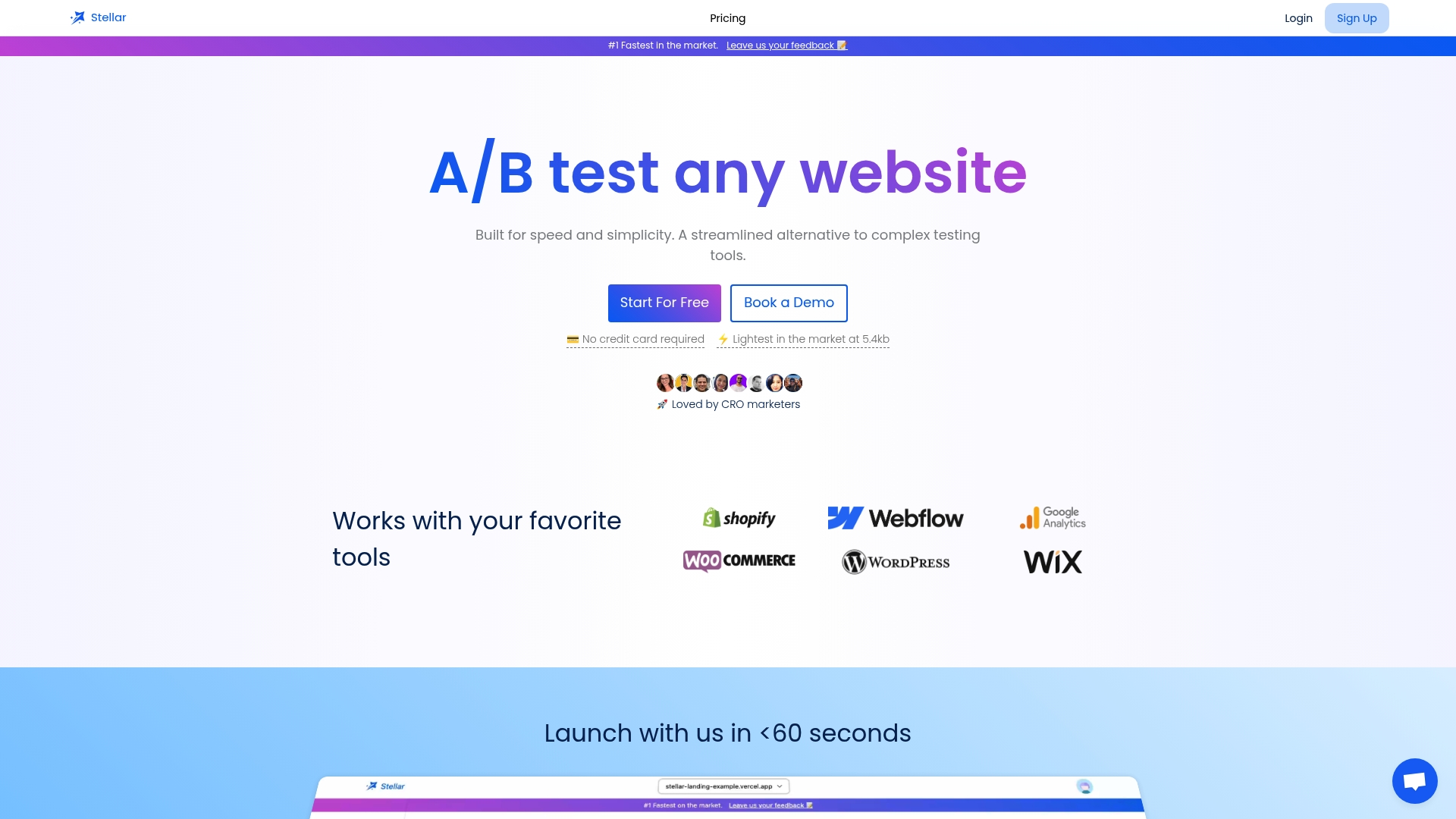
The article highlights critical challenges marketers face in 2025 such as implementing minimalist design, creating personalized UI experiences, ensuring mobile-first design, and rapidly experimenting with AI-driven tools. If you are striving to reduce page load times, tailor dynamic content, and accelerate conversion improvements without complex technical setups then you need a solution built for speed and simplicity. Stellar's lightweight platform with a 5.4KB script ensures your site stays fast while you run powerful tests. Its no-code Visual Editor lets you create and modify variants easily so you can focus on optimizing user experience and increasing engagement across all devices.
Discover how you can implement dynamic keyword insertion for relevant personalized landing pages and use Advanced Goal Tracking along with real-time analytics to gain actionable insights instantly. Don’t let slow tools or complicated testing workflows block your growth. Start improving your conversion funnel today by visiting Stellar and experience the fastest, most user-friendly A/B testing platform designed for startups and growth hackers ready to win in 2025.
Frequently Asked Questions
What are the key benefits of adopting a minimalist design in 2025?
Minimalist design improves page load times and enhances user experience by reducing visual clutter. Start by auditing your current site and remove any unnecessary elements to create a cleaner, faster interface.
How can I implement dynamic content for personalized user experiences?
Dynamic content tailors messaging and layouts based on user behavior, significantly boosting engagement. Begin by segmenting your audience and creating different content blocks to test which variations lead to higher conversions.
Why is mobile-first design crucial for conversion rates?
Mobile-first design focuses on optimizing your site for mobile users, ensuring fast load times and easy navigation. Test your landing pages on actual mobile devices to confirm they load quickly and are easy to interact with for the best results.
How should I incorporate micro-interactions to enhance user engagement?
Micro-interactions provide immediate feedback and can guide user behavior, increasing confidence in your interface. Identify critical user moments, then add subtle visual cues such as color changes or animations to enhance interaction and test these changes against your current design.
What role do bold colors and gradients play in user engagement?
Bold colors and gradients attract attention and evoke emotional responses, influencing user behavior. Experiment with different color combinations on high-impact elements like call-to-action buttons to see which options yield better conversion rates.
How can I ensure my design is accessible to all users?
Creating an accessibility-first layout means designing your site for users with disabilities, which also enhances overall usability. Start by ensuring your site meets color contrast standards and is navigable using a keyboard, then test for compliance with accessibility guidelines.
Recommended
- 7 Essential User Experience Best Practices for Success
- 7 Top Digital Trends 2025 You Must Know for Growth
- Content Personalization Ideas for CRO Marketers in 2025
- 7 Essential Marketing Trends for 2025 CRO Teams Must Know
- Spotlight Social Advertising | Expert Facebook & Instagram Ads Agency
- Creazione e Realizzazione Siti Web Internet Trieste Friuli-Venezia Giulia
Published: 1/24/2026