
Prioritize Leakiest Fixes for Fast Ecommerce CRO for Store Owners
Ecommerce conversion optimization means systematically testing changes to your store to turn more visitors into buyers, and the fastest gains almost always come from fixing your leakiest step first, whether that's checkout, product pages, or mobile speed. Skip the full-site overhaul. Run a quick funnel audit this week, find where the biggest percentage of visitors drops off, and start there.
TL;DR:
- Fixing the largest drop-off step in your funnel yields the most immediate revenue gains, especially if it involves checkout, product pages, or mobile speed.
- Prioritize quick, observable friction points such as confusing shipping costs or complex mobile forms before running formal A/B tests on uncertain changes.
- Focus on optimizing product pages, checkout flow, mobile experience, and site speed first, as these have the biggest impact on conversion and revenue.
- Use a structured testing cycle with hypothesis, controlled experiments, and scoring with impact, confidence, and ease to maximize ROI from CRO efforts.
- Implement lightweight experimentation tools that do not slow down the site or require extensive developer resources to sustain ongoing conversion improvement.
Table of Contents
- What Is Ecommerce CRO and How Do You Calculate Conversion Rate?
- How Do You Prioritize CRO Work That Actually Moves Revenue?
- Which Pages Should You Optimize First for the Biggest Lift?
- What Tactics Should You Implement First, and in What Order?
- How Should You Run A/B Tests Without Wasting Traffic?
- What KPIs Actually Prove CRO Is Working?
- Which Tools Do You Actually Need to Run a CRO Program?
- How Do You Keep Site Speed Fast While Running Experiments?
- What Mistakes Sink Most Ecommerce CRO Programs?
- What Do Real Ecommerce Conversion Wins Look Like?
- Building a CRO Program That Actually Lasts
- Try a Lighter Way to Run Your Next Experiment
- Sources
- FAQ
What Is Ecommerce CRO and How Do You Calculate Conversion Rate?
Ecommerce conversion rate optimization is the practice of increasing the percentage of site visitors who complete a desired action, usually a purchase, through structured testing rather than guesswork. It matters because most stores don't have a traffic problem. They have a leaky bucket, and pouring more paid traffic into a broken checkout just burns budget faster.
The core formula is simple: divide total orders by total sessions, then multiply by 100. Smart teams also track session-based CVR by device and traffic source, plus micro-conversions like add-to-cart rate, email signups, and product-page-to-cart clicks, which reveal friction before it shows up in the final number.
Benchmarks help you gauge where you stand, but treat them as directional, not gospel:
- Site-wide ecommerce conversion rates commonly fall between a low single-digit percentage range, though this swings hard by vertical and traffic source.
- Mobile sessions typically convert lower than desktop despite driving a majority share of website traffic, which alone justifies mobile-first fixes.
- Paid social traffic tends to convert below organic search or direct traffic, since intent differs at the click.
Two quick examples show why fractions of a percent matter. A store doing several million dollars in annual revenue at a low single-digit percent conversion rate that improves moderately adds a significant amount of revenue at the same traffic and average order value. A smaller store at lower revenue seeing a similar relative conversion lift picks up thousands of dollars a year from the same visitors it was already paying to acquire. Conversion rate optimization for ecommerce isn't about chasing a magic number. It's about squeezing more value from traffic you've already earned.
How Do You Prioritize CRO Work That Actually Moves Revenue?
Random testing wastes time. A structured lifecycle doesn't. The audit, hypothesis, test, iterate cycle is the backbone of every CRO program that produces compounding gains instead of one-off wins that fade.
Here's how the four phases break down in practice:
- Audit. Pull funnel data by step: sessions, add-to-cart, checkout starts, completed orders. Layer in heatmaps or session recordings to see where users hesitate or bail.
- Hypothesis. Write a specific, testable statement: "Adding estimated delivery dates to the product page will reduce checkout abandonment because customers currently ask this in support chats."
- Test. Run a proper A/B test with a control and variant, sized for statistical confidence, not a gut check after three days.
- Iterate. Whether the test wins, loses, or ties, document the finding and roll the insight into your next hypothesis.
Once you've got a backlog of ideas, score them with ICE: Impact, Confidence, Ease, each rated 1 to 10. Average the three scores to rank what you build first. Say you're weighing a checkout redesign (impact 8, confidence 5, ease 3, average 5.3) against adding trust badges near the buy button (impact 6, confidence 8, ease 9, average 7.7). The trust badge wins on ICE despite the lower ceiling, because it ships faster and you're more confident it works.
For your quick funnel audit, walk through five checkpoints: landing page bounce rate, product page to cart rate, cart to checkout initiation, checkout completion rate, and post-purchase return rate. Whichever step loses the highest percentage of users relative to its neighbors is your leakiest point, and that's where testing budget goes first.
Not everything needs a test. If Baymard's checkout research or your own analytics show an obvious broken field validation or a confusing shipping cost display, fix it directly. Reserve formal A/B testing for changes where the outcome is genuinely uncertain and the potential impact justifies the wait.
Pro Tip: Keep a running "trivial fixes" list separate from your test backlog. Ship those the same week you find them. Testing bandwidth is finite, and burning it on a fix everyone already agrees is correct just slows down the program.
Which Pages Should You Optimize First for the Biggest Lift?
Shopify's own CRO guidance points to the same handful of pages every time: product pages and checkout carry the most weight, with mobile experience and site speed acting as multipliers on everything else. Get these four areas right and smaller tweaks elsewhere start compounding instead of fighting an uphill battle.
Product Pages
Your product page has one job in the first three seconds: answer "is this right for me?" That means a hero image that shows the product in actual use, not just on a white background, plus a headline that states the core benefit rather than a feature spec. A clear unique selling proposition here does double duty. It converts undecided shoppers and buys you tolerance for smaller friction points elsewhere on the page.
Beyond the hero section, four elements consistently move the needle:
- A full image set showing scale, texture, and the product from multiple angles, not just the packaging shot.
- Review count and star rating visible above the fold, not buried after a scroll.
- Stock status and shipping timeline stated plainly, since ambiguity here reads as a hidden catch.
- Specs and sizing information formatted for scanning, not a wall of paragraph text.
Checkout
Checkout is where the most money quietly disappears. Baymard's research catalogs dozens of recurring friction points in checkout flows, and two show up constantly: forced account creation and hidden costs that surface late. Offer guest checkout by default. Show taxes and shipping estimates before the final payment screen, not after. Every field you remove from a checkout form is one less reason for someone to close the tab, and minimizing form fields remains one of the highest-leverage, lowest-cost fixes available. Inline validation that flags an error the moment it happens, rather than after a failed submit, cuts a surprising amount of rage-quitting at the final step.
Mobile Experience
Mobile devices now account for the majority of ecommerce website traffic, yet mobile conversion rates still trail desktop across most verticals, which means the gap between mobile traffic share and mobile revenue share is one of the largest unclaimed opportunities in ecommerce right now.
Close that gap with thumb-friendly tap targets sized for a finger, not a cursor, and forms that use the right input type (numeric keypad for phone numbers, email keyboard for email fields). Support Apple Pay, Google Pay, or similar one-tap payment methods, since typing a full card number on a phone is where a lot of mobile carts die.
Site Speed
Speed is the multiplier that makes every other fix work harder or fall flat. Google's Core Web Vitals, specifically Largest Contentful Paint, Interaction to Next Paint, and Cumulative Layout Shift, correlate directly with conversion performance. Compress and serve images in modern formats, inline critical CSS so the page renders before secondary assets load, and lazy-load anything below the fold. A page that loads two seconds faster isn't a nice-to-have. It's the difference between a shopper who sees your product and one who's already back on the search results page.
What Tactics Should You Implement First, and in What Order?
Not every fix deserves the same urgency. Grouping tactics by effort and resource level keeps a lean team from getting paralyzed by an endless backlog.
Quick wins (implement this week, minimal dev time):
- Add a free-shipping threshold banner near the top of every page if you offer one; unstated thresholds get ignored.
- Collapse the coupon code field behind a "have a code?" link instead of showing an empty box, which silently signals "you're paying too much" to shoppers without one.
- Rewrite vague CTA copy ("Submit," "Continue") into specific action language ("Add to Cart," "Complete My Order").
- Add trust badges (secure checkout icons, payment logos, return policy callout) near the buy button, not just in the footer.
Core fixes (one to four weeks, moderate effort):
- Rewrite product page copy around benefits and use cases instead of manufacturer spec sheets, and expand your image sets to include lifestyle and scale shots.
- Fix on-site search so misspellings and partial matches still surface relevant products; a broken search is a silent conversion killer that rarely shows up in top-line metrics.
- Add user-generated content, meaning customer photos and verified reviews, directly on product pages rather than linking out to a separate reviews tab.
- Simplify checkout to the fewest fields Baymard's research supports, and default to guest checkout.
Strategic tests (longer builds, higher uncertainty, run as proper A/B tests):
- Test different price display formats (strikethrough discount vs. plain price vs. "you save $X") since the framing itself changes perceived value.
- Pilot a one-click or accelerated checkout flow for returning customers who've already stored payment details.
- Trial an AI-powered product advisor for configurable or complex products, where preserving context across a shopping session shows early promise, though the evidence base is still developing.
Each tactic pairs an effort level with a directional impact estimate you should validate against your own funnel data before committing engineering time. A shipping banner takes an afternoon and typically moves the needle on cart-to-checkout rate. A one-click checkout rebuild takes a sprint or more and should only get greenlit after the quick wins and core fixes are already live, since a strategic test built on top of an unfixed checkout just tests around a problem instead of solving it.
Pro Tip: Roll out quick wins in a single batch rather than one at a time. Bundling low-risk changes into one release lets you claim the collective lift fast, and you can always isolate a specific change later with a follow-up test if you need to attribute credit precisely.
Personalization and AI-driven features belong at the bottom of this list for a reason. Layering personalization on top of solid fundamentals works. Layering it on top of a slow, confusing checkout just adds complexity to a broken experience. Fix the foundation before you chase the advanced stuff.
How Should You Run A/B Tests Without Wasting Traffic?
The line between "test it" and "just ship it" comes down to certainty and blast radius. Obvious usability bugs, broken links, and confusing copy don't need a controlled experiment; ship the fix. Reserve formal testing for changes where you genuinely don't know the outcome and a wrong guess would cost real revenue, like a full checkout redesign or a pricing display change.
Sample size discipline separates a real result from noise. Stopping a test early because the variant is "winning" on day two is one of the most common ways teams fool themselves; traffic patterns shift by day of week and by season, and a lift on a Tuesday can vanish by the following Monday. Let the test run long enough to capture at least one full business cycle, and resist checking results daily with the intent to call it early.
A few practical rules keep experiments honest:
- Segment results by device and traffic source before declaring a winner, since variants can impact desktop and mobile conversion differently.
- Watch cohort behavior separately for new versus returning visitors; a change that delights loyal customers can confuse first-time buyers, and averaging the two hides the split.
- Track guardrail metrics alongside your primary goal, such as average order value and return rate, so a conversion rate win that reduces profit margin is not mistaken for success.
- For low-traffic stores, qualitative research and best-practice implementation often beat formal A/B testing, since you simply won't hit reliable sample sizes for months.
Evaluate a winning variant on revenue impact, not just conversion rate. A test that lifts CVR by pushing a discount can win the metric while losing money per order.
What KPIs Actually Prove CRO Is Working?
Revenue per session, or RPS, should sit above raw conversion rate as your north-star metric. A variant that raises CVR but drops average order value can look like a win on the surface while shrinking total revenue, and RPS catches that immediately because it factors in both conversion and order value together.
Supporting metrics fill in the "why" behind RPS movement:
- Add-to-cart rate flags product page problems before they ever reach checkout.
- Cart-to-checkout rate isolates hesitation that happens specifically at the transition to payment.
- Checkout completion rate measures the final, highest-stakes step in the funnel.
- Average order value (AOV) tells you whether a lift in orders came with a tradeoff in basket size.
- Retention and repeat purchase rate show whether a "win" attracted the right kind of customer.
Segment every one of these by device, channel, and cohort before drawing conclusions, since a blended number can hide a mobile problem behind strong desktop performance. Finally, fold in unit economics: a test that raises orders but drags down margin, or that lowers CAC efficiency by attracting lower-intent traffic, isn't automatically a success just because the top-line conversion number went up.
Which Tools Do You Actually Need to Run a CRO Program?
Tool choice depends heavily on where your store sits today. Five categories cover most needs: web analytics for the baseline numbers, an experimentation platform for controlled testing, session replay or heatmap tools for qualitative insight, personalization engines for advanced segmentation, and a performance-focused CDN to keep pages fast under load.
For low-traffic stores, spend your budget on qualitative research (heatmaps, session recordings, customer surveys) and best-practice implementation rather than a full experimentation stack, since you won't hit statistical confidence fast enough to justify the cost. Mid-market stores with steadier traffic get real value from pairing an experimentation tool with personalization features once the fundamentals are solid.
Whatever you pick, check the script size and loading method before you commit. A heavy, synchronously-loaded testing script can itself cause the flicker and slowdown that tanks the very conversion rate you're trying to improve, which turns your CRO tool into the problem it's meant to solve.
How Do You Keep Site Speed Fast While Running Experiments?
Running experiments shouldn't mean sacrificing the page speed you spent months optimizing. This is the tension every CRO program eventually hits: the testing script itself adds weight to every page it touches, and a bloated script can quietly erase the gains a winning variant produces.
A lightweight script matters because Core Web Vitals directly influence bounce and conversion. If your experimentation tool adds meaningful load time, you're testing against a moving baseline and potentially failing tests that would have won on a faster page.
A testing script that is lightweight helps avoid the render-blocking delay that heavier testing scripts introduce. The platform pairs that lightweight footprint with a no-code visual editor, so marketers can build and launch experiments without waiting on developer time. A few features that support the workflow described in this article:
- Dynamic keyword insertion for personalizing landing pages by traffic source, without building separate page variants by hand.
- Advanced goal tracking that maps directly to the micro-conversions and RPS metrics covered above.
- Real-time analytics dashboards that surface results as they accumulate, rather than requiring a separate reporting pull.
None of this replaces the audit and hypothesis work covered earlier. It just means the tool running your tests doesn't become the reason your site slows down.
What Mistakes Sink Most Ecommerce CRO Programs?
The single most common mistake is testing too many things at once and losing the ability to attribute a result to any one change. If you overhaul the product page layout, swap the CTA color, and change the shipping message in the same release, a lift in conversion tells you nothing about which change caused it.
A close second is calling a test early. Peeking at results after two days and declaring a winner ignores day-of-week variance and seasonal noise, and it's how teams end up rolling out "wins" that quietly underperform once traffic normalizes.
Ignoring segment-level data causes a different kind of failure.
Chasing vanity metrics instead of revenue is another trap. A pop-up that boosts email signups but annoys shoppers into bouncing before purchase looks good on an email dashboard and terrible on the P&L. Tie every test back to RPS or actual order volume, not just the micro-metric closest to the change you made.
Finally, treating benchmarks as targets rather than context leads teams astray. Compare your store against its own trend line first, and use industry figures only as a rough sanity check, never as the goal itself.
What Do Real Ecommerce Conversion Wins Look Like?
The pattern behind most documented CRO successes is unglamorous: fix a specific, measurable friction point, test the fix properly, and let the result compound. Stores that focus checkout changes on reducing form fields and adding guest checkout consistently see abandonment drop, because these are the exact friction points shoppers cite most often when they explain why they left a cart.
A common before-and-after pattern looks like this: a store discovers through session recordings that shoppers are repeatedly clicking on a shipping cost line item, hesitating, and abandoning. The hypothesis is straightforward: shipping cost surprise, not price itself, is the blocker. The fix moves estimated shipping and tax to the product page instead of revealing it for the first time at the final checkout step. Because the change targets a single, well-documented friction point rather than a broad redesign, the team can attribute the resulting drop in cart abandonment directly to that one fix.

Mobile-focused wins follow a similar shape. A store notices mobile sessions convert well below desktop despite comparable traffic quality, then discovers through heatmaps that a multi-step form is causing drop-off specifically on smaller screens. Simplifying the form to fewer fields and adding a mobile wallet payment option closes part of that gap, again because the fix maps to a specific, observed behavior rather than a general "make mobile better" intention.
The throughline across every real success story is the same: specific hypothesis, targeted fix, measured result. Broad redesigns based on intuition alone rarely produce results this clean, because there's no single variable to point to when the numbers move.
Building a CRO Program That Actually Lasts
Most teams treat conversion optimization as a project with an end date. It isn't one. The stores that keep compounding gains year over year are the ones that never stop running the audit, hypothesis, test, iterate cycle, even after the obvious fixes are done.
The biggest trap I see isn't laziness. It's impatience. Teams get one good hypothesis, watch it start trending positive after four days, and ship it to everyone before the sample size means anything. That's not a win. That's a coin flip you decided to trust because it agreed with you early.
For a team with limited resources, the roadmap doesn't need to be complicated: fix checkout friction first, since it touches every single buyer regardless of traffic source. Then fix mobile, since it's where the volume lives. Then test the uncertain stuff, since that's where formal experimentation actually earns its keep. Everything else is sequencing.
— Juan
Try a Lighter Way to Run Your Next Experiment
If your team has been putting off A/B testing because past tools felt heavy, slow, or built for enterprise engineering teams, Some platforms offer a lightweight script, a no-code visual editor, and a free tier for stores under 25,000 monthly tracked users.
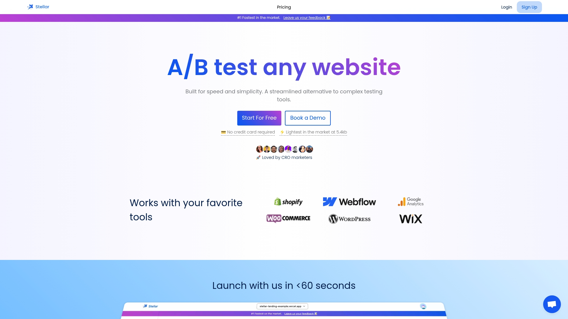
That combination matters for the exact reasons covered throughout this article. A test that slows your page down works against the conversion lift you're chasing, and a testing tool that requires a developer for every variant kills the iteration speed that makes the audit, hypothesis, test, iterate cycle actually compound. Dynamic keyword insertion and goal tracking features can plug into the checkout, product page, and mobile fixes covered above without adding the render-blocking weight that heavier platforms carry.
If you've got a leakiest-step hypothesis ready to test, whether it's a checkout field, a product page headline, or a mobile CTA, start a free trial on Gostellar and launch your first experiment this week.
Sources
- 16 Actionable E-Commerce Conversion Rate Optimization Tips
- Complete Conversion Rate Optimization Guide for Ecommerce 2026
- Share of website traffic coming from mobile devices (Statista)
FAQ
What Is Ecommerce Conversion Rate Optimization?
Ecommerce conversion rate optimization is the structured process of increasing the percentage of visitors who complete a purchase, typically through audits, hypothesis-driven testing, and iteration rather than one-off redesigns.
How Do You Improve Conversion Rate in Ecommerce?
Start by auditing your funnel to find the leakiest step, then fix checkout friction, product page clarity, and mobile speed first, since these three areas consistently show the fastest ROI across ecommerce stores.
What Is Conversion Optimization in Simple Terms?
Conversion optimization means testing specific changes to a website, like a headline, a checkout field, or a page load time, to see which version turns more visitors into customers, and keeping the winner.
What Are the Six Primary Elements of Conversion Rate Optimization?
Definitions vary across sources, but the elements CRO practitioners consistently point to are: clear value proposition, trust signals, page speed, mobile usability, streamlined checkout, and continuous A/B testing to validate every change.
Does a Testing Tool's Script Size Actually Affect Conversion?
Yes. A heavier script slows page rendering and can hurt the Core Web Vitals scores tied to conversion performance, which is why lightweight tools like Gostellar's script are built specifically to avoid that tradeoff.
Recommended
Published: 9/15/2026