
Ship 3 Quick Fixes and Test Fast to Boost Ecommerce Conversions
Conversion rate optimization is the fastest way to grow revenue without spending more on ads. The first move is always the same: measure your funnel from session to purchase and find the stage bleeding the most visitors, then fix it. Checkout friction and slow mobile pages usually deliver the quickest wins, while a running test program compounds gains over months, not days.
TL;DR:
- Most stores leave significant conversion improvement opportunities by not addressing checkout friction, slow mobile pages, and shipping cost transparency early.
- Segmenting funnel metrics by device, channel, and visitor type reveals specific points of drop-off, enabling targeted, effective fixes.
- Smaller, high-impact changes like guest checkout, visible shipping costs, and optimized mobile load times provide quick wins, especially for low-traffic sites.
- Valid A/B testing requires around 350 to 400 conversions per variant; underpowered tests can lead to unreliable results and misguided actions.
- A lightweight, no-code testing setup and detailed session replays accelerate CRO cycles and ensure fixes target real user pain points.
Table of Contents
- What Is Ecommerce Conversion Rate Optimization?
- How Does the CRO Lifecycle Work?
- What Product Page Changes Improve Add-to-Cart Rates?
- How Do You Reduce Checkout Abandonment?
- Why Does Mobile Speed Matter So Much for Conversion?
- What's the Right Order for CRO Tactics?
- How Many Conversions Do You Need for a Valid A/B Test?
- Which Tools Actually Power a CRO Program?
- How a Lightweight Testing Setup Speeds Up CRO Cycles
- What Do Real CRO Wins Actually Look Like?
- Three Things to Fix This Week
- Get a Faster Path From Hypothesis to Live Test
- Sources
- FAQ
What Is Ecommerce Conversion Rate Optimization?
Conversion rate optimization for ecommerce is the process of increasing the percentage of visitors who complete a desired action, usually a purchase, without spending more to acquire traffic. The core formula is simple: conversions divided by total visitors, times 100. But that single number, calculated site-wide, hides almost everything useful.
Blend those numbers and you'll optimize for the wrong problem. Shopify's guidance on conversion measurement makes the same point: break the funnel into stages and segments before you touch anything, because a blended rate masks where the real friction lives.
The stage-level metrics that actually diagnose problems:
- Product page conversion rate: the share of product-page viewers who add to cart, which reveals whether your copy, images, and pricing are doing their job.
- Add-to-cart rate: how many sessions result in at least one item added, a leading indicator of interest before purchase intent kicks in.
- Checkout conversion rate: the percentage of checkout starts that finish as orders, typically the single biggest leak in the whole funnel.
- Average order value (AOV): revenue per order, which matters because a 10% conversion lift with falling AOV can be a wash.
- Revenue per session (RPS): the metric that ties conversion and AOV together into one number that reflects actual business impact.
- Cart and checkout abandonment rate: the inverse of checkout conversion, useful for tracking trend lines over time.
Segmenting by device, channel, and new versus returning visitors changes what you prioritize next. A paid-search visitor landing on a product page behaves differently than an email subscriber returning to finish a cart. New visitors need trust signals and clarity; returning visitors often just need a faster path back to checkout.
Stores with mature CRO programs often push past 4.5%, which shows how much headroom most stores are leaving on the table. For a fuller breakdown by industry, see typical ecommerce conversion rate benchmarks.
How Does the CRO Lifecycle Work?
CRO isn't a one-time project. It's a loop: audit, form a hypothesis, prioritize, test, and iterate. Skip a step and you either waste testing capacity on low-impact ideas or ship changes with no way to know if they worked.
1. Audit the funnel. Start with quantitative data (where in the funnel do visitors drop?), then layer in qualitative signals: heatmaps show where clicks cluster or die, session replays reveal where users hesitate or rage-click, and on-page surveys tell you why in their own words. A drop-off at the shipping step in your analytics means nothing until a session replay shows visitors abandoning the moment a $12 shipping fee appears.
2. Form a hypothesis.
3. Prioritize with ICE. Score each hypothesis on Impact (how much could this move the needle?), Confidence (how strong is the evidence behind it?), and Ease (how fast can we ship and test it?), typically on a 1 to 10 scale each. Multiply or average the three, and you get a ranked backlog instead of a gut-feeling argument. Tying prioritization to an impact, confidence, and ease model keeps the roadmap defensible when stakeholders push for their pet idea.
4. Test with real governance. Set your sample-size target before launch, not after you peek at results. Run tests for full weekly cycles, minimum two weeks in most cases, to smooth out day-of-week purchase patterns.
5. Iterate and document. Ship the winner, but also document the losers. A test that failed still tells you something about your visitors, and re-running it six months later because nobody wrote it down wastes a testing slot you didn't have to lose.
Pro Tip: Keep a shared test log with the hypothesis, sample size, duration, and result for every experiment, win or lose. Six months in, that log becomes the fastest way to onboard a new hire or defend your roadmap to a skeptical founder.
For a closer look at pairing behavioral data with structured testing, heatmaps and A/B testing work best together, not as competing methods.
What Product Page Changes Improve Add-to-Cart Rates?
Product pages carry more optimization leverage than almost any other page type, because this is where browsing intent turns into buying intent or dies trying.
Above-the-fold clarity comes first. A visitor should understand what the product is, why it's different, what it costs, and how to buy it, without scrolling. That means a clear headline, a one-line unique selling point, visible pricing, and a primary call-to-action button that doesn't compete visually with three other buttons.
Media strategy drives buyer confidence more than copy does. Multiple angles (front, back, detail, in-use), at least one lifestyle shot showing scale or context, and video where the product benefits from motion (apparel fit, product assembly, texture) all reduce the uncertainty that kills add-to-cart decisions. Stores that add a size-comparison image or a 360-degree view routinely see fewer pre-purchase questions and fewer returns, because the visitor answered their own doubt before checkout instead of after delivery. For more on structuring the page itself, see this guide on optimizing product pages for higher sales.
Copy structure matters as much as copy quality. Lead with benefits, not specifications. "Keeps drinks cold for 24 hours" beats "18/8 stainless steel, double-wall vacuum insulated" as an opening line, even though the second line still needs to exist further down for the buyer who wants proof. Use short paragraphs, bullet-friendly specs, and bolded key benefits so a scanning visitor can extract value in five seconds.
Reviews and user-generated content work best placed near the CTA, not buried in a tab at the bottom of the page. A star rating next to the "Add to Cart" button does more work than a full review section three scrolls down, because it answers the trust question at the exact moment of hesitation.
Urgency and stock cues need honesty behind them. "Only 3 left in stock" only builds trust if it's true; fabricated scarcity gets flagged by returning customers fast and does lasting damage to credibility. Test these cues, but only ever with real inventory data behind them.
Quick reference for what to test first on product pages:
- Headline and USP clarity above the fold
- Number and type of product images (add a size or scale reference)
- Video for products where fit, texture, or assembly matters
- Review placement relative to the CTA
- Real-time stock or shipping-cutoff messaging
How Do You Reduce Checkout Abandonment?
Checkout is where the most revenue leaks, and it's often the cheapest to fix because the changes are structural, not creative.
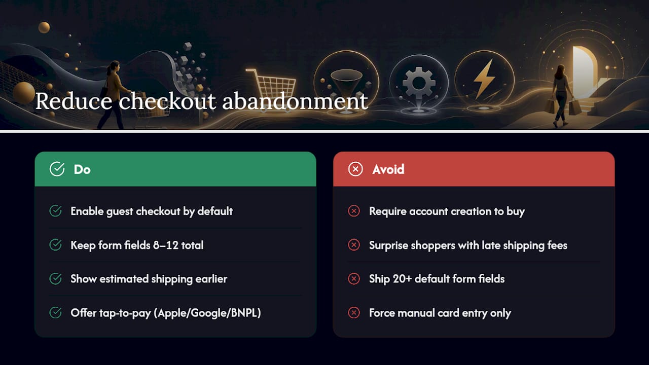
Guest checkout should be the default, not an afterthought link. Forcing account creation before purchase remains one of the most common reasons visitors abandon at the final step. Give returning customers a fast-login option, but never make an account a requirement to buy.
Field count matters more than most teams assume. Best-in-class checkouts run 8 to 12 fields total, down from the 20-plus fields many default checkout templates still ship with. Every field beyond what's strictly needed to ship and charge the order is a chance for the visitor to stop and reconsider.
Shipping cost transparency has to happen before the final screen. Surprise shipping fees at the last step are consistently cited as a top abandonment cause, and the fix is straightforward: show an estimated total, including shipping, on the cart page or product page, not just at checkout confirmation.
Payment method variety reduces form fatigue directly. Apple Pay, Google Pay, and buy-now-pay-later options let a visitor complete checkout with a tap instead of manually typing sixteen digits and an expiration date on a phone keyboard. For stores selling higher-ticket items, BNPL options can lift conversion by removing the full-price sticker shock at the moment of decision.
Form UX details compound. Inline validation (flagging an invalid email before submission, not after) prevents the frustration of a rejected form with no clear reason why. Autofill support and a visible progress indicator across multi-step checkouts both reduce perceived effort, which is often more important to completion than actual effort.
Session replay catches what analytics can't. A checkout that looks fine in aggregate data might be silently failing for Safari users on iOS 17, or throwing an error every time someone applies a discount code. Error monitoring and replay tools surface these technical failures that would otherwise just show up as an unexplained dip in the conversion chart.
Pro Tip: Run a weekly test purchase yourself, on both desktop and mobile, using a real card in test mode. A five-minute check catches broken discount codes and payment gateway timeouts before they cost you a week of lost orders.
A deeper walkthrough of checkout-specific fixes lives in this guide to ecommerce checkout optimization.
Why Does Mobile Speed Matter So Much for Conversion?
Mobile devices now generate the majority of ecommerce website traffic, yet mobile conversion rates still trail desktop at most stores. That gap is the single biggest opportunity most ecommerce teams are leaving unaddressed.
Site speed sits at the center of the problem. Target a Largest Contentful Paint (LCP) under 2.5 seconds, an Interaction to Next Paint (INP) under 200 milliseconds, and a Cumulative Layout Shift (CLS) under 0.1. These Core Web Vitals aren't just an SEO checkbox; slow-loading product pages on mobile networks lose visitors before the add-to-cart button even renders.
Beyond raw speed, mobile design has its own friction points that desktop doesn't share:
- Tap targets need enough spacing to avoid the wrong button firing on a small screen, especially near the add-to-cart and quantity selectors.
- Simplified navigation matters more on mobile, where a cluttered mega-menu becomes an unusable tap-maze.
- Sticky add-to-cart bars that follow the scroll keep the primary action visible without forcing a scroll back to the top.
- Mobile-native payment flows (Apple Pay, Google Pay) matter more here than anywhere else, since typing card details on a phone keyboard is the single biggest source of mobile checkout abandonment.
Run this diagnostic yourself this week: open your top three product pages on a mid-range Android phone over a throttled 4G connection. Time how long it takes to see the price and add-to-cart button. If it's over three seconds, you've found your highest-leverage fix before running a single test.
What's the Right Order for CRO Tactics?
Not every fix deserves the same urgency. Sorting tactics by effort and expected impact keeps a small team from getting lost in a backlog of fifty good ideas.
Quick wins (days, not weeks):
- Switch checkout to guest-first, removing the account requirement.
- Add shipping cost estimates to the cart page.
- Place trust badges (secure checkout, return policy, review stars) near the primary CTA.
- Compress product images to cut page load time without visible quality loss.
- Fix the top three broken or slow mobile pages identified in your speed audit.
Medium effort (weeks):
- Rebuild product page media with additional angles, a lifestyle shot, and video where relevant.
- Refactor the checkout form to hit the 8 to 12 field target.
- Add at least one alternative payment method (BNPL or a digital wallet) beyond standard card entry.
- Rework product copy to lead with benefits instead of specifications.
Long-term (months, ongoing):
- Build personalization logic based on browsing or purchase history.
- Add a recommendation engine for cross-sell and upsell placement.
- Test AI-assisted product consultation or guided selling for complex catalogs.
- Move from single-variable A/B tests to multivariate testing once traffic supports it.
Score each item with the ICE model before committing a sprint to it. A long-term personalization project might score high on impact but low on ease, which means it belongs on the roadmap, not this week's task list. Meanwhile, shipping transparency scores high on all three axes for most stores, which is exactly why it usually ships first. For a longer list of tactics organized by category, see proven tactics for more ecommerce sales.
How Many Conversions Do You Need for a Valid A/B Test?
Running a test without enough traffic just produces noise dressed up as a result. As a working guideline, aim for roughly 350 to 400 conversions per variant to reach reasonable statistical confidence for a typical effect size. Below that, a "winning" variant might just be random variance that happens to look like a pattern.
Three mistakes wreck otherwise well-designed tests:
- Peeking early and stopping at the first sign of a lead. Significance calculated mid-test is unreliable; check results only after your predetermined sample size and duration are both met.
- Running underpowered tests on low-traffic pages. A test on a page that gets 200 visitors a month will take years to reach a valid sample, which means the test itself was the wrong tool for the job.
- Overlapping experiments that contaminate each other. Running a checkout test and a pricing test on the same audience simultaneously makes it impossible to know which change caused which result.
If your store doesn't have the traffic to power a valid test, that's not a reason to guess. Apply well-documented best practices directly instead, guest checkout, shipping transparency, faster load times, and gather qualitative feedback through surveys and session replay rather than running a test that will never reach significance.
Pro Tip: *Measure test wins in revenue per session, not conversion percentage alone.
Which Tools Actually Power a CRO Program?
A working CRO stack covers four jobs: quantitative measurement, qualitative behavior insight, experimentation, and technical monitoring. No single tool does all four well.
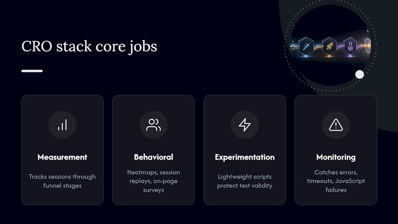
Analytics for funnel segmentation. A platform like GA4 (or an equivalent analytics suite) tracks sessions through each funnel stage and lets you segment by device, channel, and visitor type, the foundation everything else builds on.
Behavioral tools for the "why" behind the numbers. Heatmaps show where attention and clicks concentrate on a page. Session replays let you watch anonymized recordings of real visits to spot exactly where someone hesitated or gave up. On-page surveys ask visitors directly why they didn't complete a purchase, which sometimes surfaces a reason no amount of data would reveal on its own.
Experimentation platforms for testing changes safely. This is where script weight actually matters in a way many teams overlook: a heavy testing script slows page load for every single visitor in the experiment, which can quietly suppress the very conversion rate you're trying to measure. A lightweight script protects the validity of the test itself, not just the user experience.
Error monitoring for the invisible blockers. A broken discount code, a payment gateway timeout, or a JavaScript error on one specific browser version can tank conversion silently, showing up in your dashboard only as an unexplained dip nobody can immediately explain.
How a Lightweight Testing Setup Speeds Up CRO Cycles
Test velocity depends on setup speed as much as strategy. A visual, no-code editor for building test variants means a marketer can launch a headline or CTA test without waiting on a developer sprint, cutting the time between hypothesis and live test from days to minutes.
Script weight matters more than most teams realize, for the reason covered above: it affects the validity of your own results. Stellar runs at 5.4KB, built specifically so the testing script itself doesn't introduce the kind of load-time drag that skews the very metrics you're trying to improve, particularly on mobile connections where every kilobyte counts against your Core Web Vitals targets.
Dynamic keyword insertion lets one landing page automatically match its headline to the search term or campaign that brought the visitor in, without building a separate page for every variation. Paired with real-time analytics and advanced goal tracking, a small marketing team can watch a test's revenue-per-session impact update live instead of waiting for a weekly report to know whether a variant is working.
What Do Real CRO Wins Actually Look Like?
The pattern across most publicized CRO wins isn't a dramatic redesign. It's a narrow, well-measured fix applied to a specific point of friction.
A common example: a store discovers through session replay that visitors are abandoning carts specifically when the shipping cost appears for the first time at checkout, not before. The fix isn't a full redesign, it's adding an estimated shipping cost calculator on the product page itself, so the number stops being a surprise. Checkout abandonment tied to that specific step drops because the friction was informational, not structural.
Another recurring pattern shows up in field-count reduction. A checkout built with 20-plus fields, name, billing address, shipping address, phone, company name, gets trimmed toward the 8 to 12 field range that best-in-class checkouts target. The mechanism is simple: every optional field removed is one less place a mobile visitor can get frustrated and close the tab.
A third pattern involves guest checkout. Stores that quietly required account creation, often as a legacy setting nobody revisited, see checkout completion improve once that requirement is removed and account creation becomes an optional post-purchase prompt instead of a gate.
None of these wins required a large redesign budget. They required someone looking closely enough at funnel data and session replay to find the exact step where visitors were dropping, then testing a targeted fix instead of guessing at a broad one. That's the entire discipline of CRO in miniature: find the leak, fix that leak, measure again.
Three Things to Fix This Week
If I had to pick where to start, I wouldn't start with a fancy personalization engine or a full redesign. I'd ship three things: guest checkout as the default, shipping cost visibility before the final step, and a mobile speed audit on your top product pages. All three are cheap to implement and consistently show up as top abandonment causes across the data.
After that, build a monthly cadence: one or two tests running at all times, a shared log of what shipped and what it did to revenue per session, and a short report to whoever owns the P&L. CRO stalls when it's a one-time project instead of a habit.
— Juan
Get a Faster Path From Hypothesis to Live Test
Every tactic in this guide still needs a way to test it without waiting on a developer queue or slowing down the page you're trying to improve. A no-code visual editor lets a marketer build and launch a product-page or checkout test directly, while a lightweight script minimizes load time impact.
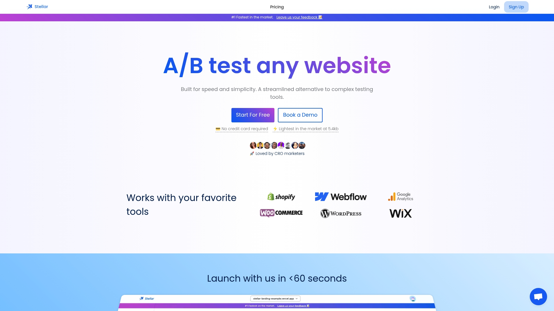
Dynamic keyword insertion and real-time goal tracking mean you're not waiting on a weekly export to know whether a variant is moving revenue per session in the right direction. A free plan is available for stores below a certain traffic threshold, making it accessible for many businesses. Visit the Gostellar landing page to check which plan matches your monthly traffic and start your first test this week.
Sources
- How to Improve Ecommerce Conversion Rates (2026) - Shopify
- 16 Actionable Ecommerce Conversion Rate Optimization Tips | Baymard Institute
- Conversion Rate Optimization Ecommerce Guide 2026 | Build Grow Scale
- Share of website traffic coming from mobile devices | Statista
FAQ
What Is Ecommerce Conversion Rate Optimization?
Ecommerce conversion rate optimization is the structured process of increasing the percentage of website visitors who complete a purchase, using a lifecycle of measurement, hypothesis testing, and iteration rather than one-off design tweaks.
How Do You Improve Conversion Rate in Ecommerce?
Start by measuring conversion at each funnel stage to find your biggest leak, then apply targeted fixes like guest checkout, upfront shipping costs, and mobile speed improvements before scaling into a testing program with tools like Gostellar for fast iteration.
What Counts as a Good Ecommerce Conversion Rate?
Site-wide averages typically run between 1.5% and 3%, though this varies by product category and traffic quality; stores with mature CRO programs often exceed 4.5%.
How Many Conversions Do I Need Before Trusting an A/B Test Result?
A common guideline targets 350 to 400 conversions per variant before treating a result as statistically reliable for a typical effect size.
Should I Run A/B Tests if My Store Has Low Traffic?
If your traffic can't reach a valid sample size within a reasonable timeframe, apply well-documented best practices directly instead of running an underpowered test, and rely on session replay and surveys for qualitative direction.
Recommended
Published: 9/14/2026