
Boost Ecommerce Conversion Rate in 90 Days: Fix Checkout, Speed, PDPs
If you fix one thing this month, fix checkout friction. Then mobile speed. Then product page clarity. In that order. Checkout and speed fixes routinely produce double-digit conversion lifts within weeks, while PDP improvements compound over months. Everything else, including personalization and fancy testing programs, waits until those three are solid.
TL;DR:
- Turning on guest checkout and displaying total costs early can reduce cart abandonment rates near 70 percent.
- Implementing mobile-friendly features like sticky CTAs and fast loading images significantly improve mobile conversion metrics.
- Prioritizing quick fixes based on impact, confidence, and ease using ICE scoring prevents wasting months on low-value improvements.
- Clear review displays, specific shipping info, and honest stock data on product pages increase add-to-cart and conversion rates.
- Regularly running small, hypothesis-driven A/B tests and tracking detailed segmentation yield consistent, evidence-backed growth over time.
Table of Contents
- Quick Wins You Can Deploy in Days to Increase Ecommerce Conversion Rate
- How to Audit Your Funnel and Decide What to Fix First
- Product Detail Page Fixes That Raise Add-to-Cart Rates
- Cart and Checkout Fixes That Cut Abandonment
- Mobile Speed and Core Web Vitals: What Actually Moves Conversions
- Which Trust Signals Actually Reduce Buyer Hesitation
- How to Run A/B Tests That Actually Tell You Something
- When and How Personalization Actually Pays Off
- The KPIs and Segmentation That Keep You Honest
- A 90-Day Roadmap to Increase Ecommerce Conversion Rate
- Why Most CRO Advice Skips the Boring Part
- Run Faster Experiments Without Slowing Down Your Store
- Sources
Quick Wins You Can Deploy in Days to Increase Ecommerce Conversion Rate
You don't need a developer sprint to move the needle. Some of the highest-leverage changes to increase conversion rate ecommerce stores rely on take a few hours to ship and start paying off almost immediately.
Here's where to start, ranked by speed of implementation versus expected payoff:
- Turn on guest checkout and show total cost upfront. Forced account creation and hidden shipping fees are the two biggest reasons carts get abandoned, according to Baymard's checkout research, which puts average abandonment near 69–70%. Add a shipping estimator on the product page or cart, not just at the final step.
- Enable Apple Pay, Google Pay, and a buy-now-pay-later option where it fits your margin. These cut the checkout down to two taps for a huge share of mobile shoppers, and they sidestep the "typing a card number on a phone" problem entirely.
- Compress your hero images and lazy-load everything below the fold. A bloated product image is often the single biggest contributor to a slow Largest Contentful Paint score, and slow pages bleed conversions before a shopper even sees your offer.
- Make your primary CTA sticky on mobile. If "Add to Cart" scrolls out of view on a phone, you're forcing thumbs to work harder than they should. A sticky bar with price and CTA visible at all times removes that friction.
- Put review counts and a recognizable secure checkout badge near your CTA. Shoppers glance at social proof before they commit, and Pew Research has documented how heavily consumers lean on reviews before buying online.
None of these require a redesign. They require someone on your team blocking off an afternoon and a willingness to ship without a six-week testing cycle first. Some fixes are simply not controversial enough to A/B test. You already know hiding shipping costs until page four of checkout is bad practice. Ship the fix, watch the trend line, move to the next item.
Pro Tip: Screen-record yourself buying your own product on a mid-range Android phone with a spotty connection. You'll find more friction in ten minutes than a full week of analytics review.
How to Audit Your Funnel and Decide What to Fix First
Not every fix deserves the same urgency, and most teams waste months polishing a page that barely affects revenue while a five-minute checkout fix sits ignored. Start by mapping every step of your funnel, landing page, PDP, cart, checkout, confirmation, and pulling drop-off rates for each, broken out by device and traffic source. The story on mobile paid social almost never matches the story on desktop email traffic, and blending them hides where the real leak is.
Once you have that map, score every candidate fix using ICE:
- Impact: how much would fixing this move the conversion rate if it worked?
- Confidence: how sure are you, based on data or prior tests, that it will work?
- Ease: how much time and engineering effort does it take to ship?
Multiply the three, and you get a rough priority order. This is the "leakiest times easiest" logic in practice, an insight-driven ecommerce CRO framework argues for exactly this: chase the step with the biggest drop-off that also happens to be cheap to fix, before touching anything that's merely interesting.
Then apply a simple decision rule: if a fix is low-risk and backed by well-established usability research (removing a form field, adding guest checkout), ship it directly. Save A/B testing for changes that are expensive, risky, or genuinely uncertain in their effect, like a full PDP redesign or a new pricing display. If you're under roughly 20,000 monthly sessions, formal split testing will take too long to reach significance anyway; run session recordings and short user interviews instead, and fix what's obviously broken.
Pro Tip: Keep an ICE scoring sheet in a shared doc. When someone proposes a redesign "because it looks dated," make them score it. Half of these ideas die on contact with the confidence column.
Product Detail Page Fixes That Raise Add-to-Cart Rates
The product detail page is where intent turns into action or quietly dies. Most stores treat it as a container for a photo and a price. Treat it instead as a sales conversation with a single job: answer the shopper's next three objections before they have to ask.
The layout matters more than the copy. Above the fold, you need the value proposition stated in plain language, a handful of benefit-focused bullets (not a wall of specs), and exactly one primary call-to-action. Two competing CTAs on the same screen split attention and lower both.
Beyond layout, a few specifics separate PDPs that convert from PDPs that don't:
- High-resolution images from multiple angles, plus real customer photos where you can get them. UGC photos tend to build more trust than studio shots alone.
- Visible review counts placed near the price, not buried in a tab three scrolls down.
- Honest stock and shipping information. "Ships in 2 days, 6 left in stock" beats a vague "in stock" every time, because specificity reads as truthful.
- Cross-sell modules positioned below the main CTA, framed as "frequently bought with," not competing for the same visual real estate as the buy button.
- Price presented clearly, with any discount math shown rather than implied. If you show a strikethrough price, make sure the savings number is visible, not something the shopper has to calculate themselves.
Skip the accordion trap. Hiding your most persuasive benefit bullets behind a "read more" click means a large share of visitors never see them. If it matters to the buying decision, it belongs in the first viewport.
Cart and Checkout Fixes That Cut Abandonment
Checkout is where good traffic goes to die if you're not careful. Roughly 69–70% of carts get abandoned industry-wide, and Baymard's research traces most of that back to surprise costs, forced account creation, and forms that ask for more than they need. The average checkout still has many form fields. Most stores need fewer than half that.
Here's the fix sequence, roughly in order of impact:
- Show total cost, including shipping and tax, as early as the cart page. Don't wait for the final screen to surprise anyone.
- Default to guest checkout. Make account creation an option offered after the order completes, not a gate before it.
- Cut form fields to the minimum. Auto-fill address from postal code, combine name fields, drop anything you don't actually need for fulfillment.
- Add inline validation. Flag a mistyped email or card number the moment it happens, not after a full-page reload.
- Offer at least two payment methods beyond card entry, and show a progress indicator so shoppers know how many steps remain.
- Strip navigation and promotional banners from the checkout flow itself. Every exit link is an invitation to leave.
For the carts that still get abandoned, a well-timed recovery sequence recovers real revenue. Send the first reminder within an hour, while intent is still warm, with a direct link back to the exact cart state, not the homepage. A second email at 24 hours can address a likely objection (shipping cost, sizing, return policy). Keep a third touch reserved for a genuine incentive, and stop there. More than three messages reads as desperate.
Pro Tip: Test your own checkout on a phone with three bars of signal and a slightly out-of-date browser. That's a meaningful slice of your real traffic, and it's usually the segment where the more painful bugs hide.

Mobile Speed and Core Web Vitals: What Actually Moves Conversions
Mobile usually carries the majority of ecommerce traffic yet converts significantly lower than desktop, according to Voyado's conversion research, which makes mobile performance one of the largest single levers available to most stores.
Every extra second of load time is associated with a noticeable drop in conversions, based on Akamai's retail performance data. A page that loads in four seconds instead of two isn't a minor inconvenience. It's a meaningful chunk of revenue quietly walking away.
Google's Core Web Vitals give you concrete targets rather than vague "make it faster" advice:
- Largest Contentful Paint (LCP) under 2.5 seconds. This measures how fast your main content, usually the hero product image, actually renders.
- Interaction to Next Paint (INP) at 200 milliseconds or below. This tracks how responsive the page feels when someone taps a button.
- Cumulative Layout Shift (CLS) under 0.1. Nothing kills a mobile purchase faster than a "Buy Now" button jumping as an ad loads in above it.
To hit those numbers, compress and lazy-load images, inline your critical CSS instead of blocking render on external stylesheets, trim third-party scripts eating up main-thread time, and serve everything through a CDN. On the UX side, keep tap targets at least 44 pixels tall, simplify navigation to a single hamburger menu rather than nested categories, and keep the add-to-cart button sticky as shoppers scroll through specs and reviews.
Which Trust Signals Actually Reduce Buyer Hesitation
Placement matters as much as the signal itself. A review count sitting far from the price does less work than one positioned right next to the CTA, where the shopper's eye already lands before clicking. Consumer research from Pew confirms shoppers lean heavily on reviews before purchasing, and stores with a visible volume of reviews consistently convert better than those with none or few.
A few specifics worth applying directly:
- Show the review count and star rating within the same visual block as the price, not in a separate tab.
- Include a handful of representative negative reviews alongside positive ones. Paradoxically, a mix of honest feedback builds more trust than an implausible wall of five-star ratings.
- State your return window and shipping timeline on both the PDP and the cart page, in plain language, not buried in a policy link.
- Place recognizable payment logos and a security badge directly at the point of card entry, where hesitation peaks.
How to Run A/B Tests That Actually Tell You Something
Most failed testing programs fail before the test even launches, usually because the hypothesis was vague or the sample size was never checked. Write down what you expect to happen and why before you build anything: "Removing the phone number field will reduce checkout abandonment because it's an unnecessary friction point unrelated to fulfillment." Pick one primary metric tied to that hypothesis, and change one major element per test. Stacking multiple changes into a single variant tells you something changed, but never which part did the work.
On sample size, don't trust a test that hasn't reached real volume. Build Grow Scale's testing guidance recommends roughly 350 to 400 conversions per variant before treating results as reliable at a 95% confidence level, run over two to four weeks depending on your traffic pattern. A weekend spike or a single email blast can fake a winner that evaporates the following month.
- Set the primary metric before launch, and don't switch it mid-test because a secondary number looks more flattering.
- Watch average order value, refund rate, and repeat purchase behavior alongside conversion rate itself.
- Kill a test early only if it's actively harming revenue, not because you're impatient for a result.
- Log every test, win or lose, so the next hypothesis builds on real evidence instead of institutional memory.
A test that lifts conversion by inflating refunds later isn't a win. It's a delayed loss with better optics for now.
Pro Tip: A urgency countdown timer or an aggressive discount pop-up can spike short-term conversion while quietly training your best customers to wait for the next discount. Check retention 60 days out before declaring victory.
When and How Personalization Actually Pays Off
Personalization is a fundamentals-are-solid tool, not a fundamentals-are-broken patch. If your checkout still has 18 fields and your mobile LCP is sitting at 5 seconds, adding a recommendation engine is decorating a house with a cracked foundation.
Once the basics are handled, start with rule-based personalization before reaching for anything AI-driven: show "customers also bought" modules on the PDP, surface complementary items in the cart, and segment your abandoned-cart emails by product category rather than sending the same message to everyone. Measure the lift on those simple rules for a few weeks.
Only after that baseline works does layering in AI-driven recommendations make sense. Applied to an otherwise healthy store, AI-driven personalization tends to add a modest incremental revenue increase on average, when applied to otherwise healthy stores on average, according to commentary citing McKinsey's research. Applied to a broken store, it mostly personalizes the abandonment.
- Track incremental revenue lift on the targeted cohort against a holdout group, not just overall revenue.
- Watch conversion rate specifically among shoppers who saw the personalized module versus those who didn't.
The KPIs and Segmentation That Keep You Honest
A blended, site-wide conversion number hides more than it reveals. Site-wide averages typically sit between 1.5% and 3%, but email traffic often converts at 4% to 5.3% while paid social can sit closer to 0.7% to 1.2%. Reporting one number across all of that tells you almost nothing actionable.
Track conversion rate alongside average order value, cart abandonment rate, customer lifetime value, and revenue per session, and always segment each by device, traffic source, new versus returning visitor, and product category. A conversion dip that looks alarming site-wide often turns out to be a single underperforming ad channel dragging the average down.
- Break every conversion report out by mobile versus desktop before drawing conclusions.
- Compare new visitor conversion against returning visitor conversion separately; blending the two hides retention problems.
- Run a basic unit-economics check, customer acquisition cost against break-even, whenever a "conversion win" also changes your ad spend or discount depth.
Chasing a higher conversion number that quietly erodes margin isn't progress.
A 90-Day Roadmap to Increase Ecommerce Conversion Rate
Three months is enough time to fix fundamentals and start a real testing rhythm, provided you sequence the work instead of trying everything at once.
- Weeks 1 and 2: Run the funnel audit described earlier, segmented by device and source. Ship the uncontroversial quick wins, guest checkout, shipping transparency, image compression, immediately. Install heatmaps and session recording so you have qualitative evidence backing every future hypothesis.
- Weeks 3 through 8: Launch your prioritized A/B tests on the PDP and checkout, using the ICE scores from your audit to decide order. Let each test run to the sample size threshold before calling a winner, and roll winning variants into the permanent experience before moving to the next test.
- Months 3 and 4: Pilot rule-based personalization on your highest-traffic category pages, and start institutionalizing a monthly CRO review, one meeting where the team looks at KPI segments, reviews test results, and picks the next quarter's priorities.
Stores that keep this rhythm going tend to land in the 4.5%-plus conversion range over time, not from one big redesign but from roughly a dozen small, evidence-backed wins stacked across the year.
Pro Tip: Block the monthly CRO review on the calendar before you need it. Testing programs that rely on someone remembering to schedule a meeting quietly die around month four.
Why Most CRO Advice Skips the Boring Part
Here's what gets lost in most conversion rate advice: the boring fixes work better than the clever ones. Every ecommerce operator I've studied wants to talk about personalization engines and AI-driven recommendations, and almost none want to talk about the 21-field checkout form nobody's audited since launch. That's backwards. Fix the fundamentals first, always run tests against a real hypothesis and a single primary metric, and check your unit economics before celebrating a conversion bump that came from a coupon code.
Speed and checkout friction deserve first priority because they're measurable, unglamorous, and almost always broken somewhere. A tool built around fast, lightweight experimentation fits that reality better than a heavyweight platform that takes a quarter to configure. That's the practical case for keeping your testing stack simple: small teams need answers in weeks, not a six-month implementation.
The honest answer on hiring an agency versus building internally comes down to bandwidth, not sophistication. If you can dedicate someone to run one test every few weeks and actually read the results, keep it in house. If nobody owns that calendar, an outside specialist earns their fee fast.
— Juan
Run Faster Experiments Without Slowing Down Your Store
Every fix in this article, guest checkout, sticky CTAs, PDP rewrites, needs a way to test it before you roll it out to everyone. That's where a lot of teams stall: testing tools that add page weight, take a developer to configure, or bury results in a dashboard nobody checks.
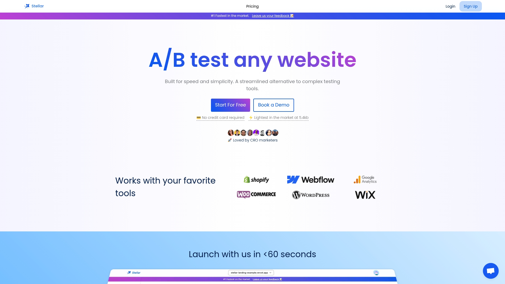
Gostellar runs on a 5.4KB script, light enough that it won't undo the speed work in your Core Web Vitals audit. The no-code visual editor lets a marketer build and launch a checkout or PDP test without opening a ticket, dynamic keyword insertion personalizes landing pages by traffic source, and goal tracking ties every experiment back to actual conversions, not just clicks. It connects directly with WordPress, Shopify, Webflow, Wix, Squarespace, Framer, and Bubble, so setup doesn't require touching your codebase. If your store tracks under 25,000 monthly users, you can start on the free plan. Start a free trial at Gostellar and get your first test live this week.
Sources
The Baymard checkout research remains the deepest published source on cart abandonment causes and field-by-field checkout usability. Shopify's benchmark guide is useful for realistic conversion rate ranges by channel. Build Grow Scale's CRO framework covers testing sample sizes and the compounding-lift argument in more depth, and Voyado's mobile conversion research breaks down the mobile-versus-desktop performance gap worth reading before you rebuild your mobile checkout.
- 16 Actionable E-Commerce Conversion Rate Optimization Tips (Baymard)
- Ecommerce conversion rate optimization guide (Voyado)
- Online shopping and purchasing preferences (Pew Research Center)
Recommended
Published: 9/2/2026