
Mobile Friendly Test: 3 Tool Checks for Marketers & Developers
Run three tests before you touch anything else: PageSpeed Insights for lab performance data, Chrome DevTools device mode for interactive layout debugging, and a multi-viewport or bulk tester when you need coverage across many pages. Each catches something the others miss, so skipping one leaves gaps. Pick one representative landing page URL and run all three today before deciding what to fix.
TL;DR:
- Running multiple tests, including PageSpeed Insights, Chrome DevTools, and multi-viewport tools, ensures comprehensive coverage of mobile usability issues.
- Focus on testing key landing pages across different device widths and real devices, not just static screenshots, to identify actual user experience problems.
- Start with simple fixes like adding a viewport meta tag, enlarging tap targets, and fixing horizontal overflow to quickly improve mobile performance.
- Use lab tools for quick, reproducible audits during development, but validate fixes with actual hardware or field data for accuracy.
- Prioritize testing pages that generate revenue, set realistic mobile performance targets, and run experiments to measure actual conversion improvements.
Table of Contents
- Comparing the main mobile-friendliness testing tools
- How to run a mobile friendly test that actually reflects real use
- Reading the results and turning labels into fixes
- The fixes worth doing first
- Balancing lab audits with real-world field data
- What I'd actually prioritize on a tight timeline
- Confirming a mobile fix actually improves conversions
- Where to go next for deeper testing guidance
- Sources
- FAQ
Comparing the main mobile-friendliness testing tools
Not every tool answers the same question, and picking the wrong one wastes time. PageSpeed Insights and its underlying engine, Lighthouse, give you lab audits you can run on any public URL, no login required. Chrome DevTools device mode is better for hands-on debugging: you can inspect computed styles, simulate touch input, and watch a layout break in real time. Search Console's URL inspection tool once offered a dedicated mobile usability report, but Google folded that reporting into broader Core Web Vitals and page indexing data, so treat it as a secondary signal rather than a primary test. Bing runs its own Mobile Friendliness Test for sites that care about Bing's index. LambdaTest and similar multi-viewport previewers let you see a page across many screen sizes and real device combinations at once, which matters when a fix that looks fine on one phone breaks on another. Bulk testers, often built on Google's testing APIs or headless Lighthouse runs, let you sweep dozens or hundreds of URLs in one pass.
- Choose PageSpeed Insights or Lighthouse when you want a reproducible, shareable lab score for a single page.
- Choose Chrome DevTools when you are actively debugging a layout or interaction problem.
- Choose a multi-viewport tool like LambdaTest when you need to confirm a fix across several real device profiles.
- Choose a bulk tester when auditing a large site and you need to triage by page rather than test one at a time.
| Tool | Best for | Test type | Device coverage | Bulk capable | Site verification | Cost |
|---|---|---|---|---|---|---|
| PageSpeed Insights / Lighthouse | Quick public URL audits | Lab | Single, simulated | No | Not required | Free |
| Chrome DevTools device mode | Interactive debugging | Simulated lab | Single, simulated | No | Not required | Free |
| Search Console URL inspection | Indexing and field signals | Field | Site-wide, aggregated | No | Required | Free |
| Bing Mobile Friendliness Test | Bing-specific compliance | Lab | Single | No | Not required | Free |
| LambdaTest / multi-viewport tools | Cross-device visual QA | Simulated lab | Many, real device profiles | Limited | Not required | Free tier, paid plans |
| Bulk mobile-friendly testers | Large-site sweeps | Lab (automated) | Single per URL, many URLs | Yes | Varies by tool | Free tier, paid plans |
If you run marketing landing pages, start with PageSpeed Insights and a multi-viewport check. Developers doing QA before a release should lean on DevTools. Anyone managing a site with hundreds of pages needs a bulk tester to find problems without manual clicking.
How to run a mobile friendly test that actually reflects real use
A single screenshot from one phone preset tells you almost nothing, since real visitors arrive on wildly different screens and input methods, and testing fluid behavior across viewports matters more than matching a named device. Follow this sequence for a test that holds up.
- Pick two or three representative URLs, including your highest-traffic landing page, and test at narrow phone width, large phone width, tablet portrait, and tablet landscape.
- Run PageSpeed Insights on each URL for a lab score, then open the same URL in Chrome DevTools device mode to interact with menus, forms, and buttons directly.
- Log every failure on a checklist: missing or broken viewport, horizontal scrolling, tap targets that are too close together, font sizes that force zooming, and menus or forms that break on touch.
- Fix the issues, then re-test on at least two real devices or a reliable emulator before calling it done.
- For recurring audits, script Lighthouse through its CLI or DevTools' automated panel instead of repeating manual checks.
- Once a site grows past a handful of pages, switch to a bulk tester and triage results by traffic and conversion value first.
Our own step-by-step method for checking a site on mobile walks through the same checklist with more detail on forms and navigation testing.
Pro Tip: Test forms with an actual on-screen keyboard open, not just a static screenshot: keyboards routinely cover submit buttons that looked fine in a still image.

Reading the results and turning labels into fixes
Test output tends to use the same handful of diagnostic labels, and each maps to a specific fix.
- "Configure viewport" or a missing viewport meta tag means the page has no
width=device-widthdeclaration, and the fix is a one-line meta tag change. - "Content wider than screen" or a fixed-width layout means an element is forcing horizontal scroll, usually a table, image, or hardcoded pixel width.
- "Tap targets too close" means interactive elements need more spacing, generally solved with padding rather than resizing the visible icon.
- "Text too small to read" means font sizes need to scale for mobile, often a CSS media query fix.
Most of these are CSS-level changes a developer can ship in an afternoon. The harder problems live in field data. Lighthouse and PageSpeed Insights use Total Blocking Time as a proxy for interaction responsiveness because they cannot observe real user input, and that proxy does not always match what actual visitors experience.
Field measurement at the 75th percentile is the recommended target for Interaction to Next Paint and other Core Web Vitals, since it reflects what most real visitors encounter rather than a single lab run.
The fixes worth doing first
Not every fix deserves the same urgency. Start with the changes that take the least effort and remove the most friction.
- Add or correct the meta viewport tag with
width=device-width, initial-scale=1, since a missing or misconfigured viewport breaks nearly everything downstream. - Set images to
max-width: 100%so they scale with their container instead of forcing horizontal scroll. - Eliminate any element causing horizontal overflow, usually a fixed-width table, iframe, or oversized image.
- Increase tap targets to roughly 48 device-independent pixels with about 8px of spacing between them.
- Defer non-critical JavaScript and cut third-party scripts that are not earning their load time.
- Apply
content-visibilityto large off-screen sections so the browser can skip rendering work until needed.
Once fixes ship, re-run PageSpeed Insights and Lighthouse to confirm the lab score moved, then watch field metrics at the 75th percentile over the following weeks to see whether real visitors felt the difference.
Pro Tip: Fix viewport and tap-target issues before touching JavaScript deferment: they take minutes and often resolve the complaints users actually mention.
Balancing lab audits with real-world field data
Lab tools and field data answer different questions, and treating them as interchangeable leads to false confidence.
- Lab audits from Lighthouse or PageSpeed Insights are reproducible and fast, making them the right tool during active development and for catching regressions before release.
- Lab tools can miss real interaction delays that only show up on actual hardware under real network conditions.
- Field data, whether from the Chrome User Experience Report or your own real-user monitoring, shows what real phones experience, including INP measured at percentiles across your actual traffic.
- A practical sequence: run a lab test, ship the fix, release it to a staged audience or an A/B test, then monitor field metrics at the 75th percentile before rolling out fully.
Our developer's guide to responsive testing covers why browser previews alone still miss real-device quirks, particularly on sites built with no-code platforms like Framer.
What I'd actually prioritize on a tight timeline
Focus testing effort on the pages that drive revenue, not every page equally. Set a realistic 75th-percentile target instead of chasing a perfect lab score, and let small, frequent fixes replace one giant overhaul. Getting design, development, and QA looking at the same checklist cuts the back-and-forth that usually slows mobile fixes down. When a fix trades speed for functionality, a quick experiment settles the argument faster than a meeting does. For more on this, see our guide to optimizing mobile landing pages.
— Juan
Confirming a mobile fix actually improves conversions
Passing a mobile friendly test tells you a page works. It does not tell you whether a fix moves people toward converting, and that gap is where A/B testing earns its keep. The tool runs on a lightweight script small enough to avoid adding the kind of load-time drag you just spent an afternoon removing, and its no-code visual editor lets you test a new tap-target layout or a simplified mobile form without waiting on a developer sprint.
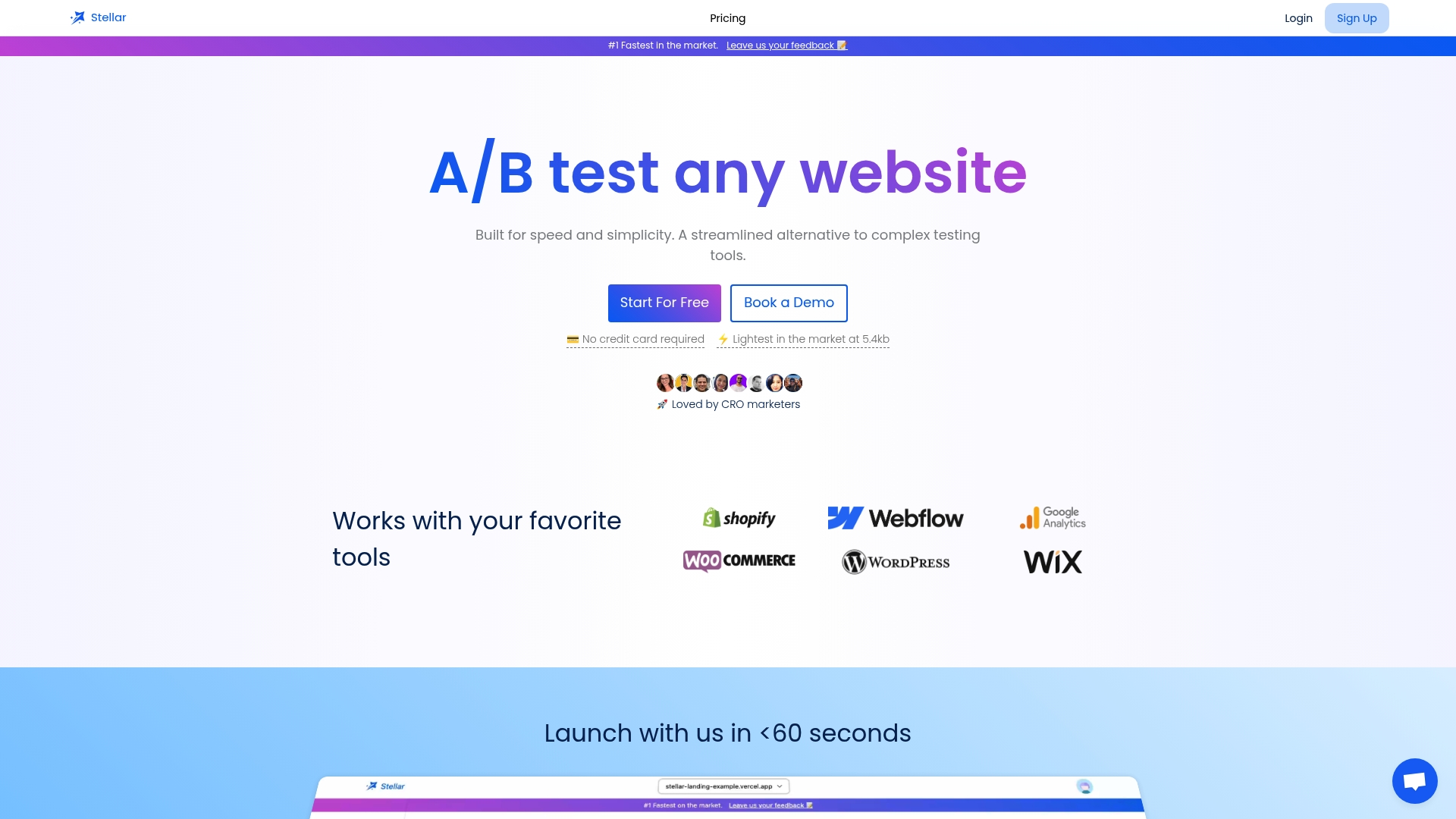
- A lightweight script that will not undo your performance fixes.
- A no-code editor for building mobile variants without writing CSS by hand.
- Real-time analytics and goal tracking to see which layout actually converts.
- A free plan for sites under a certain monthly usage threshold is available, so testing costs nothing to start.
Before you roll a mobile fix out to everyone, run it as an experiment and watch the conversion numbers instead of guessing. Check plan details and start on Gostellar to set up your first test.
Where to go next for deeper testing guidance
- Responsive web design basics for viewport and layout fundamentals.
- Accessible tap targets for sizing and spacing rules.
- Run PageSpeed Insights, Chrome DevTools device mode, and LambdaTest today for immediate results.
Sources
- Resolve mobile usability problems with the Lighthouse test tool
- Web
- Web
- Web
- PageSpeed Insights / Lighthouse background
FAQ
What is a mobile-friendly test?
A mobile-friendly test checks whether a webpage displays and functions correctly on smaller screens, looking at things like viewport configuration, tap target spacing, and text readability. Tools like PageSpeed Insights and Chrome DevTools run this kind of lab audit on any public URL.
What happened to the Google mobile-friendly test?
Google folded its standalone mobile-friendly testing report into broader tools, with mobile usability signals now surfacing through Search Console and Core Web Vitals reporting rather than a dedicated standalone checker. PageSpeed Insights, built on Lighthouse, remains the closest direct replacement for a quick public URL check.
Where can you find the mobile friendliness test tool?
PageSpeed Insights is the primary public tool for a Lighthouse-based lab audit, and Chrome DevTools device mode is built directly into the Chrome browser for interactive checks. Bing also offers its own separate Mobile Friendliness Test for sites tracking Bing search performance.
What is mobile usability testing?
Mobile usability testing means checking that a page's layout, navigation, forms, and touch interactions work properly on phones and tablets, not just that it loads. It combines automated lab audits with hands-on checks like tapping menus and filling out forms across multiple viewports to confirm nothing breaks on real devices.
Recommended
Published: 9/29/2026