
Landing Page Optimisation for Marketers: 3 Fixes That Move Conversions
Landing page optimization is the process of systematically improving a page's copy, layout, and technical performance to convert more of its existing traffic. It works by lowering customer acquisition cost and raising ad quality scores without spending additional money on media. If you fix only three things this quarter, prioritize page speed, message match, and form friction before changing headlines or hero images.
TL;DR:
- Speed, message match, and form friction reduction are the three most impactful fixes to prioritize for immediate improvements.
- Ensuring ad and landing page headlines align exactly can significantly boost conversion rates and reduce visitor doubt.
- Mobile load times are critical, with small speed gains avoiding early bounces, especially on low-bandwidth connections.
- Run isolated A/B tests focusing on mechanical issues like form length and message match before experimenting with layout or headline design.
- Small, targeted changes tested rapidly often outperform extensive redesigns, making quick wins essential for ongoing optimization.
Table of Contents
- What Is Landing Page Optimization and Why Does It Matter?
- What Are the Core Elements of a High-Converting Landing Page?
- Why Do Page Speed and Mobile Design Drive the Biggest Wins?
- How Do You Run an A/B Test That Actually Tells You Something?
- What Should Be on Your Landing Page Optimization Checklist?
- How Do You Optimize a Landing Page for SEO and AI Search?
- What Quick Wins Can You Test This Week?
- An Editorial Take on Running a Real LPO Program
- Run Faster Landing Page Tests With Gostellar
- Sources
What Is Landing Page Optimization and Why Does It Matter?
Landing page optimization (LPO) is a subset of conversion rate optimization focused specifically on one page's job: turning a click into a sign-up, sale, or lead. Instead of overhauling an entire site, you isolate the page a campaign sends traffic to and improve the elements that decide whether a visitor converts or bounces.
The financial case is straightforward. Lifting a page's conversion rate significantly increases revenue and lowers your customer acquisition cost because the same media spend yields more outcomes. According to Semrush's breakdown of landing page optimization, effective optimization improves lead generation while lowering CAC and improving ad quality scores, which in platforms like Google Ads directly reduces your cost per click.
Message match plays a bigger role in this than most marketers assume. When your ad promises "50% off running shoes" and the landing page headline talks about "premium athletic gear," you create a half second of doubt. That doubt costs conversions. The fix isn't clever copywriting, it's consistency between what the ad says and what the headline says.
Benchmarks can be misleading if treated as universal targets. For example, what’s considered excellent conversion in one industry might be poor in another. Compare a page’s performance against its own history and channel rather than generic industry averages.
Three key factors often drive early gains in landing page optimization:
- Speed: faster-loading pages retain more visitors.
- Message match: ensuring ad copy and landing page content align closely.
- Friction reduction: minimizing form fields and navigation options to prevent visitor drop-off.
What Are the Core Elements of a High-Converting Landing Page?
Every landing page is a stack of components, and each one has its own failure mode. Treat the page as a checklist of parts, not a single design decision.
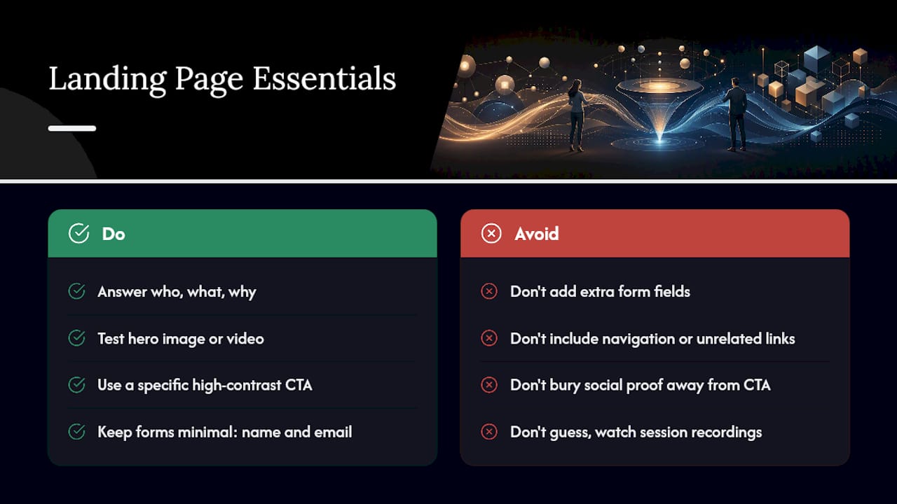
Headline and above-the-fold value proposition. Your headline needs to answer who the offer is for, what it does, and why it matters, in that order, within the first few seconds of a glance. A Semrush analysis of what makes a landing page work points out that clarity on those three points drives conversion more reliably than clever wording. Test headline variants against each other before you touch anything else on the page.
Hero image or video. A product shot works for ecommerce. A short demo clip tends to outperform static images for software. A face looking at the CTA can outperform both for service businesses. There's no universal winner here, only a universal rule: test it, don't guess it.
CTA design, placement, and copy. Button color debates are mostly noise. What matters is contrast against the background, specificity in the copy ("Start My Free Trial" beats "Submit"), and repetition. Crazy Egg's guide to landing page best practices recommends placing your primary CTA above the fold and then repeating it after any supporting content, so a visitor who scrolls past the first ask still finds a second one.
Form optimization. Every field you add past name and email costs you a percentage of completions. Prioritize fields by what you actually need at this stage of the funnel and defer the rest to a follow-up email or onboarding flow.
Social proof. Testimonials, logos, and review counts work best placed near the CTA, not buried in a separate section. Proximity matters because it addresses the objection right when the visitor is deciding.
Visual hierarchy. Remove anything that competes with the primary action. Navigation menus, unrelated links, and footer clutter all give a visitor an exit ramp they didn't ask for.
Pro Tip: Before you write a single new headline, watch five session recordings of real visitors on the page. You'll often find the problem isn't the copy, it's that nobody scrolls past the second section.
Why Do Page Speed and Mobile Design Drive the Biggest Wins?
Most landing page traffic arrives on a phone, and mobile visitors are far less patient than desktop visitors. Shopify's guide to landing page optimization notes that mobile devices account for the majority of landing page visits, which means your mobile experience isn't a secondary concern, it's the primary one.
Small load-time improvements produce outsized results because slow pages lose visitors before the message even loads. That's why Leadpages frames landing page optimization as a math problem rather than a design problem: speed and form simplification consistently outperform cosmetic redesigns, because they remove the abandonment that happens before a visitor even evaluates your offer.
Statistic to keep in mind: the majority of landing page traffic is mobile, which means every speed decision you make should be evaluated on a phone connection first, not a fiber-fed office laptop.
Concrete fixes that engineering teams can usually ship in a sprint:
- Compress and serve responsive images sized for the device requesting them, not the largest version by default.
- Lazy-load anything below the fold, including video embeds and secondary images.
- Defer noncritical JavaScript so it loads after the page becomes interactive.
- Audit third-party scripts (chat widgets, heatmap tags, ad pixels) and remove anything not earning its weight.
This is also why the size of your testing script matters more than marketers usually realize. A heavy A/B testing tag can quietly undo the speed gains your engineering team just shipped, which is one reason a lightweight script matters for anyone running experiments on a page they've already tuned for performance.
On mobile specifically, keep tap targets large enough to hit accurately, cut copy length aggressively, and make sure the primary CTA is visible without scrolling. A visitor who has to pinch and zoom to read your value proposition is a visitor who's already gone.
How Do You Run an A/B Test That Actually Tells You Something?
Most failed tests aren't failed because the idea was bad. They're failed because the test itself wasn't built to produce a trustworthy answer. CXL's landing page optimization process frames this as a loop: form a hypothesis, change one variable, run the test to a sufficient sample size, analyze the result, then repeat.
Here's how that loop plays out in practice:
- Diagnose before you hypothesize. Use heatmaps and session recordings to find where attention actually goes, not where you assume it goes. According to Hotjar's guide to landing page optimization, behavioral analytics surface friction points that A/B testing alone can miss, because a test only tells you which version won, not why.
- Isolate one variable per test. Changing the headline and the CTA color in the same test tells you nothing about which change caused the result.
- Choose the right test type for your traffic. A/B tests work at almost any traffic level. Multivariate tests, which examine combinations of several elements at once, need substantially more volume to reach statistical confidence, so reserve them for pages with sustained high traffic.
- Track the right KPIs, split by source. Conversion rate is the headline number, but event counts, CPA, and ROAS tell you whether that conversion is actually profitable. Always break these numbers out by traffic source. A page can convert well on organic search and terribly on paid social, and averaging those numbers together hides the problem.
- Let the test run its full course. Stopping a test early because it "looks like" a winner is one of the most common ways teams fool themselves; early results skew toward whichever variant got lucky traffic in the first few days.
Pro Tip: Rank your fix list by expected conversions gained per month, not by how interesting the idea is. A boring form-field removal usually beats a clever headline rewrite.
Fix mechanical issues first: speed, form length, message match. Test copy and layout changes only after those are solid, because a beautiful headline on a slow page is still a slow page. For teams building out a full testing program, a dedicated A/B testing guide for landing pages walks through sample size math in more depth.
What Should Be on Your Landing Page Optimization Checklist?
Not every fix deserves the same amount of time. Sort your backlog by impact versus effort, and start with the items that take an afternoon and move the needle the most.
- Fix page speed issues. Compress images, defer scripts, check core web vitals. High impact, low to medium effort.
- Shorten every form to essential fields only. High impact, low effort.
- Remove navigation and exit links from the page. High impact, near-zero effort.
- Match your ad headline to your landing page headline word for word where possible. High impact, low effort.
- Test three headline variants against the current one. Medium impact, low effort.
- Test CTA copy specificity ("Get My Quote" vs. "Submit"). Medium impact, low effort.
- Test social proof placement near the CTA versus lower on the page. Medium impact, medium effort.
- Set a testing cadence and document every result, win or loss. This is the item teams skip and regret, because undocumented losing tests get re-run six months later by someone who forgot they already failed.
Treat the page like a scoreboard someone owns, not a project that ends after launch. A guide to designing landing pages that convert covers the structural side of this checklist in more detail if you're starting from a blank page.
How Do You Optimize a Landing Page for SEO and AI Search?
Landing pages built for paid traffic often skip SEO entirely, which leaves organic and AI-driven discovery on the table for free. Pick one primary keyword per page and use it in the title tag, the H1, the meta description, and the URL slug, exactly as Semrush recommends for landing page SEO. Trying to rank one page for five unrelated terms usually means it ranks for none of them well.
Structure matters for machine readability too. Clear headings and concise copy make it easier for search engines and AI systems to extract what the page actually offers, which affects both snippet placement and whether an AI answer engine cites your page at all.
- Use one primary keyword consistently across title, H1, meta description, and slug.
- Keep headings genuinely descriptive, not vague labels like "Learn More."
- Add long-form copy only when the visitor's intent actually calls for it. A checkout page doesn't need 2,000 words. A B2B evaluation page often does.
- Confirm the page is indexable, has a correct canonical tag, and passes mobile usability checks. A page that's technically broken for search will never rank regardless of copy quality.
What Quick Wins Can You Test This Week?
Small changes, tested properly, often beat total redesigns.
- Cut your form from seven fields to three. Expect a jump in completions, especially on mobile, where every keystroke has friction.
- Mirror your ad headline in your landing page headline. Watch both click-through rate and conversion rate move together when the message finally matches.
- Compress your hero image and defer analytics scripts. Faster First Contentful Paint translates directly into fewer early bounces.
Three tests to queue up now: a form-length test (runs fast, even on modest traffic), a headline message-match test (needs a few hundred conversions per variant for confidence), and a CTA copy test (fast to build, fast to read). For more structured ideas, ten specific A/B testing ideas are worth running through before you build anything from scratch. Pair any copy test with a look at CTA-specific copy tactics if button copy is your weak point.
An Editorial Take on Running a Real LPO Program
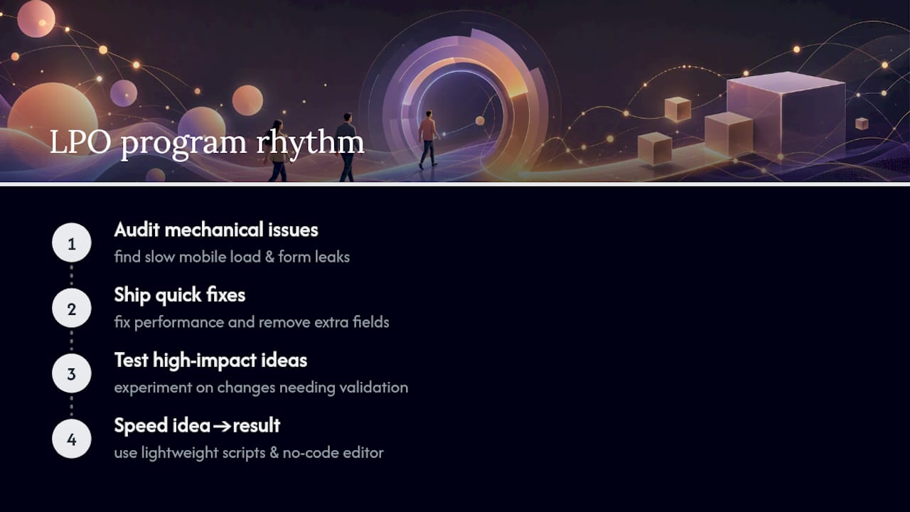
The gap between what most teams call "optimization" and what actually moves conversion rate is usually diagnosis. Marketers jump to headline tests because headlines are fun to write, while the page's actual leak is a slow mobile load or a seventh form field nobody questioned. A workable rhythm looks like this: audit the page for mechanical problems first, ship the quick fixes, then test the things that need real experimentation.
A lightweight testing script and a no-code visual editor matter here for a boring but real reason: they shrink the time between "I have an idea" and "I have a result," which is the actual bottleneck in most testing programs, not creativity.
— Juan
Run Faster Landing Page Tests With Gostellar
A good A/B testing platform gets you from hypothesis to live test in minutes instead of days, by providing a lightweight script and an editor that requires no developer ticket. That combination matters most for the exact fixes this guide prioritizes: a form-length test, a headline swap, a CTA copy change, all built visually and launched without waiting on engineering.
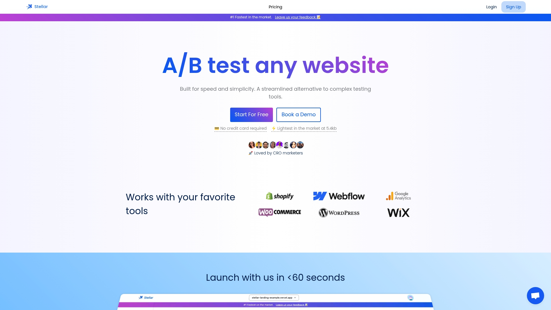
Dynamic keyword insertion lets you match ad copy to landing page headlines automatically across campaigns, closing the message-match gap without building a separate page for every audience segment. Goal tracking and real-time dashboards then tell you which variant actually earned its win, split by traffic source, so you're not guessing which channel drove the lift. Small and midsize teams can start on a free plan with a usage limit and prove the model before committing to more volume. If your next move is shortening a form or fixing message match, start that test today at Gostellar.
Sources
- What Is Landing Page Optimization? And How to Do It — Semrush
- Landing page optimization tips — Shopify
- Landing page optimization process for high conversion rates — CXL
- Landing Page Optimization Is a Math Problem, Not a Design Problem — Leadpages Blog
Recommended
Published: 9/9/2026