
90 Day Playbook to Build an Optimized Ecommerce Store for Small Teams
The three fixes that move revenue fastest are product page content, checkout friction, and mobile speed, in that order of ease-to-impact ratio. Stores that treat these as one connected system rather than separate projects typically see conversion rates climb from the industry average of 2 to 3% toward 4.5% or higher. Run an audit against all three this week before touching anything else.
TL;DR:
- Focusing on faster, easier fixes like product page content, checkout simplification, and mobile speed can significantly boost conversion rates from 2-3% to 4.5% or higher.
- Prioritizing improvements based on revenue per visitor rather than traffic volume ensures you tackle the highest-impact pages, such as converting product templates, rather than those with high traffic but low conversion.
- Implementing systematic A/B testing with clear hypotheses, proper segmentation, and measuring revenue impacts accelerates growth and avoids costly redesigns based on guesses.
- Optimizing mobile experience with faster load times, responsive images, and finger-friendly design is crucial since mobile users now make up over 62% of site traffic.
- Regularly measuring performance, running quick tests, and iterating over 90 days helps small teams sustain ongoing improvement without overwhelm or guesswork.
Table of Contents
- What Does an Optimized Ecommerce Store Actually Look Like?
- How Do You Find Your Highest-Impact Fixes First?
- What Makes a Product Page Convert Better?
- Why Are Customers Abandoning Your Checkout?
- Why Does Mobile Speed Decide Whether You Get the Sale?
- How Do You Run A/B Tests That Actually Tell You Something?
- What Does a 90-Day Optimization Rollout Look Like?
- How a Lightweight Testing Platform Fits Into This Plan
- How Should Navigation and Site Search Actually Work?
- Do Personalization and Recommendation Engines Actually Increase Sales?
- Which Trust Signals Actually Reduce Checkout Hesitation?
- How Does Stock Availability Affect the Shopping Experience?
- Does Live Chat Actually Improve Conversion Rates?
- Author Perspective: The Discipline of Continuous Optimization
- Try Gostellar for Your First Low-Impact Experiment
- Sources
- FAQ
What Does an Optimized Ecommerce Store Actually Look Like?
An optimized ecommerce store isn't a single redesign or a fresh coat of paint on your homepage. It's a system where every page template, from category grid to confirmation screen, has been measured, tested, and improved based on actual buyer behavior rather than assumption. The formal term for this discipline is conversion rate optimization, or CRO, and it sits alongside search engine optimization as one of the two pillars of ecommerce optimization more broadly.
Here's the tactical playbook, organized by tactic type with a note on whether it's a quick win you can ship this week or a strategic investment that needs planning and resources.
Quick wins (days, not weeks):
- Compress and lazy-load images. Most product photos ship at three or four times the file size they need. Run them through a compression tool and defer anything below the fold.
- Add guest checkout. If customers must create an account to buy, you're losing sales at the finish line for no good reason.
- Fix your top five product page titles and descriptions. Rewrite for the specific question a buyer has, not generic marketing copy.
- Turn on abandoned cart emails. A three-email sequence over 24 to 72 hours recovers a meaningful share of otherwise lost carts.
- Audit your search bar. Type ten real product names into it and see how many returns zero results.
Strategic investments (weeks to months):
- Rebuild category navigation around how customers actually shop, not how your warehouse organizes SKUs.
- Implement a structured A/B testing program rather than one-off guesses about what might convert better.
- Build a personalization layer that surfaces different homepage and category content based on browsing history or referral source.
- Overhaul checkout into a single-page or accordion flow with real-time validation.
- Set and enforce Core Web Vitals budgets across every new feature the team ships.
Full-funnel optimization means fixing discovery issues, page speed, and checkout friction before you spend a dollar on aesthetic tweaks, and the ecommerce optimization guide from eLogic backs that sequencing with data on where drop-off actually happens. Shopify's own research points the same direction, noting that checkout simplification alone lifted one merchant's completion rate by 15% after unifying a fragmented flow. The pattern holds across platforms: the boring fixes usually beat the flashy ones.
How Do You Find Your Highest-Impact Fixes First?
Most teams start optimizing the wrong page because they're looking at traffic instead of revenue. A category page pulling 50,000 monthly visits but converting at 0.4% is a lower priority than a product template pulling 4,000 visits that converts at 6% and feeds directly into checkout. The metric that matters is revenue per visitor, or RPV, and it should drive your prioritization list before session counts ever enter the conversation.
Here's a workable framework for building that priority list:
- Pull RPV by page template, not by individual URL. Group product pages, category pages, and landing pages separately so patterns emerge.
- Segment by device and traffic source. A template that converts well on desktop paid search can quietly underperform on organic mobile, and averaging the two hides the problem.
- Map the funnel conversion rate at each template, from landing to add-to-cart to checkout start to purchase, so you can see exactly where visitors drop.
- Layer in qualitative signals. Heatmaps and session recordings from a tool like Microsoft Clarity show you why a page underperforms, not just that it does.
- Score each candidate fix on effort versus RPV upside. A simple 1 to 5 scale on both axes, multiplied together, gives you a rough impact score you can rank.
A free stack combining GA4 for funnel data and Clarity for session recordings covers most of what a small team needs before any paid analytics tool earns its subscription cost. Don't skip this step because it feels slow. Guessing at priorities is how teams spend a quarter redesigning a homepage that was never the problem.
Pro Tip: Before you rank anything, watch five session recordings of your worst-performing checkout step. You'll often spot the real friction point in under ten minutes, something no dashboard will show you as clearly as watching a real person hesitate and abandon.
What Makes a Product Page Convert Better?
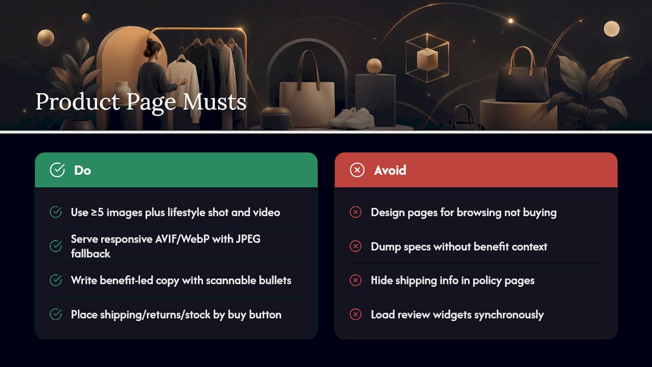
Product pages carry the heaviest conversion load on the entire site, and most of them are still built for browsing instead of deciding. The fix starts with media: aim for a minimum of five images covering different angles, one lifestyle or in-context shot, and at least one short video. Serve them responsively with srcset and modern formats like AVIF or WebP with a JPEG fallback, so a phone on a weak connection isn't pulling a desktop-sized file.
Copy matters just as much as imagery. Benefit-led descriptions that answer "what does this do for me" outperform spec dumps, and scannable bullets covering materials, sizing, and care beat a wall of paragraph text every time. Shipping timelines, return windows, and stock status should sit near the buy button, not buried in a policy page three clicks away.
Trust signals close the gap between interest and purchase. Reviews, star ratings, and user-submitted photos all reduce hesitation, but load them asynchronously so a slow review widget doesn't drag down your page speed. Reworking metadata and structured content on product pages also feeds directly into organic visibility, which means these fixes pay twice: once in conversion, once in search rankings.
Merchandising rounds it out. "Frequently bought together" modules and dynamic recommendations based on browsing history increase average order value without adding friction, as long as they're relevant rather than generic.
By the numbers: stores running structured optimization programs across product pages and checkout commonly report conversion rates near [4.5%], well above the 2 to 3% average(https://buildgrowscale.com/conversion-rate-optimization-ecommerce-guide) most stores settle for.
Why Are Customers Abandoning Your Checkout?
Checkout abandonment usually traces back to one of three causes: too many form fields, hidden costs that surface too late, and a lack of payment flexibility. Checkout usability research consistently flags long forms and forced account creation as two of the biggest, most fixable causes of lost sales.
Start by mapping every field in your checkout to an actual fulfillment or business need. If you can't explain why you're asking for a phone number, cut it. Offer guest checkout by default, and if you want account creation, ask for it after the purchase completes, not before.
Practical checkout fixes worth prioritizing:
- Show total cost, including shipping and tax, as early as possible rather than surprising buyers on the final screen.
- Add a progress indicator so buyers know how many steps remain.
- Use inline validation that flags a typo in an email or card number immediately, not after a full-page reload.
- Support multiple payment methods, including digital wallets like Apple Pay and Google Pay, which cut mobile checkout time dramatically.
- Build a cart recovery cadence: one email within an hour, a second within a day, and a final nudge within three days, often paired with on-site retargeting for return visits.
A detailed checkout optimization framework covers field-by-field recommendations if you want to go deeper on any single step. Every change here should be measured against completion rate by device, since desktop and mobile checkout behavior rarely move together.
Why Does Mobile Speed Decide Whether You Get the Sale?
Mobile now accounts for roughly 62.54% of all website traffic, which means a slow or clunky mobile experience isn't a secondary concern anymore. It's the majority experience for most stores.
Google's Core Web Vitals give you the specific targets to hit: Largest Contentful Paint under 2.5 seconds, Interaction to Next Paint under 200 milliseconds, and Cumulative Layout Shift under 0.1. Field data from real visitors matters more here than lab scores, because a page that tests fast in a controlled environment can still feel sluggish on a mid-range phone over spotty cellular.
Tactics that actually move these numbers:
- Serve images in AVIF or WebP with responsive sizing so mobile devices never download a desktop-sized asset.
- Put static assets behind a CDN to cut latency regardless of where a visitor is located.
- Defer non-critical scripts, especially marketing pixels and chat widgets, until after the main content renders.
- Design for thumbs, not cursors: tap targets need real spacing, sticky add-to-cart bars keep the purchase action visible while scrolling, and mobile payment flows should default to digital wallets.
- Audit every third-party tag quarterly. A single unoptimized script can single-handedly blow your INP budget.
Pro Tip: Run your top three product pages through PageSpeed Insights before and after removing any single third-party script. You'll often find one tag responsible for the bulk of your INP problem, and cutting it is faster than any code refactor.
How Do You Run A/B Tests That Actually Tell You Something?
A test without a clear hypothesis is just a guess with extra steps. Before launching anything, write down what you expect to happen and why: "Shortening the checkout form from twelve fields to six will increase completion rate because fewer fields reduce perceived effort." That sentence forces clarity you'll need later when interpreting results.
Follow this protocol to keep your experiments honest:
- Segment your traffic so new and returning visitors, and mobile and desktop, aren't lumped into one noisy average.
- Estimate your required sample size before launch, not after you've already peeked at early results. Stopping a test the moment it looks promising is one of the most common ways stores talk themselves into a false positive.
- Let the test run a full business cycle, typically at least one to two weeks, to smooth out day-of-week effects.
- Tie every test back to revenue metrics: RPV, average order value, and where possible, downstream retention or lifetime value, not just the raw conversion rate on the page you changed.
- Document the result either way. A failed hypothesis is still information, and skipping the write-up means someone tests the same idea again in six months.
Stores using systematic CRO frameworks rather than ad hoc guessing consistently outperform the 2 to 3% baseline conversion rate most sites hover around. Start your testing queue with checkout field reduction and product page hero copy. Both tend to produce measurable lift fast, which builds internal buy-in for a longer testing program.
For a deeper walkthrough on structuring these experiments, this guide on A/B testing for revenue growth covers hypothesis design and result interpretation in more detail.
What Does a 90-Day Optimization Rollout Look Like?
Spreading this work across a quarter keeps it manageable and prevents the common mistake of changing five things at once and losing track of which one actually worked.
- Weeks 1 to 2: Deploy or audit your analytics stack first. You cannot measure improvement you didn't set up to track.
- Weeks 3 to 4: Ship the quick wins: image compression, guest checkout, abandoned cart emails, top product page rewrites.
- Weeks 5 to 8: Tackle checkout restructuring and mobile performance fixes, measuring completion rate and Core Web Vitals weekly.
- Weeks 9 to 11: Launch your first structured A/B tests on product pages and checkout, using the hypothesis protocol above.
- Week 12: Review results, document learnings, and roll winning variants into the default experience.
Hold a short weekly check-in throughout, owned by whoever runs marketing or growth, to catch measurement breaks before they cost you three weeks of unusable data.
How a Lightweight Testing Platform Fits Into This Plan
Every fix above needs validation, and validation needs a testing tool that doesn't itself become the performance problem you're trying to solve. Gostellar runs on a 5.4KB script, a no-code visual editor for building variants, dynamic keyword insertion for personalized landing pages, advanced goal tracking, and real-time analytics dashboards. A heavy testing script can quietly wreck your LCP and INP scores while you're busy trying to improve them elsewhere, which defeats the purpose of testing in the first place.
[Author credentials, customer case studies, and third-party testimonials to be added.]
How Should Navigation and Site Search Actually Work?
Navigation exists to answer one question fast: "can I find what I'm looking for in three clicks or fewer?" Category structures built around internal warehouse logic instead of customer mental models are the single most common navigation failure on ecommerce sites.
Test your own search bar with ten real product names, including common misspellings and abbreviated terms customers actually type. If more than one or two return zero results, your search index needs work, whether that means better synonym mapping, typo tolerance, or a smarter matching algorithm. Autocomplete with visual previews, thumbnail images, and price shown inline, cuts the path to purchase noticeably compared to plain text suggestions.
Filters matter as much as the search box itself. Category pages with more than a dozen products need faceted filtering by the attributes customers actually shop by, size, color, price range, brand, rather than generic tags that mean something to your merchandising team but nothing to a shopper. Breadcrumbs should always be present so a visitor arriving from a Google search or paid ad lands with context instead of feeling dropped into an unfamiliar maze.
Mega-menus work well on desktop but frequently collapse into unusable clutter on mobile. Simplify to a slide-out drawer with clear top-level categories and let search carry more of the mobile discovery load, since typing tends to beat tapping through nested menus on a small screen.
Do Personalization and Recommendation Engines Actually Increase Sales?
Personalization works when it's based on real signals, browsing history, cart contents, past purchases, and fails when it's generic content dressed up as "just for you." The difference between the two is obvious to shoppers within seconds.
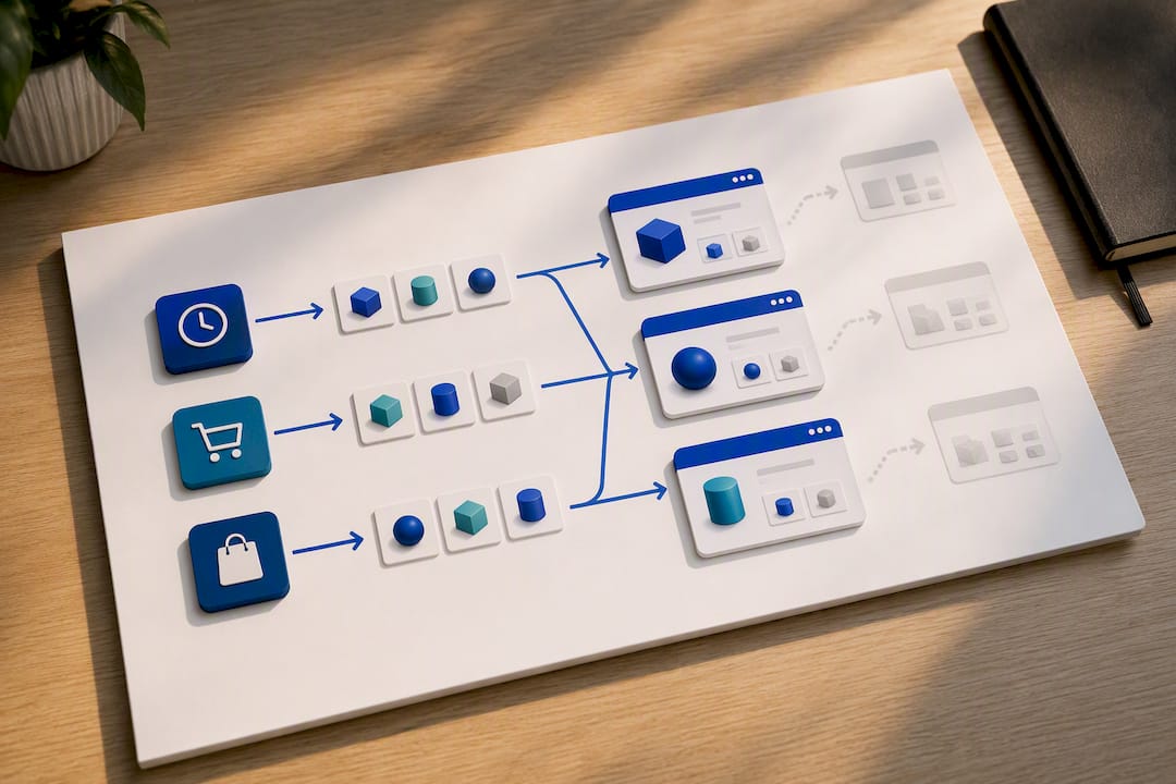
Recommendation engines earn their keep in three specific spots: the homepage for returning visitors, the product page for cross-sell ("frequently bought together"), and the cart or checkout page for last-minute add-ons. Each spot has a different job. Homepage recommendations should nudge toward re-engagement, product page recommendations should raise average order value through relevant pairings, and cart-stage suggestions need to be genuinely complementary or they read as a distraction from finishing the purchase.
Segmentation deepens the impact. New visitors from a paid search campaign should see different homepage content than a returning customer three purchases deep, and dynamic keyword insertion on landing pages, matching the visitor's actual search term into the page headline, can noticeably lift relevance and click-through without any redesign.
The trap most stores fall into is over-personalizing before they have enough data. A recommendation engine trained on thin traffic produces noisy, sometimes irrelevant suggestions that erode trust faster than generic ones would. Start simple, "customers also bought," "recently viewed", and layer in more sophisticated behavioral targeting only once you have the volume to support it.
Which Trust Signals Actually Reduce Checkout Hesitation?
Every ecommerce store needs baseline security infrastructure: a valid SSL certificate showing the padlock icon, PCI-compliant payment processing, and a clearly written privacy policy that isn't buried three footer links deep. These aren't optional extras. A missing padlock or a browser security warning ends a purchase before a customer ever reaches the payment form.
Beyond the technical baseline, visible trust badges near the buy button, payment provider logos, security seals from recognized providers, return policy summaries, measurably reduce hesitation at the exact moment a customer is deciding whether to commit their card details. Placement matters here as much as the badge itself. A trust seal buried in the footer does nothing; the same seal next to the "Complete Order" button earns its space.
Transparent policies matter just as much as visual badges. Clear, specific return windows ("30 days, no questions asked") outperform vague language ("returns accepted") because specificity signals confidence. The same logic applies to shipping timelines and any data collection disclosures, plain language stated upfront beats legal boilerplate discovered later.
Reviews and user-generated content double as trust signals and social proof simultaneously. A product page showing 200 reviews with a visible rating distribution, including some critical ones, reads as more credible than a suspiciously perfect five-star average with only a handful of reviews. Customers have learned to distrust the latter.
How Does Stock Availability Affect the Shopping Experience?
Inventory transparency shapes buying decisions more than most merchandising teams give it credit for. A product page that simply disappears or shows a generic "unavailable" message when stock runs out wastes the traffic and SEO equity that page already earned. Keep the page live, show accurate stock status, and offer a back-in-stock email signup instead of a dead end.
Low-stock indicators ("only 3 left") create legitimate urgency when the number is real and accurate. The moment customers catch a store displaying "low stock" on items that are clearly always in stock, the tactic backfires and erodes trust across the entire site, not just that one page.
Real-time inventory sync between your storefront and warehouse or point-of-sale system prevents the worst version of this problem: a customer completing checkout on an item that turns out to be unavailable, followed by an awkward cancellation email. That failure mode does more damage to repeat purchase rates than almost any other single mistake on this list, because it breaks trust after money has already changed hands.
For seasonal or limited-run products, clear messaging about restock timing, or an honest "this won't be restocked" note, respects the customer's time better than silence. Buyers who can't get clarity on availability simply leave and buy the equivalent product from whichever competitor makes that answer easy to find.
Does Live Chat Actually Improve Conversion Rates?
Customer support integrated directly into the shopping flow catches hesitation at the exact moment it happens, which is worth more than the same conversation happening over email three hours later. A shopper stuck on a sizing question or a shipping timeline will often abandon rather than hunt for a contact page, so proactive chat triggered by specific behavior, extended time on a product page, cart addition without checkout progress, converts hesitation into a sale far more reliably than a passive "chat with us" icon in the corner.
Live chat works best when it's scoped honestly. A chatbot that handles order status, return policy questions, and sizing charts frees human agents for the complex cases, but only if it hands off cleanly the moment a question exceeds its script. Nothing frustrates a shopper faster than a bot looping through the same three unhelpful responses to a specific question.
Response time matters more than most stores realize. Chat requests answered within a minute convert noticeably better than those left waiting five or more, and a visible queue estimate ("average wait: 2 minutes") reduces abandonment even when the wait itself doesn't change, because uncertainty is what drives people away, not the wait itself.
Integrating support data back into your analytics closes the loop. If the same product question shows up in chat transcripts repeatedly, that's a product page gap, not just a support volume problem, and it belongs on your prioritization list alongside the quantitative fixes from your audit.
Author Perspective: The Discipline of Continuous Optimization
The biggest mistake I see isn't a bad test. It's no test at all, or worse, a redesign shipped on gut feeling with no measurement plan attached. Optimization only works as an iterative loop: audit, fix, test, document, repeat. Skip the documentation step and you'll relitigate the same debate next quarter. Pair every CRO effort with real analytics and platform-aware execution, because the same fix looks different on Shopify than it does on a custom build.
— Juan
Try Gostellar for Your First Low-Impact Experiment
Every tactic in this guide depends on being able to test changes without guessing at the outcome, and that's exactly where a lightweight testing platform earns its keep. A lightweight testing platform typically runs on a small script designed so experiments won't drag down Core Web Vitals scores, and often includes a no-code visual editor for building product page variants without developers.
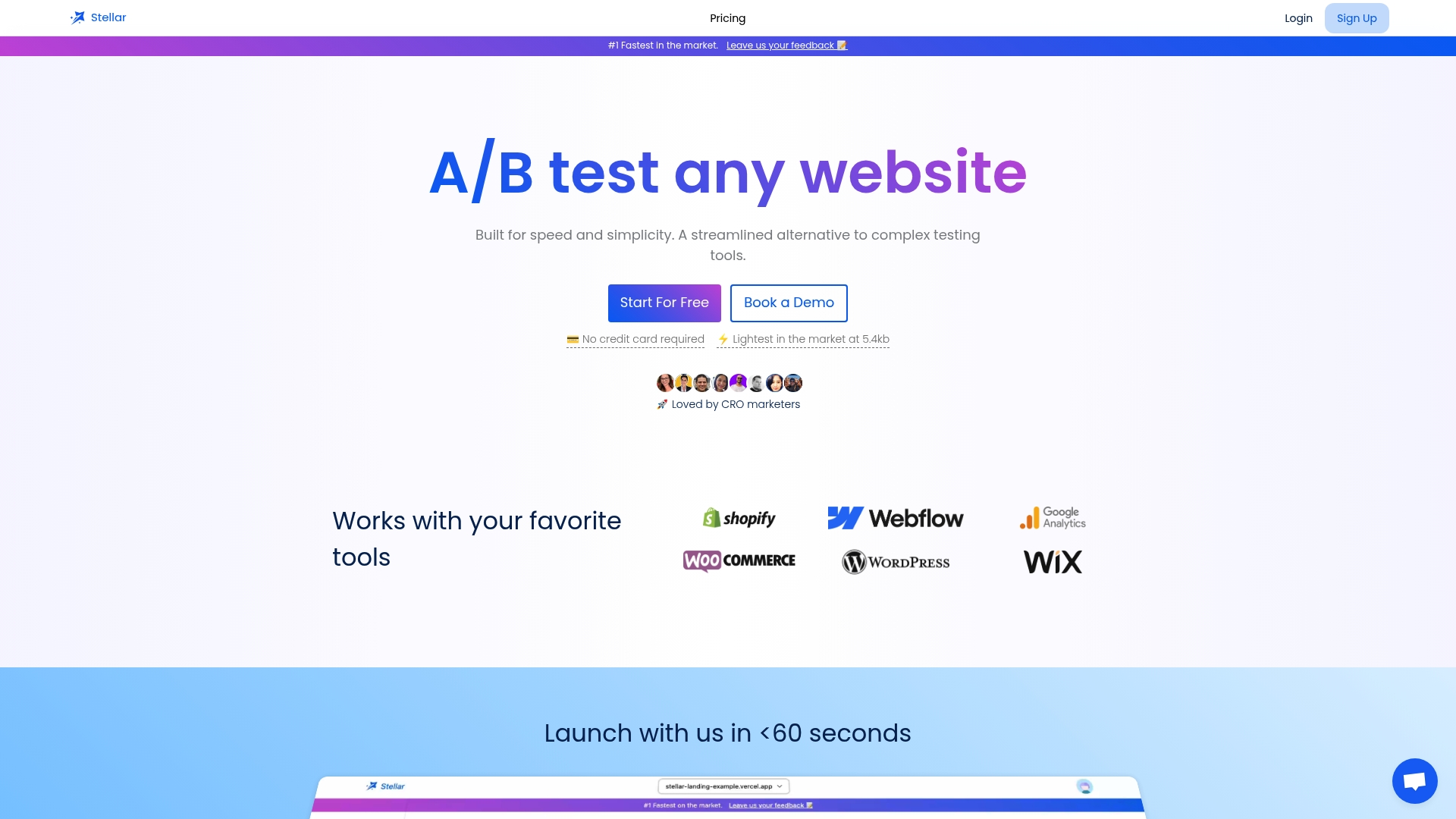
For small to mid-sized ecommerce teams, that combination matters more than a long features list. Testing platforms often provide real-time analytics, dynamic keyword insertion for personalized landing pages, and goal tracking tied to revenue metrics rather than vanity measures. The Sandbox plan is free for stores under 25,000 monthly tracked users, which makes it a reasonable starting point for running your first product page or checkout test this month rather than waiting for next year's budget cycle. Start on the free plan, pick one fix from your priority list, and launch your first test this week.
Sources
- Share of website traffic coming from mobile devices | Statista
- Conversion Rate Optimization Ecommerce Guide 2026 | Build Grow Scale
- Ecommerce website optimization guide | eLogic
- How Ecommerce Website Optimization Increases Sales (2025) - Shopify
FAQ
What Is Ecommerce Optimization?
Ecommerce optimization is the ongoing process of improving a store's speed, content, navigation, and checkout to convert more visitors into buyers without necessarily increasing traffic. It combines technical fixes like Core Web Vitals performance with content and UX changes across product pages, search, and checkout.
What Are the 5 C's of Ecommerce?
Definitions vary across sources, but the version used most consistently covers Content, Community, Commerce, Context, and Connection, the elements that together shape a customer's decision to buy and return. Not every store applies all five with equal weight, and the framework works best as a planning lens rather than a rigid checklist.
What Is the Difference Between Standard and Enhanced Ecommerce Tracking?
Standard ecommerce tracking records basic transaction data like revenue and items purchased, while enhanced tracking captures the full shopping behavior: product impressions, cart additions, checkout steps, and where in the funnel visitors drop off. Enhanced tracking is what makes the revenue-per-visitor prioritization framework described earlier in this guide actually possible.
How Much Traffic Do I Need Before Running an A/B Test?
There's no single fixed number that works for every store, since the required sample size depends on your baseline conversion rate and how big a difference you're trying to detect. As a general caution, running a test without enough conversions per variant increases the risk of a false positive, so it's safer to wait and accumulate more traffic than to call a winner too early.
What Should I Measure First When Starting Ecommerce Optimization?
Start with revenue per visitor by page template, plus your checkout completion rate by device, since these two numbers point directly at where money is being lost. A tool like Gostellar can help track goal completions and segment results once you start testing fixes against those baseline numbers.
Recommended
Published: 9/17/2026