
Launch A/B Tests in a Week With Website Questionnaires for Marketers
Pick one goal, then choose one instrument: a short targeted questionnaire of three to ten questions for most feedback, or the System Usability Scale when you specifically need a usability benchmark. Trigger it at the moment tied to that goal, whether that's exit intent, post-purchase, or mid-task. Do this and you can build questions, deploy the survey, read results, and turn recurring complaints into A/B tests within a week instead of guessing for a quarter.
TL;DR:
- Short surveys of three to six questions are sufficient for quick feedback, but longer questionnaires up to fifteen questions may be used when respondents have opted in.
- Pairing a scaled question with a follow-up open-ended question yields more actionable insights and helps identify root causes of website issues.
- Trigger surveys at moments like exit intent, post-purchase, or after completing a specific task for higher response rates and relevant feedback.
- Use the System Usability Scale when benchmarking or comparing against industry norms, but opt for custom short surveys for page-level insights.
- Analyze recurring themes from open responses and pair them with funnel data to generate focused hypotheses for A/B testing and improvements.
Table of Contents
- What Types of Questions Belong in Questionnaires for Websites?
- Which Sample Questions Should You Ask by Goal?
- How Long Should a Website Questionnaire Be?
- When and Where Should You Trigger a Website Questionnaire?
- How Do You Turn Survey Answers Into Fixes and Tests?
- What Questionnaire Templates Can You Copy Right Now?
- Quick Launch Checklist for Website Questionnaires
- When Should You Trust a Questionnaire Over a Moderated Test?
- Turning Questionnaire Feedback Into Real Experiments
- Sources
- FAQ
What Types of Questions Belong in Questionnaires for Websites?
Every question format captures a different kind of truth, and mixing them up is the fastest way to end up with data nobody trusts. Closed questions give you numbers you can chart. Open questions give you the sentence that explains the number. A good website questionnaire almost always uses both.
Closed and scaled formats work best when you need to track something over time or compare pages against each other:
- Multiple choice narrows a broad question into a handful of answers, useful for "How did you find us?" or "What brought you here today?"
- Likert scale questions (Strongly Disagree to Strongly Agree, usually five or seven points) measure attitudes like "This page was easy to navigate."
- NPS (Net Promoter Score) asks "How likely are you to recommend us?" on a 0 to 10 scale, and it's built for tracking loyalty trends over months, not for diagnosing a single page.
- Star or numeric ratings (1 to 10) work well for quick satisfaction checks after a specific interaction, like a checkout or support chat.
- Nominal questions sort people into categories with no ranking implied, such as "Which device are you using?" or "What's your role?" They're for segmentation, not sentiment.
Open-ended questions ask for free text: "What almost stopped you from completing your purchase?" They're slower to analyze but they surface problems you never thought to ask about.
The System Usability Scale is a standardized 10-question instrument using a 5-point agreement scale, and it produces a single usability score between 0 and 100. Use it when you need a benchmark you can compare against a previous redesign or an industry norm, not for quick page-level feedback. If you're running a usability test on a specific flow rather than benchmarking the whole site, a shorter custom mini-survey usually beats SUS for speed.
The single most valuable pairing in any questionnaire is a scale question followed immediately by one open-ended "Why did you rate it that way?" It costs the respondent ten seconds and gives you the reasoning behind every number on your dashboard.
Which Sample Questions Should You Ask by Goal?
Pull five to eight questions from whichever category matches your goal instead of asking everything at once. Longer surveys don't produce more insight, they just produce more abandoned surveys. Categorized lists like the ones below give you a starting bank to trim from.
1. Usability questions (trigger: after a task, or via floating widget)
- On a scale of 1 to 10, how easy was it to complete what you came here to do?
- What, if anything, confused you on this page?
- Did you find what you were looking for on your first attempt?
- What would make this page easier to use?
2. Navigation questions (trigger: on category or search-result pages)
- Was it easy to find this page from the homepage?
- Did the menu labels make sense to you?
- What were you trying to find when you got stuck?
- How many clicks did it feel like it took to get here?
3. Content questions (trigger: end of blog posts, product pages, exit intent on long-form content)
- Did this page answer your question?
- What information was missing?
- How would you rate the clarity of this content, 1 to 5?
- Is there anything here you didn't understand?
4. Performance questions (trigger: post-load delay, or after slow interactions)
- Did this page load fast enough for you?
- Did you experience any errors or delays while browsing?
- Site speed research from Google links longer load times directly to rising bounce probability, which is exactly why a single speed question earns its place even in a short survey.
5. Checkout questions (trigger: post-purchase, or on cart abandonment via exit intent)
- What almost stopped you from completing this purchase?
- Were shipping and tax costs clear before you checked out?
- How would you rate the checkout process, 1 to 10?
- Did you feel confident your payment information was secure?
6. Redesign and pre-project intake questions (trigger: dedicated landing page, or email invite to recent visitors)
- What do you use this site for most often?
- What's the one thing you'd change about the current design?
- Which device do you primarily use to visit this site?
- What's missing that you wish existed here?
7. Attribution questions (trigger: post-conversion, thank-you page)
- How did you first hear about us?
- What almost made you choose a competitor instead?
- What convinced you to complete this action today?
Notice the pattern: each category leads with a scaled or closed question for the number, then follows with an open question for the reason. That combination is what turns a stack of survey responses into something you can actually act on, and it's the same structure SurveyMonkey's own website feedback templates rely on.
How Long Should a Website Questionnaire Be?
Length kills completion rates faster than almost any other design choice. A short on-page questionnaire should run a handful of questions, typically between three and six. A dedicated usability mini-survey, sent to a targeted group rather than dropped on every visitor, can stretch to eight or fifteen questions because respondents have opted into more depth.
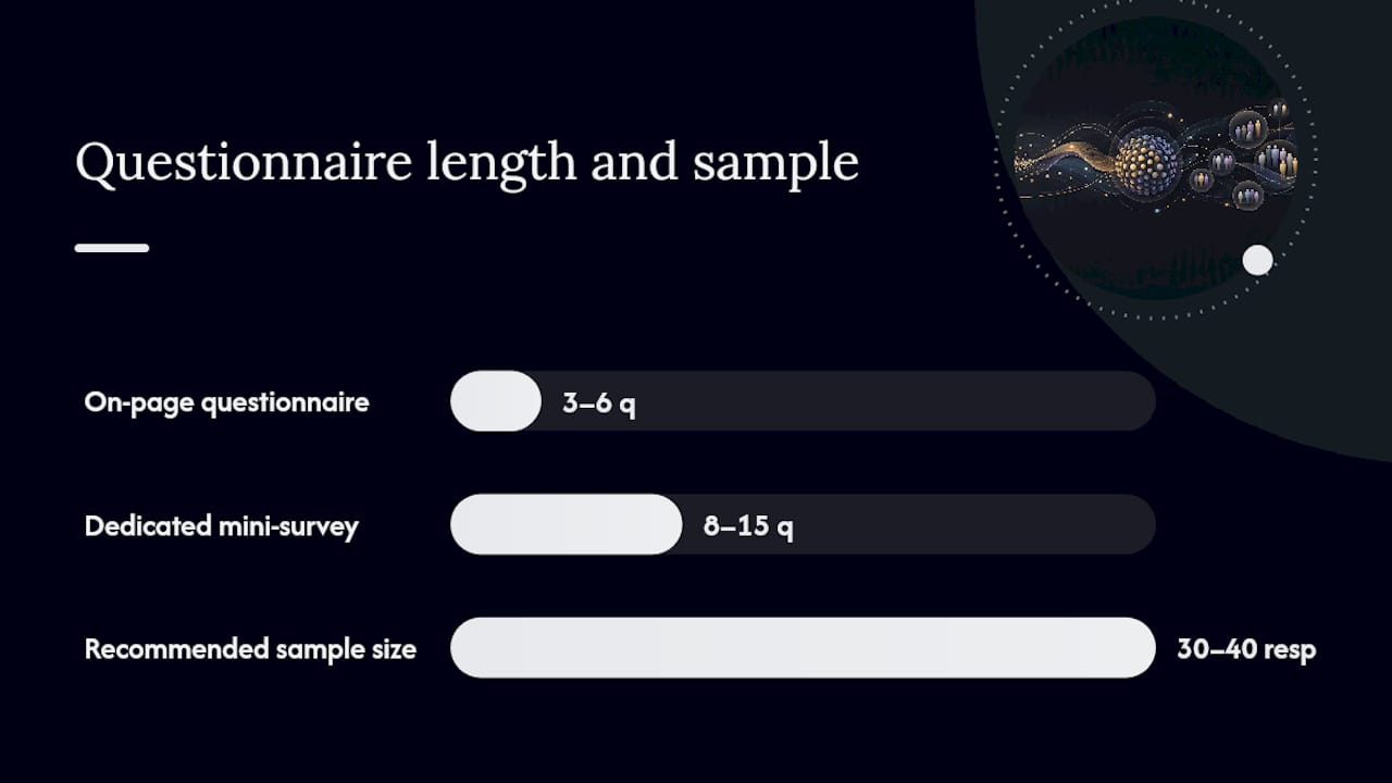
Sample size matters as much as question count. For broad usability patterns, thirty to forty responses from recent visitors is typically enough to spot recurring friction points, though it won't give you statistically rigorous benchmarks. Below that, treat individual comments as directional, not conclusive, and weight your read toward the qualitative answers rather than the averages.
A few wording and structure rules make a real difference in response quality; learn more in this guide on how to create effective surveys for actionable insights.
- Ask one thing per question. "Was the page fast and easy to use?" forces respondents to answer two questions with one number.
- Match the scale to the goal. Use 1 to 10 for granular tracking, a 5-point Likert scale for attitude statements, and star ratings for quick post-interaction checks. Don't switch scales mid-survey.
- Put the easiest question first. A quick closed question warms respondents up before you ask for open text.
- Keep language neutral. "How satisfied were you?" beats "How much did you love this feature?" which nudges toward a positive answer.
- Use conditional logic to skip irrelevant questions. If someone rates checkout a 9 or 10, skip the "what went wrong" follow-up and jump straight to "what did you like most."
Pro Tip: Route your open-ended follow-up question conditionally, so it only appears when a scaled answer falls below a threshold you set (say, under 7 out of 10). This keeps the survey short for happy users and gets you detailed complaints from the ones who actually have something to fix.
When and Where Should You Trigger a Website Questionnaire?
The trigger matters as much as the questions themselves. Ask at the wrong moment and you'll interrupt someone mid-task; ask at the right one and completion rates climb because the experience is still fresh.
- Exit intent works for abandonment diagnosis: catch someone as they're about to leave a cart or a pricing page and ask what stopped them.
- Post-conversion is the moment for attribution and satisfaction questions, since the person just finished the thing you care about.
- In-app or in-flow overlays suit usability questions tied to a specific task, like right after someone completes (or gives up on) a multi-step form.
- Floating feedback widgets work as a low-friction, always-available option for general content or navigation feedback, without interrupting anyone.
Cap frequency so the same visitor doesn't see three different popups in one session, and check your triggers across device types separately. Mobile visitors often need a shorter question set and a delayed trigger, since exit intent doesn't translate cleanly to touch devices. Wherever possible, pre-fill context automatically: the page URL, the device type, and the task the visitor was attempting, so respondents don't have to type details you can already capture.
How Do You Turn Survey Answers Into Fixes and Tests?
Numbers tell you where the problem is. Comments tell you what it actually is. Analytics show what visitors did (where they dropped off in a funnel, where they stopped scrolling on a heatmap), while questionnaire answers explain the reasoning behind that behavior, and pairing the two is how you avoid guessing at root causes.
Start by calculating simple summary metrics: the mean rating per question, the distribution around that mean (a 7 average hiding a cluster of 2s and 9s tells a different story than a tight cluster of 7s), and your NPS if you're tracking it. Then tag open responses by theme, even with a basic spreadsheet, "confusing navigation," "slow load," "unclear pricing," so recurring complaints surface instead of getting lost in a wall of text.
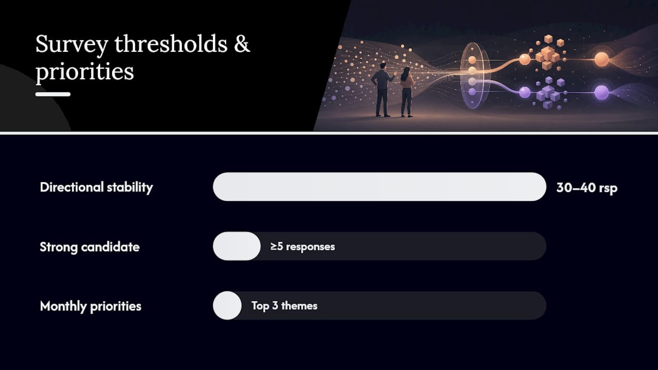
On response thresholds: treat scaled-question averages as directionally stable once you've collected around 30 to 40 responses per page for that specific page or flow. Below that, don't over-index on the number, lean on the qualitative comments and consider running a handful of targeted one-on-one sessions instead.
Once a theme repeats across five or more responses, it's a strong candidate for an A/B test: change the copy, simplify the flow, or fix the load-time issue people are naming, then measure the result instead of assuming the fix worked. This is also where analyzing conversion friction alongside your questionnaire data pays off, because it tells you whether the fix actually moved the metric you care about, not just the complaint volume.
- Pull the top three recurring themes from open responses each month.
- Cross-reference each theme against funnel drop-off data for the same page.
- Convert the highest-impact theme into a testable hypothesis before writing any code.
What Questionnaire Templates Can You Copy Right Now?
- Short on-page survey (3 to 5 questions). Trigger on exit intent or after 30 seconds on page. "Did you find what you were looking for? (Yes/No) → If no, what were you looking for? → How would you rate this page, 1 to 5?"
- Usability mini-survey (8 to 10 questions). Trigger via email invite or targeted overlay after a completed task. Open with a closed task-completion question, follow with three or four SUS-style agreement statements if you want a comparable score, then close with one open "What would you change?"
- Post-purchase feedback. Trigger immediately after order confirmation. "How would you rate your checkout experience, 1 to 10? → What almost stopped you from buying? → How did you hear about us?" Use conditional logic to only show the "almost stopped you" question if the rating is below 8.
- Redesign or pre-project intake. Trigger via dedicated link sent to recent visitors. "What do you use this site for most? → What's the one thing you'd change? → Which device do you use most often?" Route respondents who mention a specific complaint to a follow-up scheduling question for a moderated session.
Quick Launch Checklist for Website Questionnaires
Before you go live, confirm: the goal is singular and stated in one sentence, triggers fire correctly on both desktop and mobile, scales are consistent within the survey, privacy language is included and accurate, and responses route to a tagged inbox or dashboard your team actually checks.
| Priority | Check before launch | Fix first if broken |
|---|---|---|
| 1 | Checkout and payment-related triggers | Yes, always |
| 2 | Frequent UX blockers (navigation, load time) | Yes, after safety issues |
| 3 | Content and redesign feedback | No, batch and review monthly |
When Should You Trust a Questionnaire Over a Moderated Test?
Questionnaires win when you need pattern recognition across many visitors fast, especially for confirming whether a friction point you suspect is actually widespread. Moderated testing wins when you need to understand why someone got stuck in real time, watching a screen tells you things no text box ever will.
My honest take: most teams pick one method and stick with it forever, which is a mistake. If your traffic is thin, don't wait for 30 to 40 responses that may never arrive. Run five moderated sessions with recruited users instead, then use the questionnaire once you have enough volume to trust the averages. The two methods aren't competitors, they're sequential tools for different traffic stages.
— Juan
Turning Questionnaire Feedback Into Real Experiments
It won't tell you which fix actually reduces abandonment, that requires running the change against a control group and measuring what happens. This is where Gostellar fits as the next step after your feedback is collected: Gostellar is built for marketers who need to launch a test on the exact page a questionnaire flagged, without waiting on a developer, using a no-code visual editor and a script light enough that it won't introduce the same speed complaints you just fixed.
If your questionnaire surfaced a specific friction point, checkout copy, a confusing nav label, a slow-loading page, you can build the variant, set a goal, and start collecting real conversion data the same day. For teams that also want a lightweight way to test social proof or urgency messaging surfaced in feedback, the FOMO popup generator is worth a look too. Start with the free Sandbox plan if you're under 25,000 monthly tracked users, or check the Plus, Pro, and Scale tiers for higher traffic and more advanced goal tracking.
Sources
For deeper reference, see the System Usability Scale methodology, SurveyMonkey's website feedback template, and QuestionPro's categorized usability question bank, plus Typeform's website questionnaire template for quick builds.
- How to use the System Usability Scale (SUS) — Dovetail
- Website feedback survey template — SurveyMonkey
- Website usability survey questions: 45+ examples to improve UX — QuestionPro
FAQ
How Do I Create a Questionnaire for My Website?
Start by picking one goal, usability, checkout friction, or content clarity, then pull three to eight questions from a category that matches it. Use a vendor template or a lightweight embed tool, trigger it at the moment tied to your goal (exit intent, post-purchase, or mid-task), and keep the total under ten questions for on-page surveys.
What Are Good Questions to Ask in a Questionnaire?
Good questions combine a scaled or closed question with one open follow-up, like "How easy was this to use, 1 to 10?" followed by "What made you rate it that way?" Categorized banks covering usability, navigation, content, and checkout give you a solid starting set to pick five to eight questions from.
How Do I Survey a Website?
Deploy a short on-page questionnaire using a pop-up, slide-in, or embedded widget triggered by a specific action, exit intent, time on page, or post-conversion. Collect at least 30 to 40 responses per page before treating average ratings as a stable pattern, and pair the numbers with open-text comments to understand the reasoning behind them.
When Should I Use the System Usability Scale Instead of a Custom Survey?
Use the System Usability Scale when you need a standardized score to benchmark a redesign or compare against industry norms. For quick, page-specific feedback, a shorter custom questionnaire of three to six questions is faster to deploy and easier for visitors to complete.
How Much Does Gostellar Cost for Running Experiments After a Survey?
Gostellar offers a free Sandbox plan for businesses under 25,000 monthly tracked users, with paid tiers at $29, $99, and $399 per month for Plus, Pro, and Scale, respectively. Enterprise pricing is available on request for higher-volume needs.
Recommended
Published: 9/20/2026