
Test Your Website on Different Devices: A/B Testing Guide
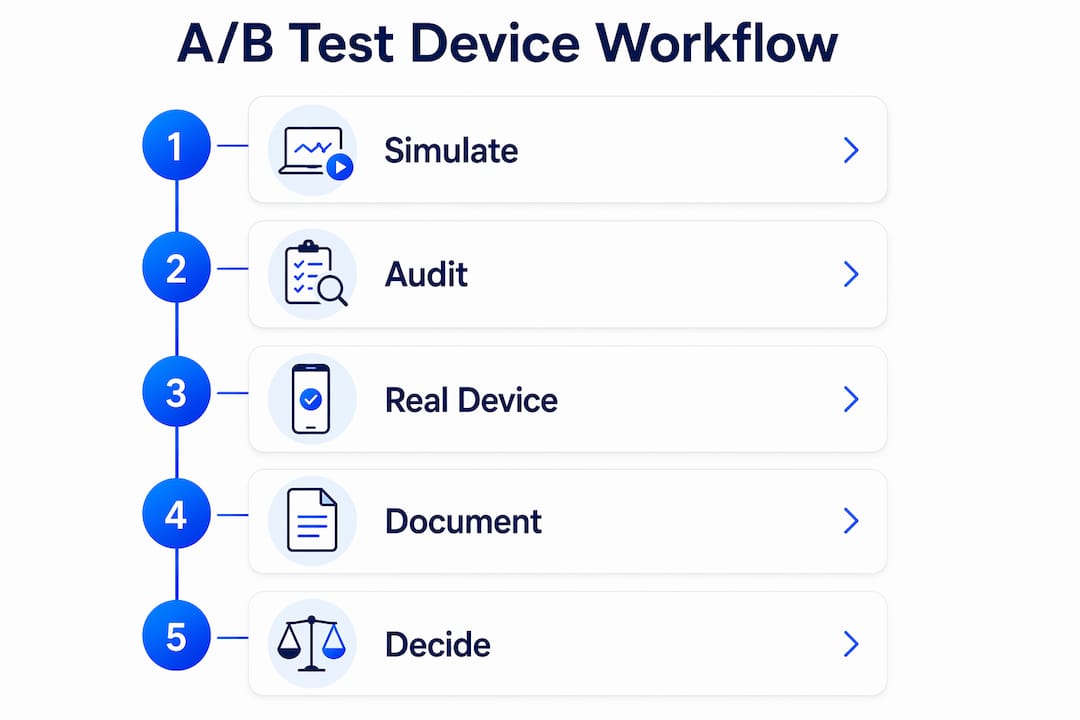
Run a three-step flow every time you test your website on different devices for an A/B experiment: simulate first in Chrome DevTools Device Mode, audit breakpoints visually with a multi-view grid, then validate problem areas on a real device or device cloud like BrowserStack. Skip any step and you risk shipping a variation that converts well on desktop but breaks on the phones that drive the majority of your traffic. Mobile accounts for roughly 60% or more of web traffic for most sites, which means a broken mobile layout isn't a minor issue — it's a conversion disaster hiding in your experiment data.
Table of Contents
- How to QA A/B Variations Across Every Device Type
- Which Tools Should You Use and When?
- What to Verify on Each Device During an A/B Test
- How to Reproduce Bugs That Only Appear on Real Devices
- Which Devices and Breakpoints Should You Actually Test?
- Productivity Hacks for Faster Multi-Device Audits
- How Long Does Device Testing Take, and What Does It Cost?
- When Is Physical-Device Testing Required?
- How Do OS Versions and Browsers Affect Rendering?
- How to Simulate Network Conditions During Device Tests
- Automated Cross-Device Testing at Scale
- How to Handle Device Orientation Changes in Tests
- How to Connect Device Test Results to Experiment Decisions
- Key Takeaways
- The Simulate-First Workflow Is Right, But Most Teams Apply It Too Late
- Gostellar Keeps Your A/B Tests Fast Across Every Device
- Useful Sources and Documentation
How to QA A/B Variations Across Every Device Type
A clean workflow keeps your experiment results trustworthy. Here's the sequence that works.
- Scope the variation first. Before touching any tool, list the device-critical elements in your variation: the CTA button, any sticky header, form fields, and hero image. This scoping step saves you from testing everything and catching nothing.
- Simulate in Chrome DevTools Device Mode. Open DevTools, toggle Device Mode, and check your target breakpoints. Confirm CSS renders correctly, DPR is set to match the target device, and touch events fire. This catches the obvious layout breaks in minutes.
- Run a synchronized multi-view grid. Load your staging URL in a multi-device preview tool to see mobile, tablet, and desktop panels side by side. Synchronized scrolling lets your eye catch breakpoint inconsistencies that single-device checks miss.
- Remote-debug on a real device or device cloud. When you spot a discrepancy or can't reproduce a simulator result, escalate. Connect an Android device via ADB for Chrome remote debugging, or use Safari Web Inspector for iOS. Capture console logs and network traces while reproducing the failing user flow.
- Validate experiment tracking before ramping traffic. Confirm event firing, experiment IDs, and goal attribution across every device/browser combo in your test matrix. A variation that fires the wrong event on iOS Safari will corrupt your results.
Pro Tip: Keep a version-control note in your experiment platform for each device test pass. When you toggle experiment flags during device QA, record which variation and build hash you tested so you can trace any regression back to a specific change.
Which Tools Should You Use and When?
The right tool depends on where you are in the workflow, not personal preference.
| Tool | Best For | Fidelity | Cost |
|---|---|---|---|
| Chrome DevTools Device Mode | First-pass CSS/breakpoint debugging | Medium (approximation only) | Free |
| Firefox Responsive Design Mode | Cross-browser layout checks | Medium | Free |
| Multi-view grid (e.g., Multi-Device Preview) | Visual audit across many breakpoints at once | Medium | Free / low |
| BrowserStack (device cloud) | Real OS/browser combos, device-specific behavior | High | Subscription |
| Chrome ADB remote debugging | Android device-only bugs, console/network logs | Highest | Free (device required) |
| Safari Web Inspector | iOS-specific rendering and JS issues | Highest | Free (Mac + device required) |
Chrome DevTools is explicitly a "first-order approximation" — it simulates DPR and touch events but does not run code on actual mobile hardware. That distinction matters most for performance and complex input flows. Firefox Responsive Design Mode covers the same ground for cross-browser checks and is worth running in parallel if your audience includes Firefox users.

Multi-device preview grids load your URL once and display it across 20+ device presets simultaneously. They're faster than switching emulator presets one by one, and the synchronized interaction lets you scroll all panels at once to spot layout breaks at a glance. Many also accept localhost and staging URLs, so you can QA pre-release variations without deploying to production.
Device clouds like BrowserStack are the right call when you need real OS and browser combinations — particularly for iOS Safari behavior, which simulators routinely misrepresent. Reserve them for high-traffic or high-revenue variations where fidelity justifies the cost.
Pro Tip: Save device presets and grid states in your multi-view tool after each audit. A named preset for "US mobile baseline" (375px, 412px, 768px, 1280px) means your next audit starts in 10 seconds, not 10 minutes.
What to Verify on Each Device During an A/B Test
Cross-device website testing for conversions means checking more than just layout. Here's what actually moves the needle.
Layout and responsive triggers
- Media-query breakpoints fire at the correct viewport widths
- CTA buttons remain fully visible and above the fold on mobile
- Text doesn't wrap in ways that truncate the value proposition
- iOS safe-area insets don't clip content on notched devices
Interaction and input
- Touch targets meet the 44×44px minimum (Apple's guideline) so taps register reliably
- Swipe and scroll behavior doesn't conflict with carousels or sticky elements
- Form fields trigger the correct keyboard type (numeric, email) on mobile
- Focus states are visible for keyboard navigation
Experiment tracking
- Experiment impression events fire on page load across all tested devices
- Goal events (clicks, form submits) attribute to the correct variation ID
- No duplicate or missing events in your analytics on iOS Safari vs. Chrome Android
Performance and third-party scripts
- First Contentful Paint stays within acceptable range under throttled network conditions
- Third-party scripts (chat widgets, tag managers) don't block experiment initialization
- Race conditions between your A/B script and analytics tags don't drop events
Accessibility basics that affect conversions
- Form labels are programmatically associated with inputs (not just visually adjacent)
- Touch spacing between interactive elements is sufficient for screen reader users
- Keyboard focus order follows a logical reading sequence through the variation
How to Reproduce Bugs That Only Appear on Real Devices
When simulators fail, remote debugging is the only path to a reliable fix.
Here's how to do it. For Android: enable Developer Options on the device, turn on USB debugging, connect via USB, and open chrome://inspect in desktop Chrome. Your device's open tabs appear there. Select the tab running your variation and you get a full DevTools panel — console, network, elements — against the live device. Capture a HAR file while reproducing the failing flow so you have a network trace to attach to your issue tracker.
For iOS: connect the iPhone or iPad to a Mac via USB, enable Web Inspector in Safari settings on the device, open the page in Safari on the device, then select it from the Develop menu in desktop Safari. You get the same console and network access.
If neither option is available, a BrowserStack session with screen recording and log capture gets you close. Record the session while reproducing the bug, download the video and logs, and attach them to the ticket.
Pro Tip: Run your remote debug session in a clean browser profile with no extensions and no experiment dev flags active. Extensions and flags introduce false positives that make real device bugs look like environment issues.
Which Devices and Breakpoints Should You Actually Test?
Start with your analytics, not a generic device list. Pull the top device families and OS/browser combos by sessions and by conversion rate — those two lists are often different, and both matter.
A solid US-focused baseline covers a range of typical viewport widths, including sizes common to popular smartphones, tablets, laptops, and desktops. Pair each width with the dominant browser for that form factor: iOS Safari for the iPhone sizes, Chrome for Android, and both Chrome and Safari for desktop.
Responsive testing tools typically include 20+ device presets covering these exact widths, so you don't have to configure them manually. Common presets include iPhone 15 Pro, Samsung Galaxy S23, iPad Pro, and standard desktop sizes.
Add a specific device model to your test matrix when a new OS version ships (iOS 18 and Android 15 both introduced rendering changes worth checking), or when analytics shows a high-converting segment concentrated on a single device family. A segment that converts at 2× the average rate deserves its own device test, not just a simulator pass.
Productivity Hacks for Faster Multi-Device Audits
Speed matters when you're running multiple concurrent experiments.
- Sync scrolling across all device frames using a multi-view tool so one scroll action reveals layout issues at every breakpoint simultaneously, cutting visual audit time significantly.
- Save named device presets for your most common test matrices so each new audit starts from a known state rather than manual configuration.
- Automate screenshots per variation using a tool that captures all device frames at once, then diff them against the control screenshots to catch unintended visual regressions.
- Use staging flags to serve the variation only to your QA devices, keeping the experiment off live traffic until device validation is complete.
- Attach visual diffs to experiment records so the decision to ramp traffic is backed by documented device coverage, not memory.
Pro Tip: Script a smoke test that loads your variation URL on three canonical devices (375px mobile, 768px tablet, 1280px desktop) and verifies that the experiment impression event fires on each. Run it before every traffic ramp.
How Long Does Device Testing Take, and What Does It Cost?
| Approach | Speed | Fidelity | Typical Cost |
|---|---|---|---|
| Chrome / Firefox DevTools | Minutes per variation | Medium | Free |
| Multi-view grid | — | Medium | Free to low |
| Device cloud (BrowserStack) | Hours per variation | High | Subscription / per-minute |
| Physical device lab | Hours per bug | Highest | Hardware + management overhead |
The decision rule is straightforward: use DevTools and multi-view grids for every variation, and escalate to a device cloud or physical device when the variation touches a high-revenue flow, complex inputs (payments, sensors), or when simulators produce inconsistent results. Device cloud costs are easy to justify when a single percentage-point lift in conversion on a high-traffic page outweighs a month of subscription fees.
When Is Physical-Device Testing Required?
Simulators are fast, but they have hard limits. Escalate to a real device when:
- An interaction bug (tap, swipe, scroll) doesn't reproduce in DevTools but appears in user session recordings
- Experiment analytics show measurement discrepancies between iOS and Android that can't be explained by browser differences alone
- The variation includes a payment flow, camera input, or any feature that accesses device hardware
- Performance regressions appear under real network conditions that throttled DevTools didn't surface
- A new OS version (iOS, Android) just shipped and your simulator hasn't been updated to match it
- A high-converting device segment (identified in analytics) shows anomalous behavior in your experiment data
When any of these triggers fire, book a device cloud session or grab a physical device before ramping traffic past 10%.
How Do OS Versions and Browsers Affect Rendering?
Platform-specific rendering differences are one of the most common sources of silent experiment failures. iOS Safari handles CSS differently from Chrome on Android — flexbox gap support, scroll behavior, and font rendering have all diverged at various OS versions. A variation that looks perfect in Chrome DevTools can display a broken layout in Safari 17 on iOS 16 because of how that specific OS version handles a CSS property.
The practical fix is to include at least two browser/OS combos in every test matrix: iOS Safari (latest and one version back) and Chrome on a modern Android. For desktop, add Firefox alongside Chrome. When a new major OS version ships, run a targeted compatibility check on your highest-traffic pages before that OS reaches significant market share in your analytics.
How to Simulate Network Conditions During Device Tests
Network throttling in Chrome DevTools lets you simulate 3G, 4G, and custom connection speeds directly in the browser. Open the Network panel, select a throttle preset, and reload your variation. This surfaces two common A/B experiment problems: third-party scripts that time out on slow connections before your experiment code initializes, and lazy-loaded elements that never appear because the connection drops before they load.
For more realistic conditions, use a device cloud session with real network throttling, or test on a physical device connected to a mobile hotspot throttled to a target speed. The difference between DevTools throttling and real network conditions is meaningful for anything involving video, large images, or multiple third-party tags.
Automated Cross-Device Testing at Scale
Manual device QA doesn't scale past a handful of concurrent experiments. Automated cross-device testing frameworks like Playwright and Selenium WebDriver let you script user flows and run them across multiple browser/device configurations in a single CI pipeline pass.
Playwright's device emulation covers a wide range of viewport sizes and user-agent strings, and it integrates with BrowserStack's cloud grid so the same test scripts run on real devices without manual setup. The practical setup for a growth team: write smoke tests for each variation's critical path (load page, see experiment, complete goal), run them on your baseline device matrix on every deploy, and flag failures before they reach live traffic.
Visual regression tools like Percy or Chromatic capture screenshots across device sizes and diff them against a baseline, surfacing layout changes that functional tests miss. Attach those diffs to your experiment record so the decision to ship is backed by documented visual coverage.
How to Handle Device Orientation Changes in Tests
Orientation changes are a common source of layout bugs that only appear in real use. A sticky CTA that works in portrait mode can overlap content or disappear entirely when a user rotates to landscape. Test both orientations for any variation that includes fixed or sticky elements, full-screen modals, or horizontal scroll components.
In Chrome DevTools, the rotate button in Device Mode toggles orientation and re-fires the relevant CSS media queries. For a more realistic test, use a multi-view tool that supports rotation per device frame, or test on a physical device where the accelerometer triggers the actual OS-level orientation change. The OS-level change sometimes produces layout recalculations that DevTools doesn't replicate exactly.
How to Connect Device Test Results to Experiment Decisions
Device test findings only matter if they feed into your experiment decision process. The practical workflow: document each device test pass in your experiment record alongside the variation build hash, the devices tested, and any issues found. When you analyze results, segment by device category (mobile vs. desktop) before looking at aggregate lift. A variation that shows a 15% lift on desktop and a 5% drop on mobile is not a winner — it's a problem that device testing should have caught before traffic ramped.
For experiment analytics, connect your device test checklist to the go/no-go criteria for traffic ramp. If device QA is incomplete, the experiment doesn't ramp past a defined threshold. This keeps device testing from being treated as optional and ensures your conversion rate optimization decisions are based on clean, device-validated data.
Key Takeaways
Reliable cross-device A/B testing requires a fixed sequence: simulate first, audit breadth with a multi-view grid, then validate fidelity on real devices before ramping any traffic.
| Point | Details |
|---|---|
| Simulate first | Chrome DevTools Device Mode catches CSS and breakpoint issues in minutes at no cost. |
| Audit breadth with multi-view | Synchronized multi-panel grids surface layout inconsistencies across 20+ presets in one pass. |
| Validate on real devices | Remote debugging via Chrome ADB or Safari Web Inspector is required when simulators produce inconsistent results. |
| Verify tracking before ramping | Confirm experiment IDs and goal events fire correctly on every device/browser combo before scaling traffic. |
| Gostellar for device-aware experiments | Gostellar's 5.4KB script minimizes performance impact during device QA, keeping test conditions clean across all device types. |
The Simulate-First Workflow Is Right, But Most Teams Apply It Too Late
Growth teams almost universally agree that cross-device testing matters. The gap is in timing. Most teams run device checks after a variation is already live, when they're trying to explain a confusing result rather than prevent one. By then, the experiment has been running for days on a broken mobile layout, and the data is compromised.
The simulate-first workflow described here isn't just a QA nicety. It's a data integrity practice. A variation that breaks on iOS Safari doesn't just lose conversions on that device — it introduces noise into your experiment results that can make a genuinely good idea look like a failure. The Chrome DevTools team's own framing of Device Mode as a "first-order approximation" is the honest starting point: use it fast, use it early, but don't stop there.
What growth teams consistently underestimate is how much OS-level rendering differences matter for experiment tracking, not just layout. An event that fires correctly in Chrome on desktop can silently fail on iOS Safari due to a script timing difference. That's not a layout bug. It's a measurement bug, and it's invisible unless you validate tracking on real devices before ramping traffic.
The simulate-to-validate sequence exists precisely to catch both categories of failure before they corrupt your data.
Gostellar Keeps Your A/B Tests Fast Across Every Device
Running device QA on a bloated experiment script defeats the purpose. Gostellar's A/B testing platform loads at just 5.4KB, so the script itself doesn't skew your performance measurements when you're testing under throttled network conditions or on lower-end mobile hardware.
The no-code visual editor lets you build and toggle variations without a developer, which means you can run device test passes on staging without waiting for an engineering deploy. Real-time analytics surface device-segmented results as traffic comes in, so you can catch a mobile-specific drop in conversion before it compounds. There's a free plan for sites under 25,000 monthly tracked users — a practical starting point for teams building out their device QA workflow before committing to a paid tier. Start your first device-aware experiment at gostellar.app.
Useful Sources and Documentation
Keep these references handy when you're working through remote debugging steps, configuring device presets, or setting up automated visual diffs.
- Chrome DevTools Device Mode documentation — authoritative guide to simulator capabilities and limitations, including the "first-order approximation" framing and remote debugging recommendations
- Multi-Device Preview tool — synchronized multi-panel viewer that accepts localhost and staging URLs
- Responsive Design Tester by Visiblytics — multi-view tool with 20+ device presets for fast visual audits
- Responsive Test Tool — iframe-based tester that accurately triggers CSS media queries; useful for breakpoint validation
- BrowserStack responsive testing — device cloud for real OS/browser combos when simulators fall short
- Responsive Viewer by BootstrapMade — synchronized interaction across multiple device frames for breakpoint audits
- Gostellar blog: browser testing guide — covers native browser features and third-party tools for multi-device previews
Recommended
Published: 7/29/2026