
Six Step UX Optimization Loop for Product Teams That Moves Metrics
UX optimization is the practice of measuring how people use a product, finding where they struggle, and fixing it in small, testable increments rather than one big redesign. It works because it's iterative and metric-driven, not because any single tactic is clever. The engine behind it is a loop: measure, diagnose, prioritize, fix, validate, monitor. Everything else in this guide is detail on how to run that loop well.
TL;DR:
- Prioritize small, testable fixes based on measurable user drop-offs and specific causes to ensure targeted improvements rather than broad redesigns.
- Use validated metrics like funnel analysis, session replays, and Core Web Vitals to identify where users struggle and confirm the success of UX changes.
- Reserve full A/B testing for structural or high-impact fixes, while deploying quick copy or layout tweaks with simple monitoring when the risk is low.
- Document each hypothesis with a clear change, target cohort, and expected effect, then run tests for at least two to four weeks to avoid premature conclusions.
- Continuously monitor post-release metrics for two to four weeks, ensuring no regressions and that improvements are durable before considering further changes.
Table of Contents
- What Is the UX Optimization Loop?
- High-Impact UX Tactics by Category
- Which KPIs and Tools Actually Reveal UX Problems?
- How Do You Prioritize and Design Trustworthy Experiments?
- Turning Fixes Into Shipped, Monitored Releases
- What Makes This Playbook Trustworthy in Practice
- Common Pitfalls That Derail UX Optimization Programs
- What Successful UX Optimization Looks Like in Practice
- Beyond Conversion: How UX Optimization Shapes Loyalty and Satisfaction
- When to Optimize Continuously vs. When to Redesign
- Try Fast, Low-Impact Testing With Gostellar
- Sources
- FAQ
What Is the UX Optimization Loop?
Most teams treat UX work as a backlog of opinions. The loop treats it as a discipline with six repeatable stages, each with a specific action attached.
Measure. Pull quantitative signals first: funnel drop-off, task completion, Core Web Vitals, session recordings flagged with rage clicks. You're looking for where behavior deviates from intent, not where your gut says something feels off.
Diagnose. Once you spot a drop-off, ask why. Watch five to ten session replays at that step. Read support tickets mentioning that page. Run a five-second usability test on the screen in question. The goal is a specific, falsifiable explanation, not "users are confused."
Prioritize. Score the fix against others in the queue (the next section covers the formula). Not every diagnosis deserves a build sprint.
Fix. Implement the smallest version of the change that tests the hypothesis. Resist the urge to bundle three fixes into one release.
Validate. Run an A/B test if traffic supports it, or a moderated usability test with 5 to 8 participants if it doesn't. Structured optimization loops that follow this measure-to-validate sequence turn small fixes into compounding gains rather than one-off wins that fade.
Monitor. Watch the metric for two to four weeks post-launch to confirm the win holds and doesn't regress elsewhere.
- Measure: instrument funnels, Core Web Vitals, and session replay tagging
- Diagnose: pair quantitative drop-off with qualitative replay and ticket review
- Prioritize: score against reach, severity, and effort
- Fix: ship the smallest testable version
- Validate: A/B test at scale, moderated test at low traffic
- Monitor: track for regression over two to four weeks
Quick fixes (copy tweaks, button contrast, field removal) don't need a full experiment; ship and monitor. Structural changes (navigation rework, checkout flow redesign) always warrant a proper A/B test or staged rollout, because the downside risk is bigger and harder to reverse. A reasonable cadence for most product teams is a weekly review of the metrics dashboard and a rolling two to three active experiments at any time, enough to keep momentum without diluting statistical power across too many simultaneous tests.
High-Impact UX Tactics by Category
Tactics only work when matched to the right problem. Here's where teams typically get the most return, organized by the area they touch.
-
Performance and perceived speed. Full load time matters less than what users perceive. Skeleton screens, optimistic UI updates, and prioritizing above-the-fold content for paint all make a page feel faster even when raw load time hasn't changed, a distinction Nielsen Norman Group's research on perceived performance backs directly. Pair that with Core Web Vitals fixes (compress hero images, defer non-critical JavaScript, lazy-load below-the-fold assets) and you address both the felt experience and the measured one.
-
Navigation and findability. Run a tree test before you touch the visual design of a menu. It's cheap and it tells you whether your category labels actually match how users think, independent of styling. Tune site search synonyms based on zero-result queries. Add breadcrumbs on any page more than two levels deep. Users don't get lost because your labels are ugly; they get lost because your labels don't match their mental model.
-
Forms and checkout. This is often the highest-leverage category on the list. Baymard Institute's checkout research documents that many sites can prune 20 to 60 percent of form fields without losing the information they actually need, and that alone lifts checkout completion. Add inline validation that fires on blur, not on submit, so errors surface before frustration compounds. Check tab order and keyboard access on every form. A field a mouse user glosses over can be a dead end for someone tabbing through.
-
Content and microcopy. Every CTA button should describe the outcome, not the mechanism: "Get my quote" beats "Submit." Use progressive disclosure for secondary options (advanced filters, optional fields) so the primary path stays uncluttered. Error messages need a way out, not just a description of what went wrong. "Enter a valid email" is a dead end; "Check for a typo in the part after the @" gives someone a next move.
-
Accessibility. WCAG 2.2 spells out concrete, testable requirements: a minimum touch target size of 24 by 24 CSS pixels for interactive elements, and specific contrast ratios for text against its background. These aren't abstract ideals. They're checkbox items your design system can enforce, and fixing them tends to improve usability for everyone, not just users with disabilities.
-
Mobile and responsive. Touch targets need real spacing, not just size, so adjacent buttons don't cause mis-taps. On-screen keyboards routinely cover the exact input field a user just tapped; test every form on an actual device, not just a resized browser window, because real-device testing catches keyboard-overlap and rendering issues emulators miss entirely.
Pro Tip: Before you fix anything on mobile, replicate the bug on three real devices spanning at least two OS versions. A layout bug that only appears on one Android build wastes a sprint if you build a fix nobody else needed.
Which KPIs and Tools Actually Reveal UX Problems?
Not every metric deserves your attention, and chasing the wrong one wastes a quarter. The KPIs worth tracking fall into two buckets: outcome metrics and friction metrics.
Outcome metrics tell you whether the experience is working: task completion rate, conversion rate by funnel step, time on task, and customer satisfaction (CSAT) scores collected right after a key interaction. Friction metrics tell you where it's breaking: drop-off rate at each funnel step, rage clicks (repeated rapid clicking that signals confusion or a broken element), and Core Web Vitals scores like Largest Contentful Paint and Cumulative Layout Shift.
Teams that combine quantitative funnel data with qualitative signals like session replay and rage-click tracking tend to find root causes faster than teams relying on either signal alone, according to Lyssna's practitioner research on UX measurement.
That mixed-methods point matters because numbers alone tell you where something breaks, not why. A 40 percent drop-off on a checkout step could mean a confusing form, a broken payment integration, or sticker shock at the shipping cost. Only a session replay or a five-minute moderated test tells you which.
Tool categories map cleanly to the KPIs they reveal:
- Analytics platforms surface funnel drop-off, conversion by segment, and time on task at scale.
- Session replay tools show you the actual click path, hesitation, and rage clicks behind a metric.
- Heatmaps reveal where attention and clicks concentrate on a given page layout.
- A/B testing platforms validate whether a fix actually moves the metric versus a control group. A UI/UX testing tool built for marketers rather than engineers keeps this loop inside the team that owns the hypothesis.
- Device labs or real-device testing services catch rendering and interaction bugs specific to hardware and OS combinations.
If you're starting an optimization program from zero, the minimum instrumentation is: page-level analytics with funnel tracking, session replay on your top three conversion paths, and a way to run at least a simple A/B test. Everything else is refinement.
How Do You Prioritize and Design Trustworthy Experiments?
Score every hypothesis before you build it. A simple formula works better than an elaborate spreadsheet: multiply reach, severity, and business impact, then divide by effort. Reach is how many users hit this issue. Severity is how badly it blocks them. Business impact is the metric it touches (revenue, retention, support load). Effort is engineering and design time to ship it. Prioritization scorecards built this way force faster decisions than long debate threads, because the math forces trade-offs into the open instead of leaving them implicit.
A testable hypothesis names three things: the specific change, the cohort it applies to, and the expected magnitude of the effect. "Removing the phone number field will increase checkout completion among mobile users by 3 to 5 percent" is testable. "Simplifying the form will help conversion" is not; it gives you nothing to falsify.
- Score every candidate fix on reach, severity, business impact, and effort before it enters a sprint.
- Write hypotheses with a named change, a named cohort, and an expected magnitude.
- Run tests for a minimum of one full business cycle, typically two to four weeks, so day-of-week and pay-cycle effects wash out.
- Don't call a test early just because one variant pulls ahead in the first three days.
Practitioner guidance on experiment design consistently points to that two-to-four-week window as the floor for defensible results when traffic allows it. Below that, a moderated usability test with a handful of participants is more honest than an underpowered A/B test dressed up with a p-value nobody should trust.
Pro Tip: Write the "we will consider this a failure if" condition into your hypothesis document before the test launches. It's the single easiest way to stop a team from rationalizing a flat result into a win after the fact.
Turning Fixes Into Shipped, Monitored Releases
A prioritized fix isn't done until it's a ticket with acceptance criteria, a rollback plan, and a monitoring window attached.
- Write the ticket with a measurable acceptance criterion. "Remove the company-name field from checkout; completion rate on mobile checkout increases without a corresponding increase in support tickets about missing invoices."
- Attach the measurement plan to the ticket. Specify which dashboard, which event, and who checks it daily for the first week.
- Include a rollback trigger. Define the threshold that pulls the change automatically, for example a 5 percent drop in the primary conversion metric within 48 hours.
- Run a QA pass on real devices, not just the staging environment on a desktop browser, especially for anything touching forms or mobile layout.
- Monitor for two to four weeks post-launch, watching both the target metric and adjacent metrics it could cannibalize, like support volume or a different funnel step.
Engineering handoff should include the exact event names already wired into analytics, so nobody ships a change that's technically live but invisible to measurement. That single gap, a shipped fix with no instrumentation, is the most common reason "optimization programs" produce no evidence six months in.
What Makes This Playbook Trustworthy in Practice
This guide leans on published usability research rather than opinion: WCAG's accessibility standards, Baymard's usability benchmarks, and Nielsen Norman Group's work on perceived performance. Those sources hold up because they're built on repeated observation across many products, not a single case.
Performance-first experimentation matters because tooling that slows a page down changes the very behavior you're trying to measure. A lightweight testing script reduces false negatives caused by the test itself degrading the experience it's supposed to improve.
That point deserves emphasis: an A/B testing tool that adds meaningful load time to a page is measuring a distorted version of your UX, not the real one. Gostellar's testing approach is built around a small script footprint for exactly this reason, since a heavy tag manager or testing script skews the very metrics teams rely on to make decisions.
.
.
Common Pitfalls That Derail UX Optimization Programs
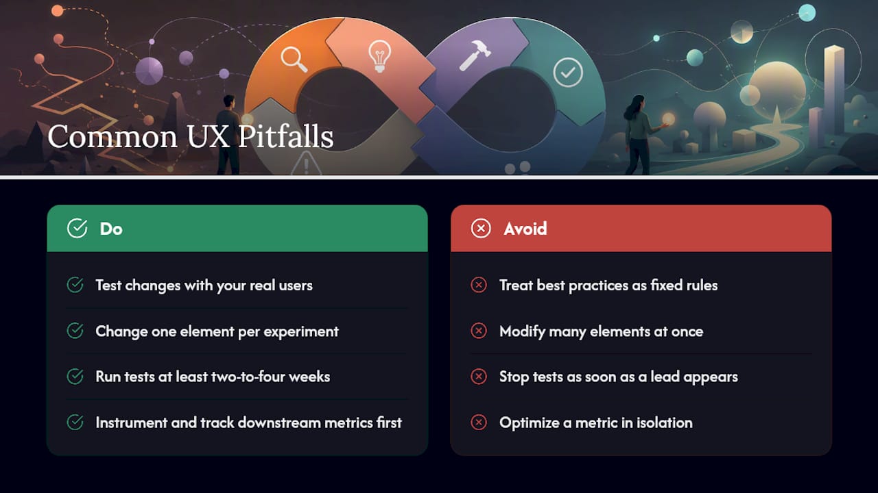
The most common mistake is treating best practices as rules instead of starting points. Baymard's usability research is explicit on this: what works for one user base can fail for another, and the only way to know is to test with your actual users, not copy a pattern because a bigger competitor uses it.
Second: teams change too many things in one release, then can't attribute the result to any single change. If completion rate moves after you touch five elements at once, you've learned that something worked, not what.
Third: stopping a test the moment it looks like a winner. Early leads regularly reverse once day-of-week effects average out, which is why the two-to-four-week minimum window matters more than eagerness to ship a result.
Fourth: optimizing a metric in isolation. A checkout flow that lifts conversion by removing a shipping-cost preview can quietly spike returns and support tickets, because the surprise moved from checkout to the customer's mailbox instead of disappearing.
Fifth: no instrumentation before the fix ships. Teams build the change, launch it, and only then realize nobody wired up the event to measure whether it worked. Instrumentation comes first, always.
Sixth: ignoring qualitative signals entirely. A dashboard tells you conversion dropped 8 percent on a page; it never tells you a form field triggers an autofill bug on one browser. That's what session replay is for.
What Successful UX Optimization Looks Like in Practice
The pattern behind most documented UX wins isn't a bold redesign. It's a narrow, well-measured fix applied to a specific point of friction. Baymard's checkout research is a good template for this: sites that pruned unnecessary form fields, most commonly things like a second address line or a company-name field nobody needed, saw completion rates improve without touching visual design at all.
The same pattern shows up in navigation work. A tree test revealing that users hunt for "returns" under a mislabeled "support" category, followed by a simple rename and a breadcrumb addition, routinely outperforms a full information-architecture overhaul, because it fixes the exact word mismatch causing the confusion instead of restructuring everything around it.
Performance fixes follow the same logic. Adding a skeleton screen during data fetch, rather than a blank white page, addresses the perceived-speed problem Nielsen Norman Group's research describes, often without touching backend load time at all. Users don't file complaints about your server response time. They abandon a page that feels unresponsive, which is a UX fix, not an infrastructure project.
The throughline across all of these: small, measured, validated changes stacked over months outperform an annual redesign gamble, because each one is tested against real behavior instead of a stakeholder's intuition about what should work.
Beyond Conversion: How UX Optimization Shapes Loyalty and Satisfaction
Conversion rate is the easiest metric to point to, but it's not the only one that moves when UX improves. CSAT scores collected immediately after a fixed interaction, like a simplified support form or a clearer error message, tend to shift faster than conversion does, because satisfaction reflects the friction someone just experienced, not a purchase decision made days later.
Retention responds to UX in a slower, compounding way. A product that consistently removes small frustrations, confusing navigation, slow load times, forms that reject valid input, builds trust that shows up months later as lower churn, even though no single fix explains the change on its own. That's a harder story to tell in a quarterly report, but it's the more durable one.
Support ticket volume is an underused signal here. A UX fix that eliminates a confusing step often shows up first as a drop in tickets referencing that step, before it ever shows up in a conversion dashboard. Teams that only watch conversion miss this leading indicator entirely.
Brand perception follows a similar lag. Users rarely praise a product for being "well optimized." They just don't think about it, because nothing got in their way. That absence of friction is what turns into word-of-mouth recommendation and repeat use, even though it never shows up as a line item in a UX audit.
When to Optimize Continuously vs. When to Redesign
Incremental optimization wins most of the time. Small, validated fixes compound faster than teams expect, and each one carries lower risk than a full redesign. A redesign is defensible only when the underlying information architecture no longer matches how the business or its users actually work, not because the visual design feels dated. The safest path combines both: keep the optimization loop running continuously, and reserve redesigns for structural mismatches the loop keeps surfacing but can't fix incrementally.
— Juan
Try Fast, Low-Impact Testing With Gostellar
Every tactic in this guide depends on one thing: the ability to test changes without the test itself distorting the experience you're measuring. That's the exact problem Gostellar was built to solve. Its script weighs 5.4KB, light enough that it doesn't introduce the page-slowdown artifacts that skew results on heavier testing platforms.
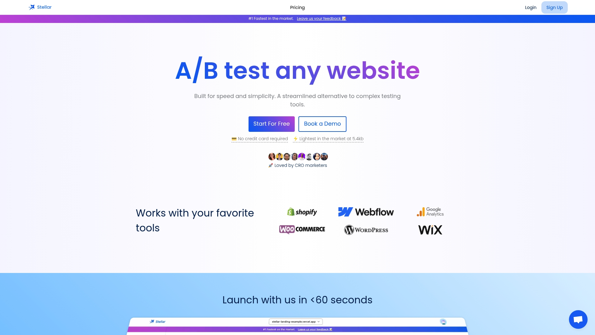
A lightweight footprint combined with a no-code visual editor allows marketers to launch checkout field tests or CTA copy variants without waiting on an engineering sprint. Dynamic keyword insertion can personalize landing pages by traffic source, and goal tracking can tie variants directly to conversion or completion metrics. A free plan is available for businesses below a monthly user tracking threshold, making it a practical way to run initial prioritized experiments. Explore Gostellar's web UX and A/B testing guide and start your first test on the metric you flagged as highest priority.
Sources
For deeper reference beyond this guide: the W3C's WCAG 2.2 target size guidance covers accessibility requirements in full detail. Baymard Institute publishes ongoing usability benchmark research across e-commerce and checkout flows. Nielsen Norman Group covers perceived performance and usability testing methodology in depth, and BrowserStack's UX optimization guide details real-device testing practices worth adopting alongside any A/B testing program.
- User Experience Optimization: 10 Steps to Improve UX in 2026
- Baymard Institute — UX research and usability benchmarks
- Understanding success criterion: target size (minimum) — W3C/WCAG 2.2
- Nielsen Norman Group — research on perceived performance and UX
- Optimize user experience — BrowserStack guide
FAQ
What Is UX Optimization?
UX optimization is the ongoing process of measuring how people use a product, diagnosing friction points, and shipping validated fixes through a repeatable loop rather than a single redesign.
What Is Optimal UX?
There's no universal "optimal" UX; the closest working definition is an experience validated against your specific users' actual behavior, since Baymard's research shows best practices are starting points, not guarantees, for any given audience.
What Is UI Optimization?
UI optimization focuses specifically on the visual and interactive layer, things like button placement, contrast, and touch target size, while UX optimization covers the full journey including flow, content, and findability.
What Are the Four Pillars of UX Strategy?
Definitions vary across practitioners, but a common framing covers research (understanding users), design (structuring the experience), testing (validating changes), and measurement (tracking whether fixes actually move outcomes), the same four pillars this guide's optimization loop is built around.
How Do I Know If My UX Fix Actually Worked?
Validate it with an A/B test run for a full two to four weeks when traffic allows, or a moderated usability test with 5 to 8 participants when it doesn't, and monitor the target metric for regression afterward. Tools like Gostellar's testing platform tie the fix directly to a measurable goal so the result isn't guesswork.
Recommended
Published: 9/12/2026