
Performance First Visual Website Optimization for SMB Marketers
Visual website optimization means combining behavioral data (heatmaps, session recordings, on-site surveys, funnel analytics) with structured experiments to improve how a site looks, feels, and converts. The core move is simple: capture visual evidence first, then run one prioritized A/B test against a single primary metric. Script weight and load timing are gating factors here. A heavy or poorly loaded testing snippet can undo whatever conversion lift the experiment produces.
TL;DR:
- Heatmaps should be analyzed first, filtering by device and traffic source, before running session recordings or A/B tests on the most problematic page elements.
- Session recordings reveal specific user frustrations like rage clicks, input errors, or reload loops that heatmaps cannot detect.
- A/B tests must be well-designed with a clear primary metric, appropriate sample size, and full duration, to avoid false positives and misinterpretations.
- Personalization works best when segments convert significantly worse than average, requiring small-scale testing and KPI tracking per segment instead of global changes.
- Visual and SEO performance are interconnected, so experiments must avoid slowing page load or causing layout shifts, which can negatively impact rankings and user experience.
Table of Contents
- What Is Visual Website Optimization? A Quick-Start Checklist
- How Do You Read Heatmaps Without Misreading Them?
- What Do Session Recordings Reveal That Heatmaps Miss?
- How Do You Design a Valid A/B Test?
- When Does Personalization Beat a Global Change?
- What Analytics Foundation Do You Need Before Testing?
- How Do You Keep Testing Scripts From Hurting Page Speed?
- Why Performance-First Tooling Matters for This Work
- What Should You Ask Visitors Directly?
- What Layout Principles Actually Drive Conversions?
- Does Color Choice Really Change Conversion Rates?
- How Should You Optimize Images and Video for Engagement?
- What Changes on Mobile That Desktop Testing Misses?
- What Accessibility Standards Should Every Visual Test Meet?
- How Does Visual Optimization Support SEO Goals?
- An Editorial Take on Running This Without Fooling Yourself
- Ready to Put This Playbook Into Practice?
- Sources
What Is Visual Website Optimization? A Quick-Start Checklist
Some marketers call this practice "visual website optimizer" work, a nod to the category of tools built to run it, but the discipline itself covers a stack of distinct techniques. Each one answers a different question, and running them in the wrong order wastes traffic.
- Heatmaps and scroll maps: show where attention concentrates and where it drops off. Run these first, before you touch a single pixel.
- Session recordings: reveal moment-by-moment friction that aggregate heatmaps miss, like a form field nobody can figure out.
- On-site surveys: capture the "why" behind the "what," directly from visitors who just experienced the friction.
- Funnel and form analytics: quantify exactly where drop-off happens across a multi-step process.
- A/B and multivariate testing: validate whether a proposed fix actually moves the metric, rather than just looking better.
- Personalization: applies a validated win to a specific segment instead of the whole audience.
Prioritize with a rough formula: impact times confidence times effort, biased toward low effort. For a mid-traffic site, a sane starter sequence is heatmap review, then three or four session recordings on the worst-performing page, then one A/B test on the highest-friction element you found. That sequence alone often surfaces the first real win within two to three weeks. For a deeper primer on how this fits into a marketer's broader workflow, see this web UX and testing guide.
How Do You Read Heatmaps Without Misreading Them?
Click maps, movement maps, and scroll maps each answer a different question, and conflating them is the single most common heatmap mistake. Click maps show where visitors actually tap or click, which is useful for spotting "false affordances," design elements that look clickable but aren't (or vice versa). Movement maps track cursor position on desktop, a rough proxy for visual attention. Scroll maps show the percentage of visitors reaching each depth of the page, which is invaluable for figuring out whether your call-to-action sits below the fold for most visitors.
None of these numbers mean much until you segment them. Filter by device first, since mobile traffic share varies significantly by region and mobile scroll behavior differs from desktop in ways that flatten out in an unsegmented aggregate. Then filter by traffic source and campaign. A heatmap blending organic visitors with a paid campaign audience will often show a muddled, contradictory picture.

Good heatmap anomalies turn directly into test ideas. If a scroll map shows 60% of visitors never reaching your pricing table, test moving it higher. If a click map shows visitors tapping a non-interactive image expecting it to expand, test making it a real link.
Pro Tip: Before you trust a heatmap pattern, check the sample size behind it. A striking "hot spot" built on 40 sessions from one referral spike is noise, not signal, so wait for a few hundred sessions per segment before drawing conclusions.
What Do Session Recordings Reveal That Heatmaps Miss?
Session recordings show individual user journeys frame by frame, which catches friction that aggregated heatmap data smooths over. You're watching for a specific set of behaviors:
- Rage clicks: rapid repeated clicking on an unresponsive element, a near-certain sign of broken expectations.
- Input errors: visitors typing into a form field, getting an error, retyping, and abandoning.
- Dead mouse movement: cursor idling in one spot for several seconds, often a sign of confusion or hesitation.
- Reload loops: visitors refreshing the same page repeatedly, usually chasing content that failed to load.
The real power shows up when you pair recordings with your event funnel.
One practical note on ethics: mask personally identifiable information such as payment fields and personal messages, and disclose recording practices in your privacy policy. Most session-recording tools offer field-level masking by default. Skipping this step isn't just a legal risk. It's a trust risk if a customer ever asks what your team can see.
The workflow that works: watch recordings until a pattern repeats across multiple sessions, write that pattern up as a specific hypothesis, then design the smallest possible test that could confirm or kill it.
How Do You Design a Valid A/B Test?
Visual testing tools have made experimentation dramatically faster than it used to be. What once required an engineering sprint to spin up a variant now takes a marketer an afternoon with a visual editor, which is exactly why experimentation velocity has increased so sharply across product and marketing teams. Speed is only useful if the underlying test design holds up, though.
- Choose A/B or multivariate based on your traffic. A/B tests compare two full variants and need less traffic to reach significance. Multivariate tests isolate the effect of individual elements (headline, image, button color) but need far more volume, generally reserved for higher-traffic pages.
- Set a minimum detectable effect (MDE) before launch. Deciding you need to detect a 10% relative lift, rather than "any improvement," determines your required sample size and prevents you from stopping early on noise.
- Pick one primary metric and commit to it. Conversion rate, click-through rate, or a specific goal completion, chosen in advance, not selected after the fact because it happened to move.
- Run the full planned duration, covering at least one full business cycle. A test that ends midweek misses weekend behavior; a two-week test that only captures one payday cycle misses seasonality.
- Resist checking results daily and declaring a winner early. Peeking at a dashboard and stopping the moment a variant looks ahead inflates your false-positive rate substantially.
- Act decisively once the test concludes. A validated winner gets rolled out to 100%, a segment-specific win becomes a personalization rule, and a loser gets rolled back without ceremony.
Documenting all of this in a short experiment brief before launch, hypothesis, primary metric, MDE, sample size, duration, and rollback criteria, catches most bad tests before they ever go live.
When Does Personalization Beat a Global Change?
Personalization makes sense when a segment behaves differently enough that a single global design would serve one group well and another group poorly. The most common vectors marketers use are campaign source, referrer domain, past behavior (returning visitor vs. new), UTM parameters, and geography.
The decision rule is straightforward: if a heatmap or funnel shows a segment converting meaningfully worse than your average, test a targeted change for that segment specifically rather than changing the experience for everyone. A campaign-specific landing page headline that matches the ad copy a visitor just clicked, for instance, often outperforms a generic headline built for the average visitor.
Track segment-specific KPIs rather than blended averages:
- Click-through rate on the personalized element itself.
- Conversion rate within that segment, compared against a held-out control from the same segment.
- Average order value, especially relevant for geo- or campaign-based personalization in e-commerce.
Roll out personalization the same way you'd roll out any risky change: seed it to a small slice of the qualifying segment, confirm the lift holds for a couple of weeks, then expand. Skipping the seed phase and pushing a personalized experience to 100% of a segment immediately is how teams end up chasing phantom wins that were really just a lucky week.
What Analytics Foundation Do You Need Before Testing?
Every visual experiment needs an event taxonomy mapped to funnel stages, or you'll spend more time arguing about what "engaged" means than analyzing what happened. Define events at each stage: page view, scroll depth marker, form field interaction, CTA click, and conversion. Name them consistently across every experiment so results are comparable months later.
- Exposure events: confirm a visitor actually saw the variant, not just that they were bucketed into it.
- Engagement events: scroll depth, time on page, interaction with the tested element specifically.
- Conversion events: the single primary goal you defined before launch.
Server-side tracking has a real advantage here: some testing plugins now support optional server-side event capture for e-commerce actions like add-to-cart and purchase, which improves reliability against ad blockers and browser privacy restrictions that routinely undercount client-side events. That gap between client-side and server-side counts isn't small on some sites, and it's worth auditing before you trust any dashboard number blindly.
Validate your tracking before trusting any result: fire a test conversion yourself, confirm it appears in the dashboard within the expected window, and check that the count matches across your testing tool and your primary analytics platform. Mismatched counts almost always mean a false positive is coming.
How Do You Keep Testing Scripts From Hurting Page Speed?
The single biggest technical risk in visual experimentation is the testing script itself. A heavy or badly loaded snippet can drag down Largest Contentful Paint and Cumulative Layout Shift, the exact metrics you're trying to protect while you optimize conversions. Most visual testing platforms work by inserting a JavaScript snippet in the page head, and how that snippet loads matters as much as how small it is.
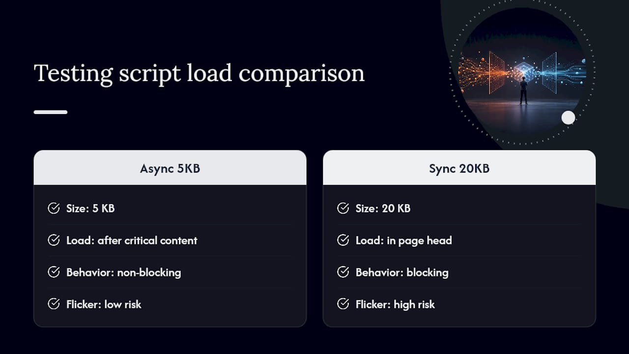
Flicker, that jarring flash where visitors see the original page before the variant swaps in, comes from exactly this client-side injection pattern. The standard fixes are asynchronous, non-blocking script loading, critical CSS that hides the original element until the variant renders, and, where feasible, server-side rendering of the tested variant so there's no visible swap at all.
Set up monitoring that flags regressions tied to a live experiment, not just overall site performance. If Core Web Vitals dip the same week a test launches, that's your rollback trigger, regardless of what the conversion number says.
Pro Tip: If you can only fix one thing about your testing setup, fix load order. A 5KB script loaded asynchronously after critical content almost always beats a 20KB script loaded synchronously in the head, even when the bigger script has more features.
Why Performance-First Tooling Matters for This Work
Every technique above depends on one unglamorous constraint: the tool running it has to stay out of the way. The tool was built around that constraint specifically, with a lightweight script that is designed to avoid becoming a performance bottleneck in the workflow described above.
The no-code visual editor maps directly onto the heatmap-to-test workflow. Marketers can build a variant from an observed friction point without waiting on a developer. Dynamic keyword insertion supports personalization patterns by matching landing page copy to campaign source without building separate pages for every segment. Goal tracking and real-time analytics cover the measurement foundation this guide keeps returning to: exposure, engagement, and conversion, visible as a test runs rather than after it ends. A free plan is offered for sites with limited monthly tracked users, allowing small teams to run this entire playbook before committing to a paid tier.
What Should You Ask Visitors Directly?
Behavioral data tells you what happened. On-site surveys tell you why, and that distinction matters more than most teams treat it. A heatmap showing hesitation near a pricing table is a hypothesis. A survey response saying "I couldn't tell if this included tax" is confirmation.
The most useful survey types are short and contextually triggered rather than generic. An exit-intent survey on a cart page asking "What almost stopped you from completing this purchase?" produces sharper answers than a generic "How are we doing?" popup on the homepage. Timing matters as much as wording: trigger the survey after a meaningful action (scroll past a certain point, time spent on a pricing page) rather than immediately on page load, which mostly captures annoyance rather than insight.
Keep surveys to one or two questions. Response rates fall fast past that, and a five-question popup on a checkout page will cost you more conversions than the insight is worth. Open-ended questions surface the friction points your heatmap missed entirely, especially around trust signals, pricing clarity, and shipping information, three of the most common reasons e-commerce visitors report abandoning a purchase according to UX research from Baymard Institute.
Route every survey response into the same backlog you use for heatmap and recording findings. Treated separately, survey insight tends to get siloed in a "customer feedback" folder that the optimization team never opens.
What Layout Principles Actually Drive Conversions?
Visual hierarchy determines the order in which visitors process a page, and getting that order wrong is one of the most common reasons a well-designed page still underperforms. The eye moves toward size, contrast, and whitespace before it moves toward color or decoration, which means your most important element needs to win on those three factors first, not just look prettiest.
A few layout principles hold up consistently across heatmap data: the top-left to bottom-right reading pattern common in left-to-right languages means your primary value proposition belongs in that path, not buried in a sidebar. Whitespace around a call-to-action increases the odds it gets clicked, because a crowded layout forces the eye to compete for attention among multiple elements at once. Grouping related elements (a product image, its price, and its "add to cart" button) tight together, while separating unrelated groups with clear spacing, reduces the cognitive work needed to parse a page.
The F-pattern and Z-pattern layouts, both well documented in eye-tracking research, aren't universal rules so much as defaults. A page with a strong single focal point, like a single hero product shot, often breaks the F-pattern entirely because visitors fixate rather than scan. That's exactly the kind of thing a heatmap will tell you about your specific page that a generic layout principle can't.
Test hierarchy changes one variable at a time. Moving a CTA above the fold, increasing whitespace around it, and changing its color in the same variant makes it impossible to know which change actually drove the result.
Does Color Choice Really Change Conversion Rates?
Color psychology gets oversold constantly, usually with claims like "red buttons convert better," stated as universal fact when the real driver is almost always contrast, not hue. A button that stands out sharply from its background will generally outperform one that blends in, regardless of whether that button is red, green, or blue. The color matters far less than whether it's the only saturated color on the page.
That said, color does carry contextual meaning that's worth respecting. Red and orange tend to signal urgency, which fits a limited-time offer but can feel jarring on a page meant to build trust, like a medical or financial services site. Blue reads as trustworthy and calm across a lot of Western contexts, part of why it dominates finance and healthcare branding. These associations shift by culture and industry, though, so treat them as a starting hypothesis to test, not a rule to apply blindly.
Contrast ratio matters for a second, less discussed reason: accessibility compliance. The Web Content Accessibility Guidelines set minimum contrast ratios (4.5:1 for normal text against its background) that many marketing pages quietly fail, especially light gray text on white backgrounds that looks stylish and reads as nearly invisible to anyone with low vision.
When you test color, isolate it. Change the button color alone in one variant, keep everything else identical, and let the heatmap and conversion data tell you whether the specific hue mattered or whether contrast against the surrounding page was doing all the work.
How Should You Optimize Images and Video for Engagement?
Visual content earns attention that plain text struggles to match, part of why visual content in marketing tends to generate dramatically more engagement than text-only pages. That engagement only helps conversion if the images and video load fast enough that visitors actually see them before bouncing.
Compress everything. Modern formats like WebP and AVIF cut file size substantially compared to standard JPEG without a visible quality loss, and that size reduction has a direct effect on Largest Contentful Paint, one of the Core Web Vitals metrics Google uses for ranking and one you're already protecting for your test scripts. Serve responsive image sizes rather than one large file scaled down by the browser. A hero image sized for a 4K desktop display has no business loading at full resolution on a phone screen.
Video needs different handling entirely. Autoplay video with sound is one of the most reliable ways to spike bounce rate, so default to muted autoplay with visible controls, or better, a static thumbnail that loads video only on click. Lazy-load any image or video below the fold so it doesn't compete with above-the-fold content for bandwidth during initial load.
When you A/B test creative assets, video against a static image is one of the more reliable test patterns worth running, since the two formats often produce meaningfully different engagement and conversion numbers on the same page, not always in the direction teams expect.
What Changes on Mobile That Desktop Testing Misses?
Mobile visitors don't just see a smaller version of your desktop page. They interact with it differently, scroll faster, and abandon friction points more quickly than desktop visitors typically do. Testing a layout only on desktop and assuming it translates is one of the more expensive mistakes a marketing team can make, especially given how large mobile's share of total traffic has become in most regions.
Thumb reach matters more than most desktop-trained designers account for. Primary actions belong in the bottom half of the screen where a thumb naturally rests, not stretched to the top where a two-handed reach is required. Tap targets need real size, generally at least 44 by 44 pixels, because a button that works fine with a precise mouse cursor becomes a frustrating miss-tap generator under a thumb.

Forms deserve particular attention on mobile. A multi-field form that feels reasonable on desktop can feel enormous on a phone screen, where each field requires a full keyboard switch and scroll. Test collapsing multi-step forms into fewer visible fields at once, and always match input types to content, a numeric keyboard for phone numbers, not a full alphabetic keyboard.
Run your heatmap and session recording review separately for mobile and desktop segments, never blended. A scroll map showing 70% depth on desktop might show 40% on mobile for the exact same page, and averaging the two tells you nothing true about either.
What Accessibility Standards Should Every Visual Test Meet?
Accessible design isn't a separate initiative from conversion optimization. It's frequently the same fix applied for a different stated reason. A button with sufficient color contrast helps a visitor with low vision and also helps every visitor scanning quickly on a bright phone screen outdoors.
The Web Content Accessibility Guidelines (WCAG) give concrete, testable standards rather than vague good intentions: minimum contrast ratios, keyboard navigability for every interactive element, and descriptive alt text for images that convey information rather than decoration. Run any new test variant through an automated checker before launch. It catches contrast failures and missing alt text in minutes.
A few practices matter enough to call out specifically. Never rely on color alone to convey meaning, a red border on an invalid form field needs an accompanying text message, because color-blind visitors won't catch the visual cue alone. Keep font sizes above 14 pixels for body text, and never disable pinch-to-zoom on mobile, a practice that actively harms visitors with low vision and violates accessibility guidelines outright.
Test variants for accessibility the same way you test them for conversion, before rollout, not after a complaint arrives. A variant that lifts conversion 8% while quietly breaking keyboard navigation for screen reader users isn't a win. It's a liability wearing a win's clothing, and it usually gets caught eventually, at a worse time than launch week.
How Does Visual Optimization Support SEO Goals?
Visual changes and SEO performance are more connected than most marketing teams treat them, mostly because both disciplines answer to the same underlying signal: Core Web Vitals. A visual experiment that slows page load to test a flashier hero image can quietly cost search ranking even while it lifts on-page conversion, and few teams check both numbers together.
Image optimization work, the compression and responsive sizing covered earlier, directly supports SEO through faster Largest Contentful Paint scores. Alt text written for accessibility doubles as a ranking signal search engines use to understand image content, so writing genuinely descriptive alt text serves two goals with one pass of work.
Layout stability matters just as much. Cumulative Layout Shift, one of the three Core Web Vitals, penalizes pages where content jumps around as it loads, exactly the failure mode that sloppy client-side test injection creates. A test variant that causes visible layout shift during the swap-in is hurting your search ranking on every single page view, tested or not, for as long as that variant runs.
The practical rule: treat your SEO monitoring dashboard as a permanent participant in every visual experiment, not a separate concern checked quarterly. A conversion win that erodes organic search traffic over the following months isn't a net win. It just moves the cost to a line item nobody's watching that week.
An Editorial Take on Running This Without Fooling Yourself
Governance sounds bureaucratic until you've watched a team ship a "winning" variant that was actually a false positive from a badly designed test. Three rules prevent most of that damage: keep an experiment registry so nobody re-runs a test you already killed, name experiments and variants consistently so results are comparable six months later, and commit to exactly one primary metric before launch, not after you see which number moved.
If you're starting from nothing, run these three first: a heatmap-driven fix to your worst-performing above-the-fold element, a mobile-specific form simplification, and a personalized headline matched to your top paid campaign. All three tend to surface a real signal within a few weeks on medium-traffic sites, and all three teach you something about your specific audience that no generic best-practice list ever will.
— Juan
Ready to Put This Playbook Into Practice?
Everything in this guide depends on tooling that doesn't get in its own way, and that's the specific gap Gostellar was built to close. The no-code visual editor lets you turn a heatmap finding into a live variant the same afternoon, without filing an engineering ticket. Its script stays light enough that flicker and load-time regressions, the technical risks covered earlier, rarely become a rollback trigger. Dynamic keyword insertion handles the personalization patterns from this guide directly, and goal tracking paired with real-time analytics gives you exposure, engagement, and conversion numbers while a test is still running, not three weeks later in a report nobody reads.
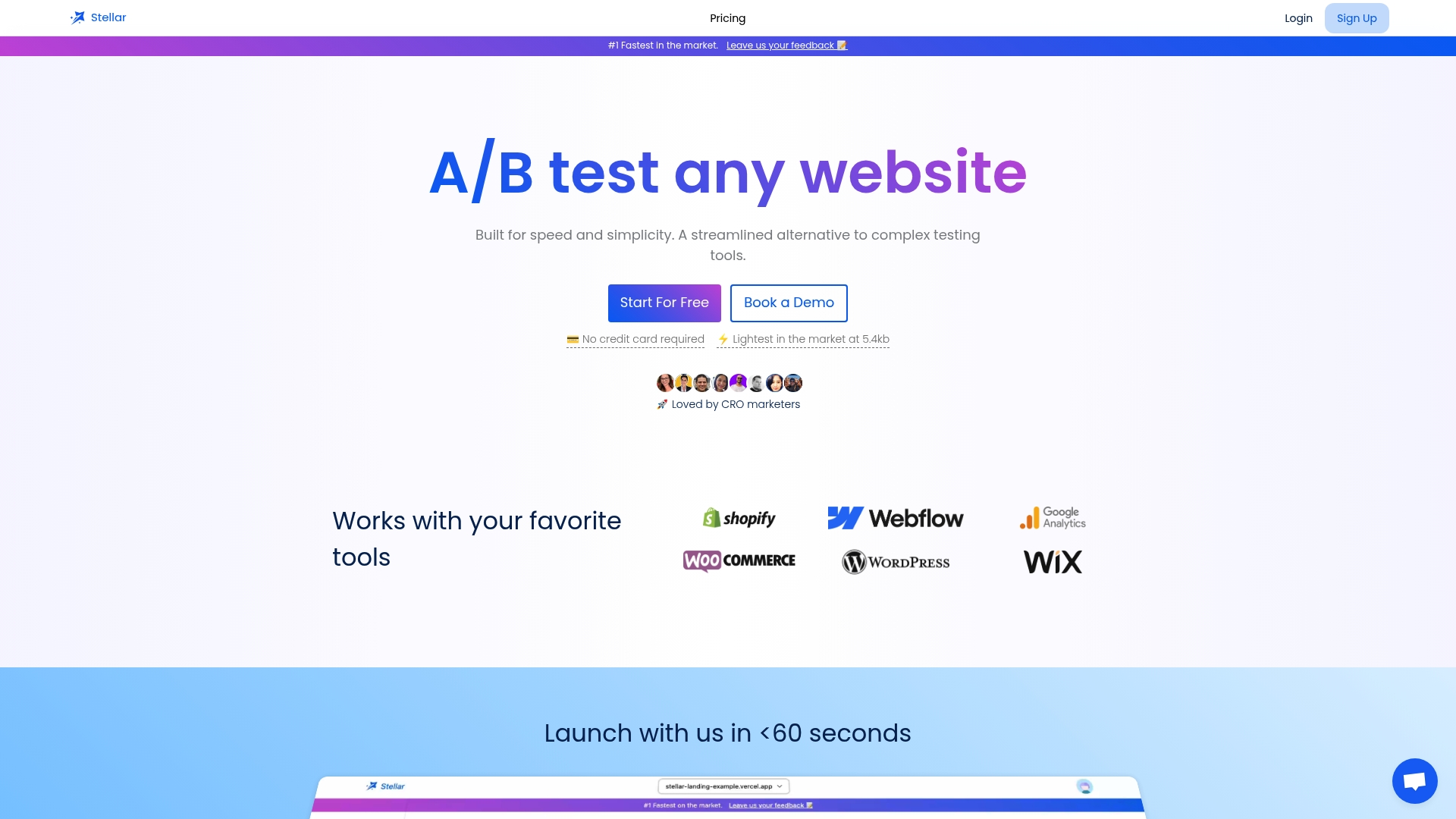
The tool integrates directly with WordPress, Shopify, Webflow, Wix, Squarespace, Framer, and Bubble, so setup rarely requires developer involvement. For sites running fewer than 25,000 monthly tracked users, a free plan is available that covers most of the starter sequence described in this guide. Start a free trial at Gostellar and run your first heatmap-driven test this week.
Sources
For strategic sequencing across a full testing calendar, see landing page A/B testing strategies for 2025. For a quick list of starter experiments, see 10 A/B testing ideas.
- A/B testing in product management — GeeksforGeeks
- Share of mobile internet traffic in global regions — Statista
- Drupal
Recommended
Published: 9/5/2026