
8–10 Metric Dashboard: Web Metrics Analytics for Marketers
Web metrics analytics is the process of measuring and interpreting a focused set of outcome-driven metrics, paired with qualitative signals, to drive repeatable improvements in traffic, engagement, and conversions. The immediate move: pick 3-5 conversion goals, build a primary dashboard of 8-10 metrics tied directly to them, and pair that dashboard with session replay or heatmap data to explain the "why" behind every number.
TL;DR:
- Tracking a few key metrics linked to specific conversion goals enables faster decision-making and avoids information overload.
- Combining quantitative tools like GA4 with qualitative insights from session recordings and heatmaps improves diagnosis and fixing of issues.
- Privacy measures and ad blockers can skew data unless filtered with proper tagging, bot filtering, and privacy-first analytics tools.
- React to metric changes with a structured process: detect, diagnose, act, then verify through targeted experiments to ensure lasting improvements.
- Effective reports pair metric fluctuations with behavioral explanations from session recordings and heatmaps, not just raw numbers.
Table of Contents
- What Do Web Metrics and Web Analytics Actually Measure?
- Why Does Tracking Website Metrics Actually Matter?
- Which Metrics Should You Track in Each Category?
- How Do You Choose and Prioritize the Right Metrics?
- What Tools Belong in Your Analytics Stack?
- How Do You Build a Dashboard and Set Useful Alerts?
- How Do Privacy Rules and Bad Data Distort Your Metrics?
- What's the Framework for Turning a Metric Change Into Action?
- What Do Real Web Metrics Reports Look Like in Practice?
- A Marketer's Take on What Actually Moves the Needle
- How Gostellar Helps You Act on Metrics Faster
- Sources
What Do Web Metrics and Web Analytics Actually Measure?
Every visit to a website generates raw events: clicks, page loads, form submissions, scroll depth. Web analytics platforms group those events into sessions, users, and funnels, then turn them into metrics you can actually act on. That processing step matters. A raw event log tells you someone clicked a button 4,000 times last week; a metric tells you your checkout completion rate dropped 6 points after a design change.

Modern web analytics organizes this data across four layers: traffic and acquisition, engagement and behavior, conversion and revenue, and performance or friction. Each layer answers a different question. Traffic tells you who showed up. Engagement tells you what they did. Conversion tells you whether it worked. Performance and friction tell you what got in the way.
Why Does Tracking Website Metrics Actually Matter?
Metrics exist to prioritize work, not to fill a slide deck. A marketing team staring at ten possible fixes needs a way to rank them by expected impact on revenue or conversion, and that's what a clean metrics setup gives you.
Diagnostic metrics tell you why something happened; descriptive metrics tell you what happened. A pageview count is descriptive. A funnel drop-off rate segmented by traffic source is diagnostic, and it's the kind of number that tells you where to spend next month's dev hours.
Pro Tip: When a metric moves, ask whether it's descriptive or diagnostic before you react. Descriptive shifts often just reflect seasonality; diagnostic shifts usually mean something on your site actually broke or improved.
Teams that build dashboards limited to ten metrics or fewer tend to make faster decisions, largely because nobody's scrolling past 40 rows trying to guess which number matters this week.
Which Metrics Should You Track in Each Category?
Most credible guides on this topic, including Deloitte Digital's breakdown of website metrics, converge on five categories. Here's what each one covers and why it earns a spot on your dashboard.
Traffic and acquisition metrics show you who's arriving and from where: sessions by channel, new versus returning visitors, cost per session for paid traffic. These numbers answer "is the top of the funnel healthy," nothing more.
Engagement metrics have quietly changed shape over the past few years. Classic bounce rate is fading in favor of engaged-session rate, which counts sessions with meaningful interaction (scroll depth, multiple pageviews, time thresholds) rather than just "did they leave from one page." Engaged-session rate is a better proxy for content quality because it doesn't punish a single well-answered landing page the way bounce rate does.
Conversion and revenue metrics are where the business case lives: conversion rate by page, funnel drop-off at each step, revenue per session. These are the outcome metrics your dashboard should orbit around.
Performance metrics center on Core Web Vitals, the three scores Google uses to judge loading speed (LCP), interactivity (INP), and visual stability (CLS). Slow, jumpy pages bleed conversions before a visitor ever reaches your offer.
UX and friction metrics catch what the aggregate numbers miss: rage clicks (repeated frantic clicking on something unresponsive), dead clicks, form abandonment rates, and the session recordings that show exactly where someone gave up.
- Traffic and acquisition: sessions by channel, cost per session, new vs. returning visitors
- Engagement: engaged-session rate, pages per session, average engagement time
- Conversion and revenue: conversion rate by page, funnel drop-off, revenue per session
- Performance: LCP, INP, CLS, server response time
- UX and friction: rage clicks, dead clicks, form abandonment rate
How Do You Choose and Prioritize the Right Metrics?
Start from your conversion goals, not from a list of every metric your analytics tool can produce. Pick 3-5 goals (newsletter signups, checkout completions, demo requests) and work backward to the metrics that actually move them.
- List your 3-5 core conversion goals for the current quarter.
- For each goal, identify one or two metrics that directly reflect progress toward it.
- Cap your primary dashboard at 8-10 metrics total, favoring outcome metrics like conversion rate by page and revenue per session over exploratory ones.
- Build separate tactical dashboards for exploratory or channel-specific metrics that don't belong on the main view.
- Segment every core metric by device, channel, and new versus returning visitors before you trust it.
Pro Tip: Before adding any metric to the primary dashboard, ask: "Would a 20% change in this number change what we do next week?" If the answer is no, it belongs on a secondary dashboard, not the main one.
What Tools Belong in Your Analytics Stack?
No single tool covers every layer of web metrics analytics well, which is why most working stacks combine two or three platforms with distinct jobs, including tools to optimize your website for AI search engines.
- Google Analytics 4 handles baseline traffic, acquisition, and conversion tracking. It's the default starting point for most teams and the source of your primary dashboard's core numbers.
- Microsoft Clarity adds free session recordings, heatmaps, and AI-generated summaries that show you exactly where users get stuck, something GA4's aggregate numbers can't do on their own.
- Hotjar covers similar qualitative ground, with heatmaps and recordings aimed at UX and CRO teams running structured experiments.
- Amplitude steps in once you need cohort analysis, retention curves, and funnel comparisons across a product rather than just a marketing site.
- Plausible offers a lightweight, cookie-free alternative for teams that want core traffic metrics without the compliance overhead of a full consent stack.
A sensible starter stack: GA4 for quantitative tracking, Clarity for free qualitative diagnosis, and Amplitude added once you're running cohort-level or product-led experiments.
How Do You Build a Dashboard and Set Useful Alerts?
A dashboard only earns its place if someone actually changes behavior because of it.
- Group your 8-10 primary metrics by category (traffic, conversion, performance) rather than listing them alphabetically.
- Set alert thresholds on metrics where a sudden change signals a real problem, like a 15% drop in checkout conversion or a Core Web Vitals score crossing into "poor."
- Review daily for alerts, weekly for trend direction, and immediately after any experiment or launch.
A landing-page campaign dashboard, for example, might track sessions by source, engaged-session rate, form completion rate, LCP, and revenue per session, all on one screen.
How Do Privacy Rules and Bad Data Distort Your Metrics?
Consent banners and ad blockers quietly suppress a chunk of your event data before it ever reaches your reports, which skews conversion rates and undercounts real traffic. Bot filtering, consistent event naming conventions, and proper cross-domain tagging catch a lot of that noise before it reaches your dashboard.
Privacy-first tools like Plausible often produce cleaner data by avoiding consent-layer complexity entirely, since there's less tracking infrastructure to fail or get blocked in the first place.
What's the Framework for Turning a Metric Change Into Action?
When a number moves, resist the urge to react immediately. Run it through four steps instead.
- Detect the change through an alert or a scheduled segmentation review.
- Diagnose the cause using session replay and funnel breakdowns rather than guessing from the aggregate number alone.
- Act by launching a targeted experiment or shipping a fix based on what the replay actually showed.
- Verify by checking the same metric post-change and updating your dashboard if the underlying goal has shifted.
Pro Tip: Never skip the verify step. A fix that looks successful in week one sometimes reverts once novelty wears off, especially with UX changes tied to a redesign.
What Do Real Web Metrics Reports Look Like in Practice?
A useful metrics report rarely looks like a wall of numbers. It looks like a short narrative built around one or two decisions.
Take a typical mid-funnel scenario: a marketing team notices engaged-session rate holding steady while conversion rate by page slides for three straight weeks on a key landing page. A heatmap review shows visitors scrolling past the primary call-to-action entirely, distracted by a new testimonial block placed above it. The fix isn't a redesign. It's moving one element. Revenue per session on that page recovers within the following reporting cycle.

Another common pattern shows up in website user journey analysis: a checkout funnel with a 40% drop at the shipping-information step. Session recordings reveal a form field silently rejecting valid ZIP codes on mobile. No dashboard alert would have caught this on its own. The metric flagged the symptom; the qualitative layer diagnosed the cause.
The pattern across both examples holds regardless of industry: the quantitative dashboard tells you where to look, and the qualitative layer tells you what to fix. Reports that pair a specific metric movement with a specific behavioral explanation get acted on. Reports that list forty numbers with no story attached tend to get filed away and forgotten.
A Marketer's Take on What Actually Moves the Needle
Most teams over-invest in dashboard breadth and under-invest in the qualitative layer that explains why a number moved. A conversion rate by itself is a symptom, not a diagnosis. Pairing outcome metrics with tools like Microsoft Clarity or reviewing a practical analytics guide closes that gap faster than adding another chart ever will.
— Juan
How Gostellar Helps You Act on Metrics Faster
Once your dashboard flags a conversion problem, the next question is always the same: how fast can you test a fix? The platform runs on a script weighing just 5.4KB, minimizing load-time impact that could affect Core Web Vitals scores.
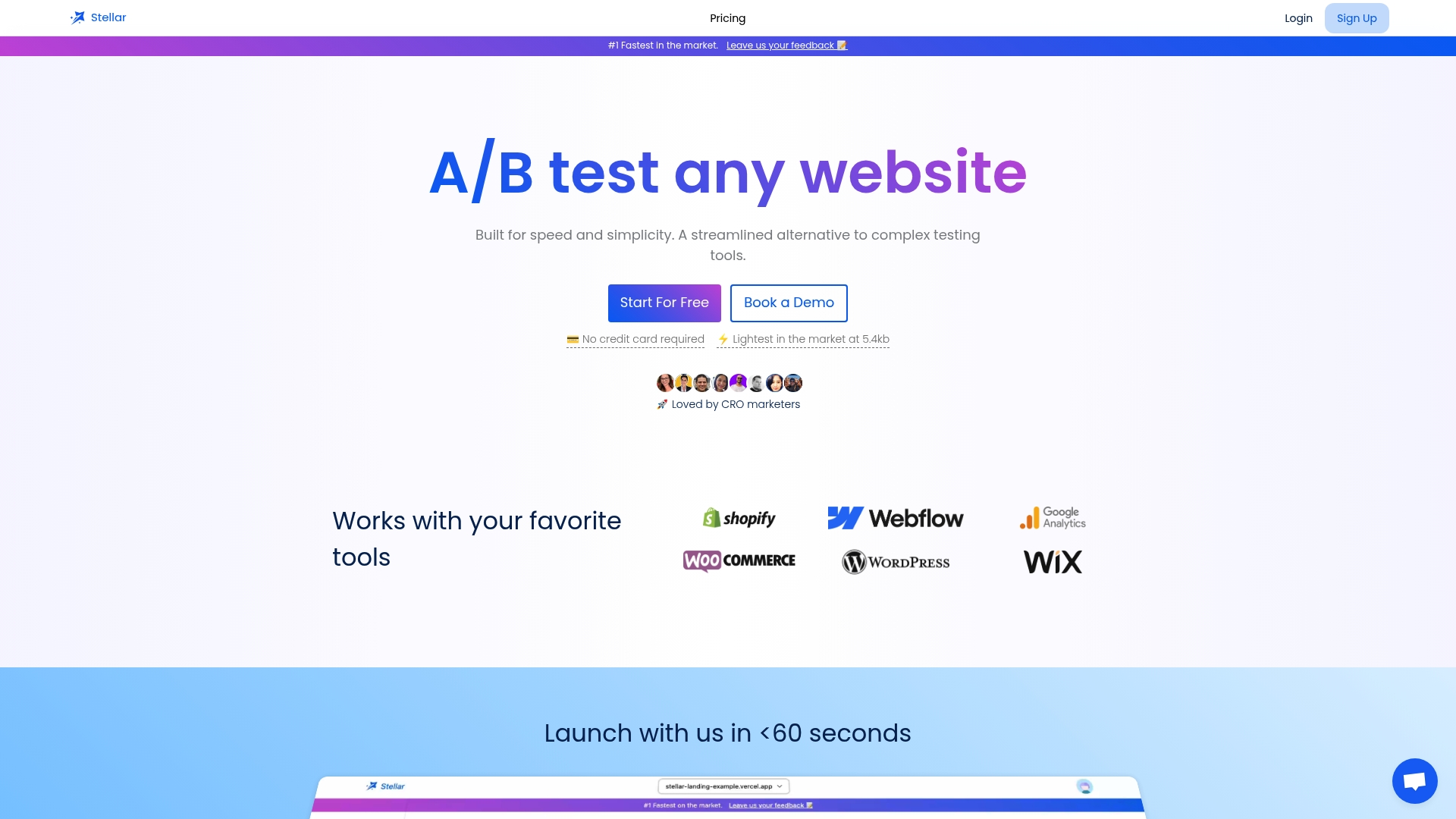
A no-code visual editor enables quick launch of variants when a heatmap reveals a problem, without requiring a developer sprint. Dynamic keyword insertion can personalize landing pages by traffic source, and built-in goal tracking links tests to conversion metrics on a dashboard. Teams can start on a free plan designed for moderate monthly tracked users and scale up as traffic grows. If your dashboard just flagged a page that's underperforming, start a free Gostellar trial and turn that diagnosis into a live test today.
Sources
- What is web analytics? Definition, metrics & how it works.
- What Is Web Analytics? Definition, Metrics, and Top 10 Tools
- Microsoft Clarity
- Web Analytics Platform by Amplitude
Recommended
Published: 9/3/2026