
Website User Flows: A Conversion-First Guide for Growth Teams
A website user flow is a visual diagram mapping every sequential step a user takes to complete a specific task, where nodes represent screens or decision points and arrows represent the actions that move them forward. Get that diagram right and you have a direct blueprint for A/B tests. Flow-informed UI changes have produced notable conversion uplifts and significant revenue increases in documented product-led growth scenarios. Every node in a finished flow is a testable hypothesis waiting for GA4 event tracking to confirm or kill it.
- A flow is task-scoped and UI-level: checkout, signup, onboarding.
- Nodes map to screens; decision diamonds map to branch conditions.
- Each node becomes an experiment candidate once behavioral data shows drop-off.
Table of Contents
- What website user flows actually look like
- User flows vs. user journeys: which one do you actually need?
- How to design a testable user flow in five steps
- Tools and templates to sketch, share, and prototype flows
- How to turn a flow node into a valid A/B test
- Which metrics validate a finished flow
- Common pitfalls that kill conversions
- Checkout and signup flow templates with test ideas
- Realistic time and resourcing estimates
- Your pre-launch flow-to-experiment checklist
- Key Takeaways
- Why the flow-first approach actually works
- Run flow-driven A/B tests faster with Gostellar
- Useful sources and further reading
What website user flows actually look like
Four visual forms cover most situations you will encounter.
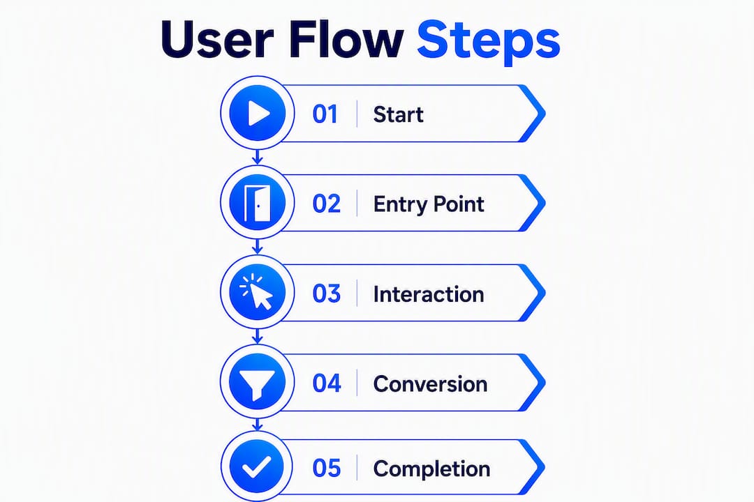
| Flow Type | Best For | Fidelity |
|---|---|---|
| Flowchart | Logic-heavy paths with many branches | Low |
| Wireflow | Connecting UI layout to navigation logic | Medium |
| Linear funnel | Single-path conversions (checkout, signup) | Low–Medium |
| Branching/conditional | Personalization, segmented entry points | Medium–High |
Standard symbols keep diagrams readable across teams: ovals mark start and end points, rectangles represent screens or actions, diamonds signal decision points, and parallelograms indicate user input fields. Stick to these UML conventions and any engineer or PM can read your diagram without a walkthrough.
Keep flows to 5–7 steps to minimize cognitive load, since longer paths can cause substantial drop-off in non-optimized e-commerce sites. A minimal flow fits on one screen and communicates the critical path at a glance. Reserve branching flows for situations where segmented entry points genuinely require different paths, such as a paid-ad landing page versus an organic product page.
Pro Tip: Sketch mobile first, always. With mobile accounting for about 61.95% of web traffic, a flow that looks clean on desktop can collapse into an unusable tap-target nightmare on a 375px screen. Draw the mobile version before you touch a desktop wireframe.
User flows vs. user journeys: which one do you actually need?
The short answer: flows are tactical and UI-level, taking minutes to complete within a single product. User journeys are holistic and multi-touch, spanning hours to months and capturing emotions, channels, and touchpoints outside your product.
| Dimension | User Flow | User Journey |
|---|---|---|
| Scope | Single task inside one product | Full experience across channels |
| Time horizon | Minutes | Days to months |
| Output | Testable screen-by-screen diagram | Strategic alignment artifact |
| Best for | A/B test planning, sprint work | Retention initiatives, stakeholder buy-in |
Choose a flow when you are planning a checkout conversion experiment or instrumenting a signup funnel for a sprint. Choose a journey map when you are diagnosing a retention problem that spans email, in-app, and support touchpoints over weeks.
- Use a flow for: A/B test hypothesis generation, sprint planning, engineering handoff.
- Use a journey for: cross-channel retention work, stakeholder alignment, emotional pain-point discovery.
- Use both when: a journey reveals a strategic gap and a flow operationalizes the fix.
How to design a testable user flow in five steps
This process ends each step with an experiment-ready output.
-
Define the conversion goal and primary KPI. Name the exact action that counts as success: a completed purchase, a confirmed signup, a scheduled demo. Attach one primary metric (conversion rate, revenue per session) and one guardrail metric (error rate, time to completion) before you draw a single box.
-
Identify entry points and device mix. List every channel feeding the flow: paid search, organic landing pages, email campaigns, direct. Note the device split from GA4. A paid-ad visitor landing on a product page carries different intent than someone arriving from a blog post, so each entry point may need its own starting node.
-
Map screens and decision points with staged fidelity. Start on paper or a whiteboard. Sketch the critical path first, then add decision branches. Promote to a wireflow only after the logic is stable. Trying to polish visuals before the logic is settled wastes everyone's time.
-
Sketch in Figma or FigJam and annotate GA4 events. Figma handles polished wireflows; FigJam is faster for collaborative workshops. On each node, annotate the GA4 event name you will fire:
add_to_cart,begin_checkout,sign_up. This annotation becomes your instrumentation spec for engineering. -
Validate against behavioral data and convert nodes to A/B tests. Pull GA4 funnel reports and Hotjar heatmaps. Where drop-off is highest, that node becomes your first experiment. Behavioral data confirms whether your assumed critical path matches how users actually move.
Pro Tip: Run a 60–90 minute FigJam workshop with your PM, UX designer, and one engineer before committing to a flow. About 64% of UX teams build these artifacts collaboratively to reduce silos. Shared ownership means faster experiment sign-off.
Tools and templates to sketch, share, and prototype flows
Diagramming: Figma for polished wireflows and handoff; FigJam for real-time collaborative sketching during workshops. Both support comment threads, which keeps feedback in context.

Analytics: GA4 for funnel visualization and event-based drop-off analysis. Set up a custom funnel exploration with each flow node as a step. The funnel report shows exactly where users exit.
Session replay and heatmaps: Hotjar surfaces click patterns, scroll depth, and rage clicks that a diagram cannot predict. Use it to validate whether users are actually following the path you designed.
Event-based analytics: Mixpanel lets you query user-level event sequences, making it easier to identify which segment of users drops off at a specific node versus completing the flow.
Signup flow template: Landing page → value proposition screen → social or email signup choice → email verification or OAuth redirect → onboarding trigger. Annotate each node with the GA4 event and the micro-copy variant you want to test.
Checkout flow template: Product page → add to cart → shipping details → payment → order confirmation. Flag the shipping and payment nodes immediately: U.S. checkouts typically have an average of about 23.48 form elements, making field reduction the highest-leverage test target in the entire flow.
Pro Tip: Share the finalized flow diagram in your team's Notion or Confluence page, not just in Figma. Engineers who can reference the flow during implementation catch edge cases (expired sessions, failed payments) before they become production bugs.
How to turn a flow node into a valid A/B test
-
Identify high-leverage nodes. Look for the step with the steepest drop-off in your GA4 funnel report or the highest rage-click density in Hotjar. That node is your first experiment.
-
Write a hypothesis using this template: "If we change [element] at [node], then [metric] will improve by [target] because [behavioral reason]." Example: "If we reduce the shipping form from 8 fields to 4, then checkout completion rate will increase because fewer required inputs lower abandonment friction."
-
Run a sample-size check. Use a power calculator before launching. Underpowered tests produce false positives that send teams chasing phantom wins.
-
Instrument and QA. Confirm GA4 events fire correctly in both control and variant. Segment by device type from the start; mobile and desktop users often respond differently to the same change.
-
Set a launch cadence and rollback criteria. Define the minimum detectable effect, the observation window, and the condition under which you stop the test early. Document these before launch, not after.
-
Interpret and act. A statistically significant win at one node does not mean the full flow is optimized. Roll out the winner, then move to the next high-drop-off node.
Pro Tip: Pair your conversion funnel data with Mixpanel cohort analysis to check whether a variant win holds across new versus returning users. A change that lifts new-user conversion while hurting returning users is a net negative.
Which metrics validate a finished flow
| Metric Type | Metric | Tool |
|---|---|---|
| Primary | Conversion rate, revenue per session | GA4, Mixpanel |
| Primary | Task completion rate | GA4 funnel exploration |
| Guardrail | Error rate, form abandonment rate | GA4 events, Hotjar |
| Guardrail | Time to completion | GA4, session replay |
| Qualitative | Rage clicks, dead clicks | Hotjar heatmaps |
For GA4 instrumentation, fire a custom event at every node transition: view_item, add_to_cart, begin_checkout, purchase. Add a step_number parameter so funnel explorations can isolate each node independently.
- Heatmaps confirm whether users see and interact with the primary CTA or ignore it.
- Session replays surface hesitation patterns (cursor hovering, repeated scrolling) that quantitative data misses.
- When a variant wins, check guardrail metrics before rolling out. A higher conversion rate paired with a spike in error-rate events signals a broken experience, not a real gain.
Common pitfalls that kill conversions
Pitfalls to cut immediately:
- Overlong flows: every step past seven is a conversion tax.
- Unclear primary CTAs: one dominant action per screen, not three competing options.
- Treating the flow diagram as a static artifact: update it every time a major test changes the UI.
- Ignoring mobile constraints: touch targets below 44×44px and forms with 10+ fields destroy mobile conversion rates.
Conversion-focused best practices:
- Mobile-first sketching before desktop.
- Progressive disclosure: show only the fields or information the user needs at each step.
- Single dominant path principle: design for the happy path first, then handle edge cases.
- Label all form inputs visibly (not just placeholder text) and confirm keyboard navigation works on every interactive element. This covers basic accessibility and reduces error rates for all users.
Pro Tip: The UX decisions that affect conversion rates most are rarely the ones that look dramatic in a design review. Removing a single redundant field or clarifying one CTA label consistently outperforms full-page redesigns in A/B test results.
Checkout and signup flow templates with test ideas
Checkout flow (5 nodes):
- Product page — Test: headline microcopy vs. benefit-led subhead; social proof placement above vs. below the CTA.
- Add to cart — Test: cart drawer vs. redirect to cart page; urgency messaging (low stock) vs. no urgency.
- Shipping details — Test: field reduction (remove optional fields); autofill prompts vs. manual entry.
- Payment — Test: payment option order (card first vs. PayPal first); single-page checkout vs. stepped checkout.
- Confirmation — Test: upsell placement vs. no upsell; referral prompt vs. social share CTA.
Signup flow (4 nodes):
- Landing page — Test: social proof above the fold vs. below; single headline vs. headline plus subhead.
- Value proposition screen — Test: bullet list vs. icon grid; three benefits vs. five.
- Signup method — Test: social login (Google/GitHub) first vs. email first; progressive profiling (ask one field now, more later) vs. full form upfront.
- Onboarding trigger — Test: immediate product tour vs. "set up your first project" CTA; welcome email timing (instant vs. 10-minute delay).
Pro Tip: Write acceptance criteria before you launch each test: "We will call this a win if checkout completion rate increases by at least 5% with 95% confidence over a 14-day window." Vague success criteria are how teams talk themselves into shipping losers.
- Hypothesis format: "If we [change], then [metric] will [direction] by [amount] because [reason]."
- Acceptance criteria: minimum detectable effect + confidence level + observation window.
Realistic time and resourcing estimates
- Quick audit (1–2 days): One analyst reviews GA4 funnel data and Hotjar recordings to identify the top three drop-off nodes. Output: a prioritized node list.
- Draft flow and workshop (1 week): PM, UX designer, and one engineer sketch the flow in FigJam, run a 60–90 minute workshop, and finalize the diagram. Output: annotated wireflow with GA4 event specs.
- Prototype and instrument (1–2 sprints): Engineering implements event tracking; design builds variants in Figma. Output: QA-ready experiment.
- Validation (2–6 weeks): Depends entirely on traffic volume. Low-traffic sites need longer windows to reach statistical significance.
For small teams without a dedicated UX researcher, a PM with basic Figma skills and an analyst who owns GA4 can cover most of this. The engineer's time is concentrated in the instrumentation sprint, not the design phase.
Your pre-launch flow-to-experiment checklist
Run through this before every test goes live.
- Conversion goal defined with a single primary metric.
- Entry points identified and segmented by channel and device.
- Flow diagram finalized with all decision branches documented.
- GA4 events annotated on every node and confirmed firing in QA.
- Hotjar heatmap or session replay active on the test pages.
- Segment definitions set (new vs. returning, mobile vs. desktop).
- Sample-size calculation completed; minimum detectable effect documented.
- Launch timing confirmed (avoid holiday periods, major campaigns).
- Statistical power target set (typically 80% power, 95% confidence).
- Observation window defined with a hard end date.
- Rollback criteria documented: the condition that triggers stopping the test early.
- Results review scheduled in the next sprint retrospective.
Pin this checklist to your pre-sprint review. Teams that skip steps 7 and 11 most often end up shipping tests that either run too short or never get stopped.
Key Takeaways
Well-designed website user flows are the fastest path from a conversion hypothesis to a statistically valid A/B test result.
| Point | Details |
|---|---|
| Keep flows short | Aim for 5–7 steps; each extra step increases drop-off risk on the path to conversion. |
| Mobile-first always | With mobile at roughly 61.95% of traffic, sketch and validate the mobile flow before the desktop version. |
| Nodes become tests | Every high-drop-off node is an experiment candidate; write a hypothesis before touching the variant. |
| Instrument before launch | Annotate GA4 events on every node and confirm they fire in QA — no instrumentation means no valid results. |
| Gostellar accelerates this | Gostellar's 5.4KB script and no-code visual editor let small teams instrument events and launch flow-driven tests without engineering overhead. |
Why the flow-first approach actually works
Most growth teams skip straight to running A/B tests on whatever page the CEO thinks looks wrong. The result is a backlog of low-signal experiments that move metrics by fractions of a percent, if at all.
The flow-first approach forces a different question: where does the user actually break? That question has a data answer, and the data lives in GA4 funnel reports and Hotjar recordings, not in opinions about button colors. When you map the flow first, annotate events, and then design experiments around confirmed drop-off nodes, you are testing things that matter. The checkout field-reduction example is instructive: cutting a form from 23 fields to the minimum required is not a creative insight. It is an obvious fix that becomes visible only when someone draws the flow and counts the fields.
The other thing teams underestimate is the workshop step. Getting a PM, a UX designer, and an engineer in the same FigJam session for 90 minutes produces alignment that weeks of async Slack threads cannot. The diagram becomes a shared contract, not a design artifact that engineering ignores.
Run flow-driven A/B tests faster with Gostellar
You have the flow mapped, the drop-off nodes identified, and the hypotheses written. The bottleneck is usually instrumentation: getting events firing correctly and variants live without pulling an engineer off a sprint.
Gostellar is built for exactly this moment. Its 5.4KB script adds virtually no page-weight penalty, the no-code visual editor lets you build and launch variants without touching code, and advanced goal tracking connects directly to the GA4 events you annotated in your flow diagram. The free plan covers teams with under 25,000 monthly tracked users, so there is no reason to wait until budget is approved to start testing. Start your first flow-driven experiment today and see results in your next sprint cycle.
Useful sources and further reading
The references below are worth bookmarking if you want to go deeper on any section of this guide.
- IxDF — What Are User Flows?: The most thorough treatment of flow notation, UML symbols, and task completion funnel design. Start here for visual conventions.
- Nielsen Norman Group — User Journeys vs. User Flows: The authoritative source on when to use each artifact. Required reading before your next sprint planning session.
- Shopify Blog — How to Design User Flows: Practical five-step process with e-commerce examples and GA4 validation guidance.
- wrkshp.studio — Website User Flow Design: Detailed practitioner guide covering mobile-first design, field reduction, and conversion case statistics.
- UXCrush — User Journey Map Guide: Covers collaborative mapping practices and the 64% collaborative-usage finding cited in this guide.
For more on connecting flows to conversion strategy, the Gostellar guides on user journey optimization and mobile conversion tactics pick up where this guide leaves off.
Recommended
Published: 7/31/2026