
What is user experience? A practical guide for marketers
TL;DR:
- UX encompasses all user interactions, not just visual design, influencing conversions and revenue.
- Key UX principles like clarity, hierarchy, and accessibility significantly improve landing page performance.
- Incorporating continuous, data-driven UX optimization into strategy boosts sustainable growth and conversion rates.
Most marketers treat user experience as a design problem. They hand it off to a developer or a UI specialist and move on to split testing button colors. But UX improvements like headline optimization can lift conversion rates by up to 34%, CTA placement adjustments by 21%, and reducing a single form field by 18%. These are not design wins. These are revenue wins. If you are running A/B tests without grounding them in UX principles, you are likely leaving your biggest gains on the table. This guide breaks down what user experience really means, why it directly shapes your testing results, and how to apply it practically inside your growth experiments.
Table of Contents
- What is user experience? Key principles explained
- How UX shapes conversion: Evidence and benchmarks
- UX vs. conversion optimization: Finding the balance
- Applying UX principles to A/B testing for growth
- Why UX strategy trumps tactics for sustainable marketing growth
- Unlock better UX and higher conversions with automation
- Frequently asked questions
Key Takeaways
| Point | Details |
|---|---|
| UX is strategic | User experience is more than design—it's a core driver of customer retention and conversions. |
| Data-backed improvements | Optimizing headlines, CTAs, and form fields can dramatically boost conversion rates. |
| Balance conversion and UX | Not all usability changes raise conversions; the best marketers balance short-term gains with long-term trust. |
| Test and apply | Applying UX principles systematically to A/B tests yields measurable growth for marketers. |
What is user experience? Key principles explained
To dive deeper, let's define what user experience actually means and why it matters for every marketer.
User experience, often shortened to UX, is the sum of every interaction a person has with your product, page, or service. That includes how fast a page loads, how easy it is to read a headline, whether a signup form feels like a burden or a breeze, and whether a visitor feels confident clicking your call to action. UX is not a synonym for "pretty design." It is a measurement of how well your product serves the actual human using it.
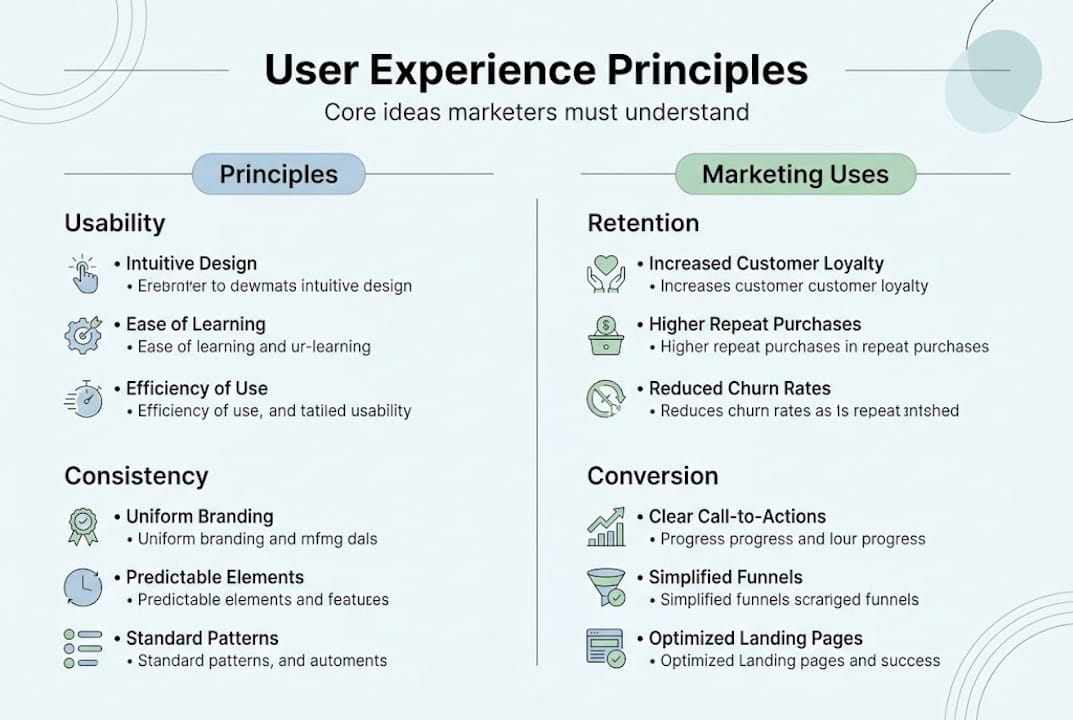
For marketers specifically, UX is the invisible framework behind every decision your visitors make. When someone bounces from your landing page in three seconds, that is a UX failure. When someone reads all the way through and converts, something in the experience earned their trust. The difference between those two outcomes usually comes down to a handful of foundational principles.
According to Figma's UX design resource library, the core UX principles every marketer should understand include user-centricity, consistency, hierarchy, usability, accessibility, and context awareness. Here is what each one means in practical, marketing terms:
| UX principle | What it means | Marketing application |
|---|---|---|
| User-centricity | Design everything around the user's needs and goals, not your preferences | Write copy that answers visitor questions before they ask them |
| Consistency | Keep visual patterns, language, and interactions predictable | Match your ad headline to your landing page headline exactly |
| Hierarchy | Guide the eye and attention through clear visual and content priority | Put your primary CTA above the fold, not buried at the bottom |
| Usability | Make tasks easy to complete with minimal friction | Reduce form fields to only what is absolutely necessary |
| Accessibility | Ensure the experience works for users with varying abilities | Use sufficient color contrast and readable font sizes |
| Context awareness | Adapt the experience to the user's situation, device, and intent | Optimize mobile pages differently from desktop landing pages |
Each of these principles sounds simple in isolation, but they compound fast. A page that nails hierarchy and usability but ignores context awareness will still underperform on mobile, where the majority of traffic now arrives.
What makes UX a business strategy rather than just a design checklist is the feedback loop it creates. When you invest in user experience optimization, you reduce friction, which lowers your bounce rate, which increases the pool of visitors available to convert. Better UX also increases return visits and word-of-mouth referrals. Small improvements compound into significant retention and revenue advantages over time.
The mistake most marketers make is treating UX as a one-time project. You redesign your landing page, call it done, and move on. But UX is a living, breathing layer of your marketing system that requires ongoing attention and iteration, especially as audience behavior and device usage shift.
How UX shapes conversion: Evidence and benchmarks
Knowing the principles is important, but what matters most is how user experience directly boosts the bottom line.

The data here is both encouraging and humbling. Dedicated landing pages with strong UX practices average a 4.02% conversion rate, while the typical landing page sits at just 2.35%. That gap is not explained by traffic quality alone. It is a UX gap, and it represents a significant amount of revenue for businesses that close it.
Breaking this down further, the same benchmarks reveal which specific UX changes deliver the strongest lifts. Headline optimization alone can boost conversions by 34%. A better-placed CTA yields a 21% improvement. And every single form field you remove increases completion rates by roughly 18%. These numbers should reframe how you think about your next A/B test. You are not just testing copy or color. You are testing user experience variables.
Here is a direct comparison of common UX tweaks and their typical conversion impact:
| UX change | Typical conversion impact |
|---|---|
| Headline optimization | Up to 34% lift |
| CTA placement improvement | Up to 21% lift |
| Removing one form field | Up to 18% lift per field |
| Page load speed improvement | Varies; significant on mobile |
| Adding trust signals | Moderate to strong lift |
The three UX areas every marketer should prioritize when designing growth experiments are:
-
Headlines and value propositions. Your headline is the first UX test your visitor encounters. If it does not match their intent or clearly signal a benefit, everything downstream fails. Test specificity, emotional resonance, and alignment with the traffic source.
-
CTA design and placement. Button text, color contrast, and position all influence whether a visitor takes action. Testing optimizing CTA buttons is one of the fastest ways to identify UX-driven conversion gains without a full redesign.
-
Form length and complexity. Every extra field you ask visitors to complete is a small tax on their patience. Fewer fields consistently outperform longer forms in controlled experiments. If you are not running tests on this, start now.
Pro Tip: Before launching your next A/B test, rank your current page elements by friction level. Ask yourself: "What is the one thing most likely to make a visitor stop and leave?" That is your first test hypothesis, not whatever looks interesting to you aesthetically.
What makes A/B testing for smarter decisions so powerful in this context is that it turns UX intuition into measurable evidence. You stop guessing which version of your page is better and start proving it with data collected from real visitor behavior.
UX vs. conversion optimization: Finding the balance
With evidence in hand, it is worth asking: is better UX always better for business numbers?
The honest answer is no. And this is one of the most important nuances in growth marketing that rarely gets discussed openly.
"Applying usability heuristics without considering the psychology of commitment and persuasion can actually reduce conversion rates, even while improving perceived usability scores." — UXMatters
This tension plays out in real ways for marketers every day. Consider a checkout flow. From a pure usability standpoint, offering a "Save for later" option makes the experience friendlier and more flexible. But that same option gives hesitant buyers an easy escape route, which can reduce completed purchases. The UX improvement hurts the business metric.
The opposite happens too. Aggressive conversion tactics like countdown timers, limited availability warnings, and removing the "back" button can increase short-term conversions while damaging trust and long-term retention. You optimize the number, but you break the relationship.
Here are some real-world examples of this tension in action:
- More information vs. fewer distractions. Adding FAQs and trust badges improves UX and helps hesitant visitors, but clutters the page and can dilute CTA focus for visitors who are already ready to convert.
- Easy navigation vs. linear flow. Good UX often includes multiple navigation options, but sales landing pages intentionally remove navigation to keep visitors focused on one action.
- Personalization vs. simplicity. Contextually personalized content improves experience, but overly complex personalization logic can slow your page load time and hurt performance.
- Transparent pricing vs. curiosity-driven clicks. Showing all pricing upfront respects the user, but withholding it can increase demo request rates for SaaS tools where conversations close sales better than pages.
None of these is a clear right or wrong answer. They are strategic trade-offs that require you to know your audience deeply and measure outcomes carefully.
Pro Tip: When reviewing your A/B testing best practices, always define what "winning" means before you run the test. If you measure only clicks, you might declare a winner that quietly tanks downstream conversions or customer satisfaction. Tie your success metric to actual business outcomes, not just engagement.
The smartest marketers hold both UX and conversion optimization as goals simultaneously. They use A/B testing not to pick one over the other, but to find the overlap. That is where sustainable, compounding growth actually lives.
Applying UX principles to A/B testing for growth
To bring this all together, here is how marketers can put UX theory to work during A/B experimentation.
A lot of A/B tests fail not because the idea is bad, but because the experiment was poorly designed. Grounding your testing process in UX principles dramatically improves both the quality of your hypotheses and the clarity of your results. Here is a step-by-step approach:
-
Audit your current experience through user-centricity. Before writing a single test hypothesis, put yourself in your visitor's shoes. What do they know, want, and fear when they land on your page? Use session recordings, heatmaps, or user feedback in A/B testing to gather evidence, not assumptions.
-
Map friction points using usability and hierarchy principles. Walk through your page and identify where the visual hierarchy breaks down or where users must work too hard to take the next step. These are your highest-priority test candidates.
-
Write hypotheses rooted in UX logic. A strong hypothesis sounds like: "If we move the CTA above the fold and match the language to the visitor's source query, we expect conversion to increase because users will immediately see the relevant next step." Weak hypotheses skip the "because" entirely.
-
Apply context awareness to your test variants. Do not just create a variant that looks different. Create one that serves the user's specific context better, whether that is their device, their referral source, or their stage in the buying process.
-
Monitor test results through a UX lens. When a variant wins, ask why it won from a user experience standpoint. Understanding the mechanism behind the result lets you apply the insight across other pages and tests, not just celebrate the single win.
-
Optimize the full user journey, not just the page. A landing page does not exist in isolation. It connects to an ad, a follow-up email, an onboarding flow. Testing with the broader journey in mind prevents local optimization that damages the overall experience.
Common mistakes marketers make when applying UX to A/B testing include:
- Testing too many variables at once, making it impossible to isolate the UX improvement that drove the result
- Running tests on low-traffic pages without enough statistical significance to trust the outcome
- Stopping tests too early when early data looks promising, missing the full behavioral picture
- Ignoring qualitative signals like exit surveys or chat transcripts that explain the "why" behind the numbers
- Optimizing for vanity metrics like time-on-page instead of actions that directly reflect business value
A clean testing framework starts with a single UX principle, a clear hypothesis, one variable changed, and a predefined sample size. That discipline is what separates marketers who build on each test result from those who spin in circles chasing noise.
Why UX strategy trumps tactics for sustainable marketing growth
Most marketers who engage with UX do so tactically. They fix a confusing form here, rewrite a CTA there, and move on. These are good moves, but they are not a strategy. The uncomfortable truth is that one-off UX fixes rarely compound. They patch individual leaks without addressing the underlying gaps in how your experience serves users at every stage.
The marketers who see sustained, compounding growth are those who treat UX as a cross-functional, always-on growth input rather than a project with a finish line. That means regularly reviewing behavioral data, running strategic A/B testing cycles tied to UX hypotheses, and aligning your design, content, and development teams around a shared understanding of what your users actually need.
Tactics get you a 20% lift on one landing page. Strategy gets you 20% lifts across every landing page, every quarter, because you have built a system that keeps improving. The shift from tactical to strategic UX thinking is the highest-leverage move available to most growth teams right now.
Unlock better UX and higher conversions with automation
If you have taken anything from this guide, it is that UX-driven A/B testing is not a one-time project but a repeatable growth engine. The challenge for most small and medium-sized businesses is finding a tool that makes that engine easy to run without a dedicated development team.
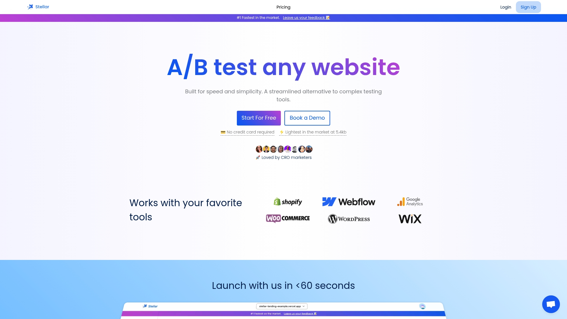
The GoStellar platform is built precisely for that. With a no-code visual editor, real-time analytics, and a 5.4KB script that keeps your pages fast, Stellar makes it easy for marketers to run UX-informed A/B tests without slowing down their site or waiting on technical resources. Whether you are testing headlines, CTA placement, or form length, Stellar gives you the data you need to make confident decisions. Start with a free plan for up to 25,000 monthly tracked users and build your UX testing habit from day one.
Frequently asked questions
What is the difference between UX and UI?
User experience (UX) covers the entire interaction and satisfaction a person has with a product, while user interface (UI) focuses on the visual layout and elements a user interacts with directly.
How do UX improvements affect marketing results?
UX improvements can sharply raise conversion rates, with headline tweaks lifting results by up to 34% and better CTA placement delivering a 21% improvement.
Does focusing on usability always increase conversions?
Not always. Improving usability can reduce conversions if it ignores user psychology or commitment triggers, which is why strategy matters more than blindly following usability heuristics alone.
What should marketers test first for UX impact?
Start with headlines, CTA placement, and reducing form fields, as these three changes consistently deliver the strongest measurable improvements in controlled experiments.
Recommended
Published: 4/26/2026